Overview
Courtside is a community-interest company that is dedicated to improving physical and mental well-being by transforming old park facilities into community-driven spaces. They aim to address health inequalities, specifically targeting individuals who may require encouragement for better physical and mental well-being. With hubs in Oxfordshire and across the UK, Courtside is committed to encouraging active lifestyles, building healthier communities and creating connections across the generations.
What they needed
Courtside approached us with a challenge: to develop a website that was capable of booking a variety of activities in different locations across the UK, ensuring it was accessible for users of all abilities. They offer over 50 activities that are designed for all ages and intensity levels and as the business grows and the locations expand, the website needs to be able to facilitate the same growth. Courtside also wanted to define its brand message to appeal to all of these audiences, from beginners to sporting enthusiasts. Originally, the Courtside brand was focused on B2B, and the messaging needed to work for a B2C market.
This project presented numerous challenges, including prioritising activities, identifying primary and secondary target audiences, aligning stakeholders around the brand vision and creating a brand identity without the foundations of a logo.
Despite these challenges, our goal was clear: to design a website and booking journey that appealed to different age groups and allowed fast filtering of different activities, whilst creating a tone for Courtside's exciting and inclusive brand identity.
What we did for them
We broke down the process into two phases, experience strategy followed by design. This approach allowed us to:
Identify the target audience and conduct a user journey map workshop
Develop the brand positioning through a strategy workshop
Create the information architecture of the booking system
Design the User Interface (UI)
Our approach
Personas & user journey mapping workshop
Our workshop was structured to identify two key areas: the primary user group and the categorisation of activities.
In the initial persona review, four main segments emerged: professionals, students, elderly people and families, with families being highlighted as particularly significant, primarily parents booking activities for their children. Activities were then categorised based on specific requirements; considering factors such as budget, group size, intensity, equipment, age and availability. Three key categories emerged: facility-based (requiring equipment), coached activities (booking sessions without additional equipment) and slot-based activities. To illustrate our approach, we chose a specific high-priority and low-entry activity, in this case, shuffleboard, and mapped out the user journey.
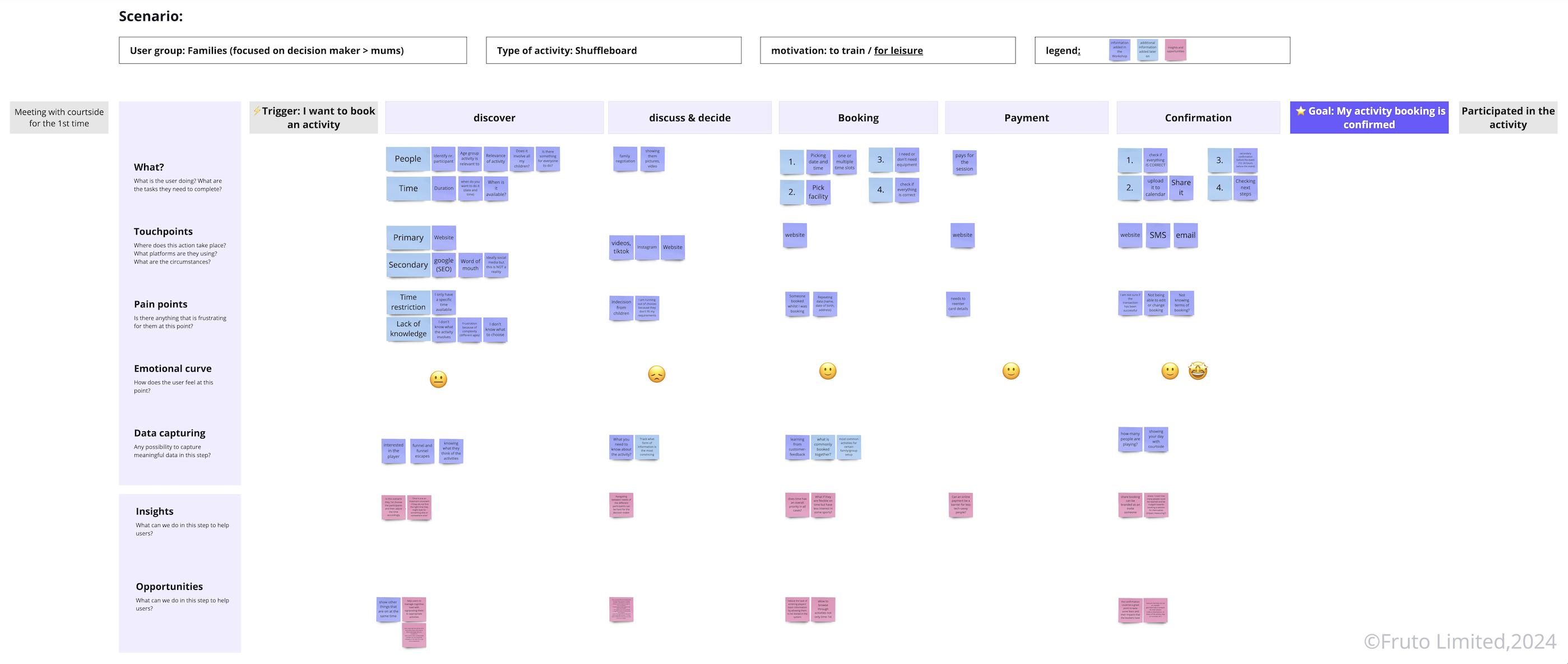
This workshop was the foundation for a targeted, inclusive and user-centred approach, ensuring that Courtside’s website met the diverse needs of its target audience.
Brand strategy workshop
Our engagement with Courtside developed into an in-depth brand strategy workshop. We integrated ourselves into their mission, understanding the positive impact they aimed to make within the community.
We began by conducting collaborative exercises with Courtside’s team to define their brand persona, addressing elements such as personality and tone of voice. We assisted with discussions on the visual identity of the brand, selecting colours, typography and images that reflected their identity. We focussed on how a strong brand strategy could improve the overall site and customer experience, making sure each exercise contributed to shaping Courtside’s vision and providing clear direction for the brand identity.
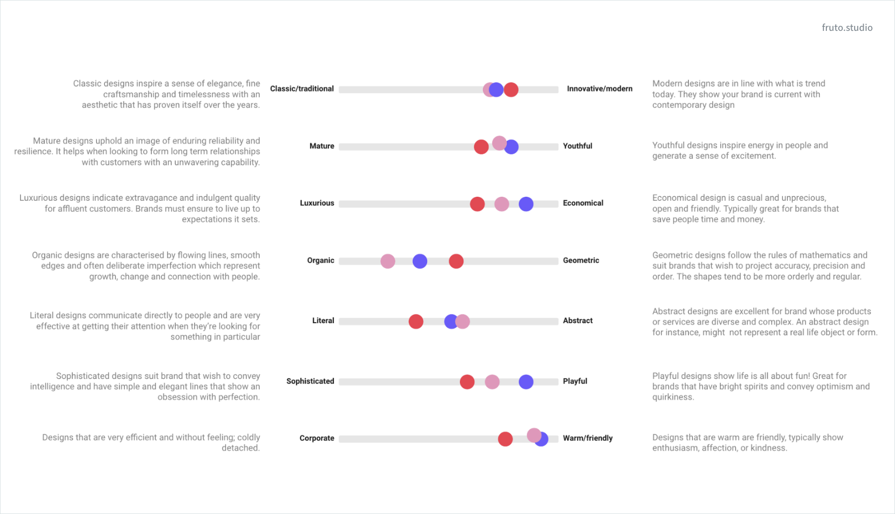
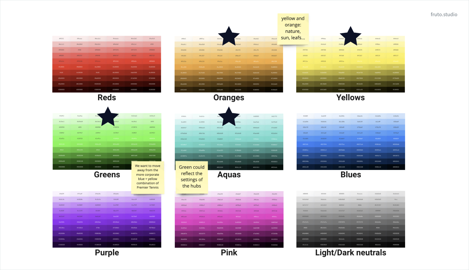
The outcomes of the workshop provided a roadmap for consistency across the brand, helping Courtside to communicate who they are and what they stand for.
Information architecture & wireframes
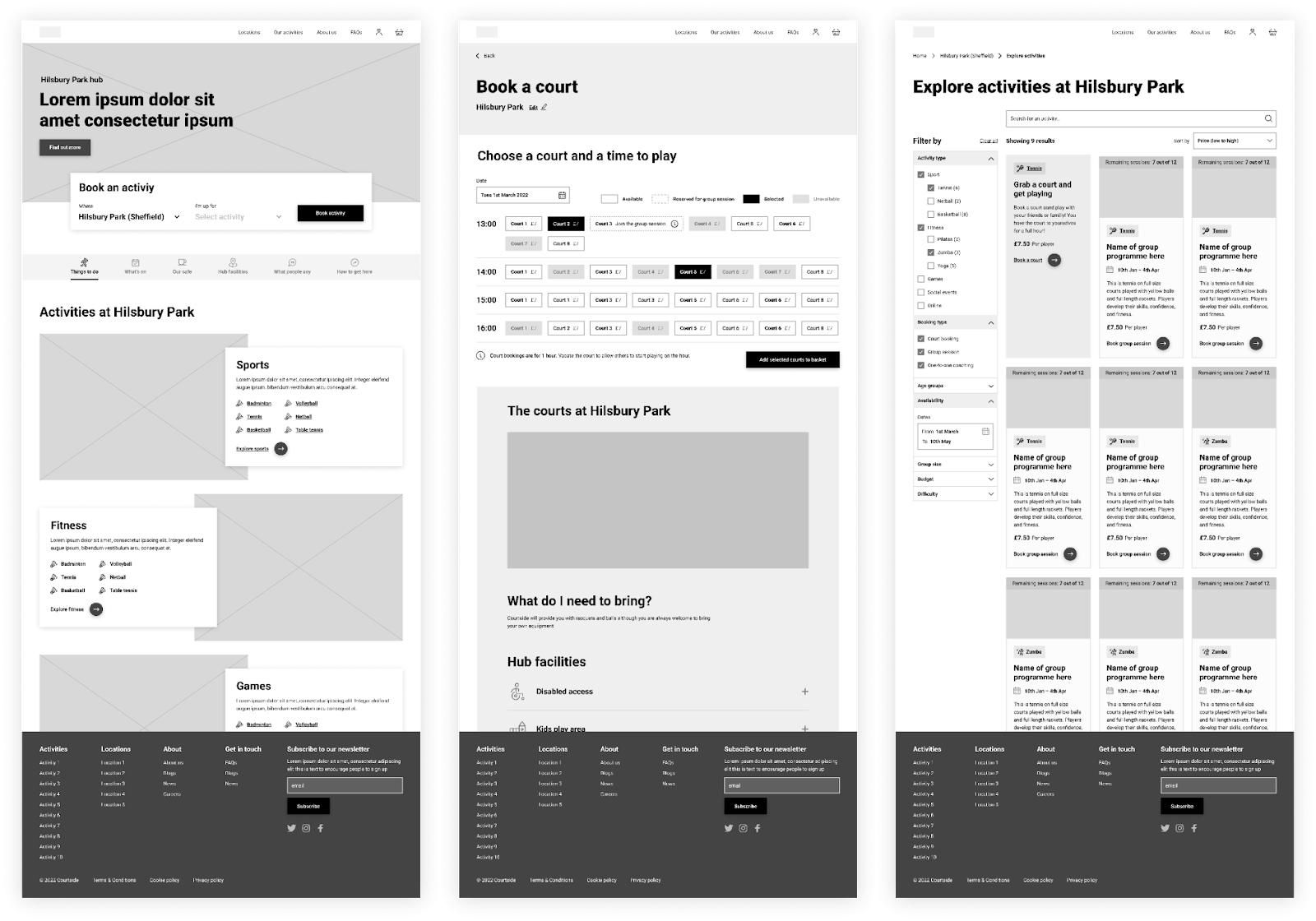
We began to structure the flow of information across the website, starting with a page flow and developing high-fidelity wireframes. The key objective was to explore the usability and take into account the range of activities, for easy navigation.
We considered user groups, such as new Courtside customers and regular Courtside customers who required different user experiences on the website navigation. We placed a widget which facilitates quick access to bookings and incorporated a filter to allow users to input specific variables. We kept this consistency on each page with sub-navigation, contributing to a more integrated user experience throughout the website. This approach meant that the UI design not only met the functional requirements of all user groups but also reinforced Courtside’s distinct brand identity.
The new website needed to cater for Courtside’s internal growth across new locations and activities, we incorporated this into the site architecture ensuring that users could navigate the website regardless of the amount of activities and locations presented. The interface was designed to be user-friendly and scalable, allowing Courtside to easily add and remove locations, activities and features.
UI design
We began by creating a baseline brand identity crafted with a mix of 70% Everyman and 30% Caregiver archetypes in mind. The brand identity applied throughout the UI is designed to resonate on a personal level, employing warm, earthy colours that show feelings of care and reliability.
This colour palette was chosen to reinforce the brand's approachable and nurturing side, mirroring the Everyman's quest for connection and the Caregiver's dedication to support and empathy. By combining these hues with visuals (such as shapes and imagery) and messaging that emphasises accessibility, trustworthiness, and a communal spirit.
The UI design was a major part of the Courtside project to bring the strategy to life. We used colour-coding for group activities like sports and social events, improving user experience through easy recognition and navigation. This simplifies information processing, improves aesthetics, and aligns with the brand identity, enhancing the platform's consistency and engagement. It uses colour effectively as a non-verbal guide, making navigation intuitive and accessible.
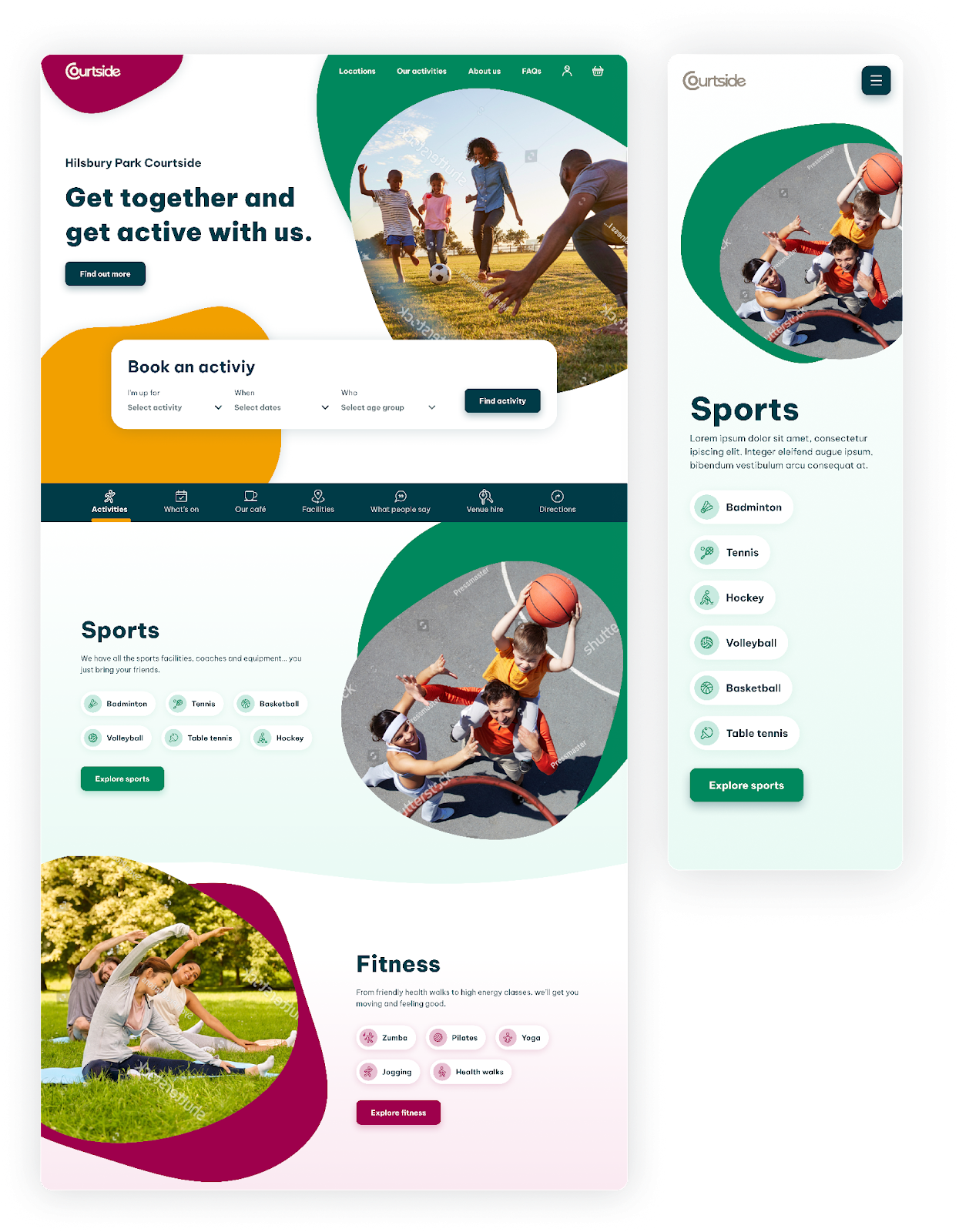
To accommodate our colour-coded categorisation of activity types, special attention was given to ensuring all colour combinations on the website met the AA accessibility standard. With a maintained contrast ratio that meets or exceeds WCAG requirements—4.5:1 for normal text and 3:1 for large text and graphics—our design guarantees that users with colour vision impairments can navigate the site with ease.
We focused on user experience and interface design for their website which allowed the public to easily browse and book various community activities.
We developed a customisable pattern library and components for Courtside to maintain visual and UX consistency across their digital touchpoints. The pattern library gave Courtside a user-tested toolkit for efficiently expanding their site, activities and other platforms. It also maintained consistency with its newly developed brand identity.
On the 'Explore activities' page, we optimised the UI with a filter system, enabling users to efficiently pinpoint suitable activities. Filters—covering activity and booking types, age groups, availability, dates, group sizes, budget, and difficulty—are intuitively presented, with quick-reset options for new searches. High-quality visuals and brief descriptions offer snapshots of activities, while distinct 'Book a session' buttons simplify the booking process, crafting a seamless, tailored search-to-booking journey.
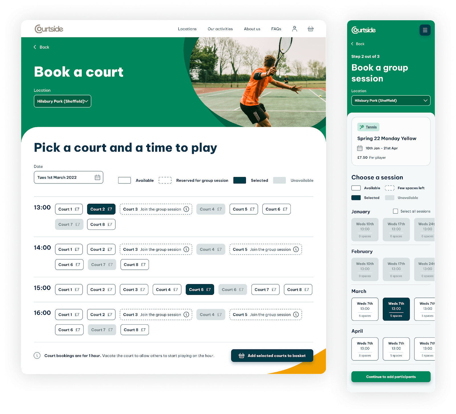
Central to this UI design is the step-by-step booking process that lays out the booking journey across clear, numbered stages, reducing complexity and focusing the user's attention. Availability is displayed through the use of colour, patterns and text labels, ensuring accessibility for users with colour vision deficiencies. Consistency in the layout of session information, such as date, time, and remaining spaces, ensures users quickly familiarise themselves with the format, streamlining the selection process. Action buttons like 'Book a session' and 'Add to basket' are prominently displayed and distinctly labelled, guiding users towards the next step. The interface also incorporates fields for adding participants, reflecting inclusivity and attention to user-specific needs.
Results
The new website resulted in an inclusive platform that facilitates easy booking of activities for all ages and abilities. It aligns with Courtside’s mission of enabling physical activity, supporting communities and making a positive contribution to societal well-being.
The new website is in the final development stages and we’re looking forward to seeing the outcomes later in the year once following the website launch and opening of Courtside’s first activity hubs in Oxford and Witney.
What better way to showcase the new design, than booking yourself on to an activity and integrating yourself into the community…. We hope to see you there!


