
Colour has a great impact in the world around us and this is no different in User Interfaces (UI). However, it’s not always given the importance it deserves. Sometimes colour is understood as a purely aesthetic element that is completely relative and subjective. Nonetheless, colour plays a key role (on multiple levels) in the user experience of a product, and therefore it is worth our attention as designers.
In this post I’ll show you some tips on how to build a successful palette. I’ll talk through some of the basics around colour, the key roles colour plays when designing a user experience, and give you some pointers on how to apply this knowledge when creating your own colour palette.
Terminology
When talking about colours, and more specifically creating a palette for your UI, it’s key that you know the different elements that make up a colour so you can use them to your advantage. Before I give this brief overview, I’d like to point out that when I refer to black and white, I mean ‘pure’ white and black (respectively the hex colour codes #FFFFFF and #000000), rather than a rich black like #010b13, which is a very dark shade of cyan-blue or other off-whites or off-blacks.
Hue
Hue is the pure state of a colour. A hue is the colour without any black or white added to it. We could say that hue is kind of a more fancy way of saying colour.
Tint
A tint is when white is added to a colour/hue. In Sketch for instance you can create tints by lowering the opacity of said colour (as long as the layer behind your colour/ hue is white)
Shade
A shade is when black is added to a colour/hue. In Sketch, the way I do this is to overlay black on top of my colour/hue and reduce the opacity of the black to control the shade (higher opacity of black = darker shade)
Tone
A tone is a combination of a tint and a shade. A tone is created when grey is added to the colour/hue. When saying grey, we are referring to pure grey, which is an intermediate colour between pure black and pure white. Pure grey is an achromatic color. Meaning a colour "without colour," as it is composed of black and white (in different proportions depending on the pure grey)
Value
The value refers to how light or dark a colour is, it’s the amount of light that a colour gives.
Saturation
Saturation is how vibrant a colour is. This term relates to the purity of the colour. More saturated colours are vibrant and less saturated ones are more dull.
It is important to have a basic understanding of this terminology so you can apply it to your colour palette creation process.
The roles that colour plays
Colour has many roles in UI design. I’d like to outline what some of these roles are, and how each can help us create a strong UI design and ultimately, a better user experience.
1. Colour as a mood-setter
This is perhaps the most commonly understood role of colour. Each colour can create a mood and is associated with certain feelings and assumptions. It is important to have a basic understanding of the psychology of colour so you can create the correct mood and transmit the right message to your target audience.
In this post I’d like to pay more attention to the other roles of colour that are not talked about as often. Since the basics of colour psychology are more generally understood I think the easiest way to provide this information is in an image.
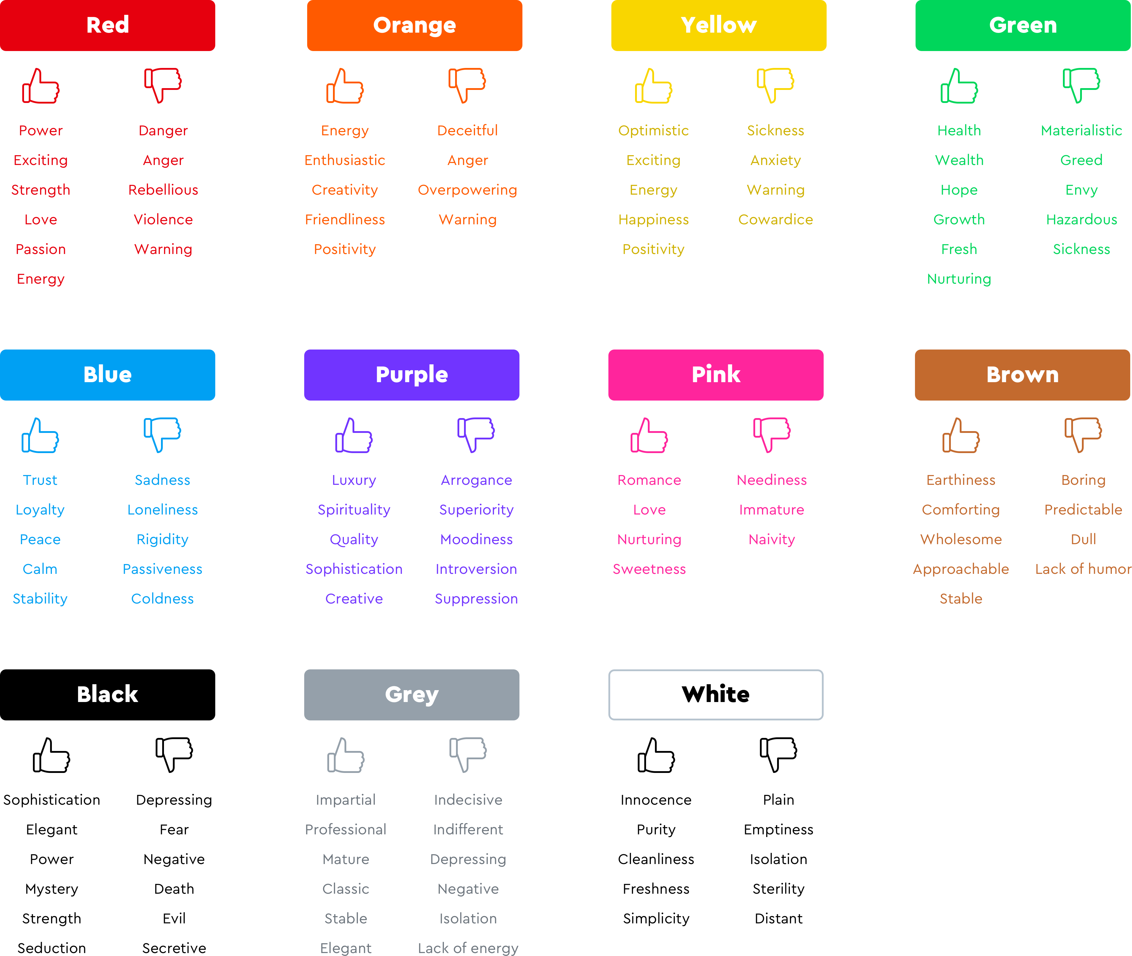
It’s worth pointing out that the positive or negative connotation of a certain colour might also depend on the variations of said colour (if it has a tint, or a shade applied to it or if the saturation is high or low). In the image above the hues we see are just representative of that particular colour.
It is also key to note that the positive or negative connotations for each colour represented in the image above, are based on a traditionally western interpretation of colour. The emotions that colours transmit may vary between different cultures. It is key that as designers we take into consideration these potential differences when designing for cross-cultural contexts. A few examples of these differences of interpretation can be seen with:
White: While white is generally associated with positive attributes in western culture (purity, cleanliness, simplicity, hope, etc) this does not apply to certain Asian cultures where this same colour is associated with death and mourning.
Blue: While in western culture blue is generally associated with trust, reliability and peace in some South American cultures it’s associated with trouble.
Have a look at this great infographic by ‘Information is beautiful’ that outlines the difference in the meaning of colours in different cultures.
2. Colour as decision-influencer
As outlined in its first role, each colour can evoke a certain feeling or emotion. This can play a very important role in retail. Selling requires persuasion and although there are many factors that influence a customer’s buying behaviour, it is clear that visual cues, and in particular colour, play an active role. Visual cues are the fastest form of communication, and therefore are the very first thing that potential customers will process when they land on a website.
The psychology of colour is not only used to reflect a brand's personality and evoke certain feelings in the audience but also to influence the actions that consumers take on a website.
Certain colours can prompt users to take certain actions within the interface. An example of this is a red button that says ‘sale’. Because red promotes concepts like urgency and excitement it can be used to prompt users to take action quickly. Another example could be a green button. Because of the meaning that green has in western culture it provokes feelings of calmness, and a sense of going forward and growth. Choosing green for a button could indicate to the user that there is more information or more steps that need to be taken.
3. Colour as a guide through the interface
Colour can play a key role in guiding users through an interface. By using colour appropriately you can guide your users through an interface, leaving some options open and closing others. A good example of this is an active button versus a disabled one. The active button gives the user the option to take a path to another part of the interface, while the disabled one blocks or removes the option to access another area of that same interface.

While in the previous example the role of colour is enabling the user to perform an action or not, colour as navigation can take other shapes, like for example when an item is selected the colour of said item might change. In this scenario colour enables the user to have visibility of the system’s status, meaning that with a change of colour for a selected item the user knows the system has registered their choice.

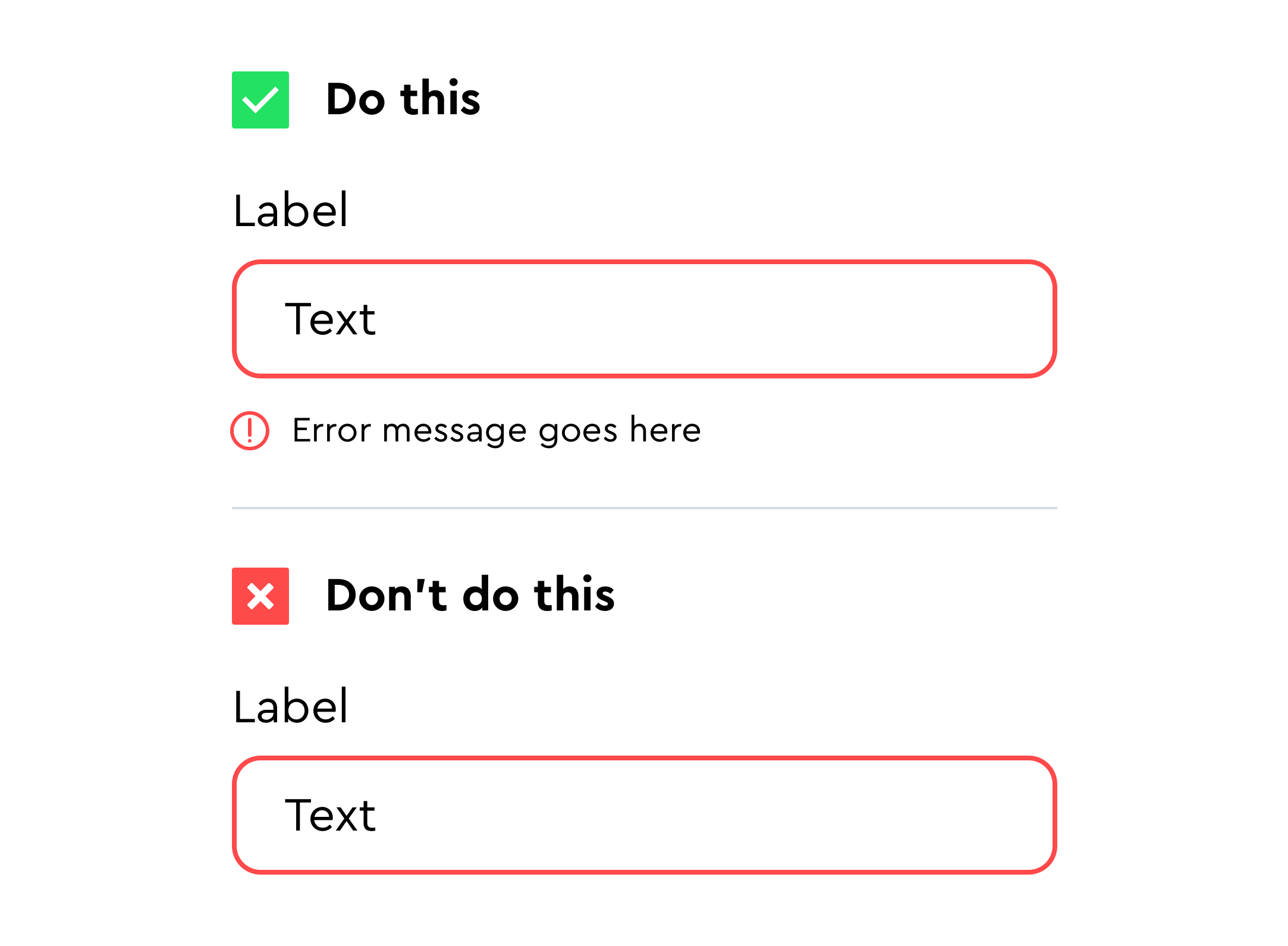
Lastly colour can help with error prevention. An example of this is using colour to indicate a form has been filled in with the wrong information. Rather than waiting for the user to submit the form and display an error message, we can use colour (red in most cases) to indicate that there is something wrong with one of the fields. In the same way we can use colour to indicate success or an active field (green in most cases).

4. Colour as hierarchy creator
Hierarchy is defined by the specific arrangement of certain elements based on their importance. With some items being represented as ‘above’ (more important), ‘below’ (less important) or ‘at the same level’. Hierarchy is key as it will prompt users to scan the elements on the page in the order that the designer deems appropriate.
In UI design, hierarchy can be created in very different ways. One of them is by using colour (alone or in combination with other elements such as typography and spacing).
Colour can take on various approaches to create a desired hierarchy. These approaches are dependent on three components of colour: saturation, lightness/darkness and hue. These components can be mixed and matched to create said hierarchy.
1st approach – Saturation
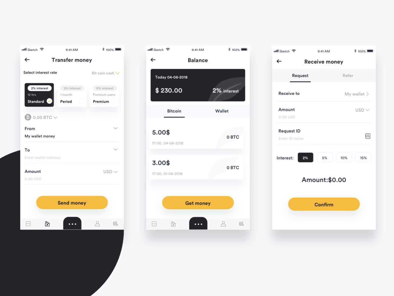
Designs where there is saturation in certain elements grab the user’s attention and direct it to said component. This can be seen in the example below, where all elements are de-saturated and only the ‘call-to-action’ (CTA) buttons have saturation in their colour. The hierarchy of this design could be attributed to multiple elements, however, it is arguably led by the fact that the CTA jumps at us for being the only element on the page that has a high saturated colour.
2nd approach – Hue
As I outlined in the section on colour as a mood-setter, certain colours grab our attention faster or more efficiently than others. This is the case of red for example, it jumps at us almost immediately. Being aware of which colours tend to stand out more and which ones don’t can help us create the desired hierarchy on a design. However, which colour stands out most in each context is dependent on the third component, lightness and darkness.
3rd approach – Contrast
In a design that uses mainly dark colours (independently of if they are saturated or not), light hues will stand out more while darker ones will recede into the background and vice versa. This leads us to contrast. We can play with lightness and darkness on a design to create the desired level of contrast that will lead to the creation of hierarchy. The higher the contrast on a component, the more prominent it will be for the user.
5. Colour as accessibility enabler
Accessibility is a key factor designers must consider when designing interfaces. Good or bad accessibility will dictate who can and cannot use your design. As designers we should always design with accessibility in mind so that our designs can be used by anyone, regardless of physical, mental or cognitive disabilities and impairments.
Colour plays a key role in creating an accessible product. Contrast is, perhaps, the first factor that comes to mind when talking about accessibility in our use of colour. When talking about contrast, in this case, I am referring to background-to-text contrast. There are guidelines in place to help you create an accessible product. Guidelines such as The Web Content Accessibility Guidelines.
To help you meet the guidelines, there are many tools out there. However, my personal favourite as a UI designer would be a plug in called Cluse. Cluse allows you to quickly test and adjust background-to-text contrast without having to resort to external resources. Another great (online) tool is Colorable.
Despite colour’s ability to improve the accessibility of your product, it should never be the only medium through which you do so. Colour should not be the only way you communicate, especially when it comes to crucial information on the interface.
A good example of this is error states on forms. If you only communicate error through colour (in this case red), a user with colour blindness might completely miss the error and try to continue without correcting said error. In this case make sure you use icons or some kind of message that transmits that same error information the colour red is communicating.
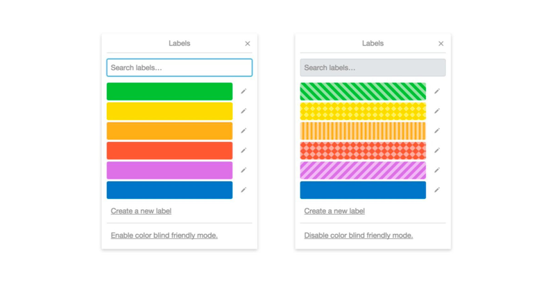
The concept of not only using colour to improve accessibility also translates into more complex components of an interface like charts, graphs and labels. In order to improve usability in these instances make sure to incorporate some kind of visual pattern as well as the colour of choice. A good example of this is the labelling system that Trello uses.
Choosing your palette: tips and tricks
In order to create a successful colour palette you should keep in mind all points made above in this post (paying special attention to ‘Colour as a mood setter’ and ‘Colour as accessibility enabler’). However, below I have gathered specific tips and tricks to watch out for in order to create a colour palette that is aesthetically pleasing, accessible and flexible.
Think beyond the brand
Generally when we think of a colour palette in design, we think of a branded colour palette. Although this color palette is key to define the interface, in UI design we need a little more flexibility. This is because unlike the colours on a logo or branded materials (business cards, banners, etc), the UI colour palette must also accommodate the comfortable usage of the interface. This gives an extra dimension for colour choice beyond the traditional lines of representing brand values or creating visual impact.
In my own experience I often see this as something that is not well understood, and can lead to rigid interfaces and poor accessibility. This is due to the lack of ‘neutral’ colours. These colours tend to be shades of off white and grey, ranging from very light to very dark (these colours might vary if designing for a light or dark mode).
From a brand’s perspective it would make complete sense not having extra shades of grey that don’t exist anywhere else in that brand. However, from a user interface point of view those colours will make up the majority of the interface, they will help the actual brand colours stand out and have specific functions and are therefore a must in the creation of a (UI focused) colour palette. Elements such as forms, functional icons, cards, shadows and text among others, usually have one of these neutral colours applied to them. This brings me to the next section of this post, the 60-30-10 rule.
Choosing your proportions
There is an interior design rule for choosing the proportions of your colours that states that regardless of the colours you use in your design, they should (when and if possible) each be distributed in a 60% - 30% -10% proportion ratio. With 60% being the dominant colour, 30% being the secondary color, and 10% being an accent color.
With this in mind, when it comes to designing a user interface, the 60% is usually taken by the neutral colours mentioned in the previous section (whites and greys). In the same way, the 10% is usually reserved for important elements that will help the user navigate the interface, components such as call-to-action buttons.
The ‘60-30-10’ rule allows users to shift their attention from one focal point to another, it helps create harmony and hierarchy. However, it is not set in stone and you’ll find that although it’s good to keep it in mind it’s not always possible to apply it depending on the nature of the interface.
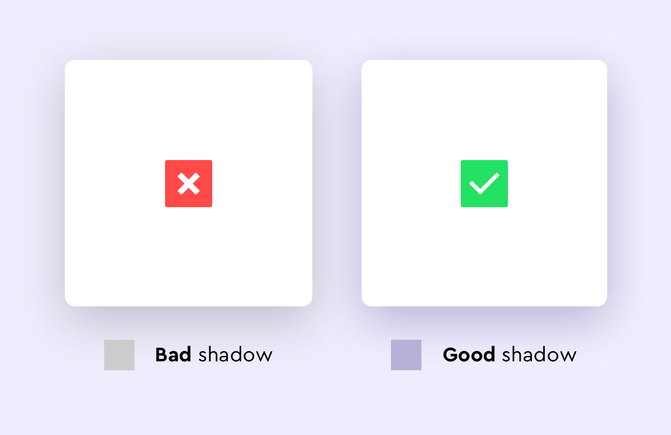
Stay away from pure greys and blacks
This is a tip that will make your designs look much more fresh and modern. In the section ‘Think beyond the brand’ I mentioned the need for a range of greys and off whites in our colour palette. When referring to these greys, I am not talking about pure greys (an achromatic colour that is composed of pure white and pure black). I am referring to greys with a hint of saturation (meaning adding a bit of another colour into the mix). The reason for (generally) avoiding pure greys and blacks is that in reality these colours don’t actually exist and by adding a bit of saturation (I usually add a little blue to make it more clean looking, however, this will depend on the background colour) your users will relate more to these colours subconsciously as they derive from a base colour that is already present on the interface.
Colour combinations
When making a choice of which colours to combine, keep in mind these five rules of thumb for creating a harmonious and balanced colour palette.
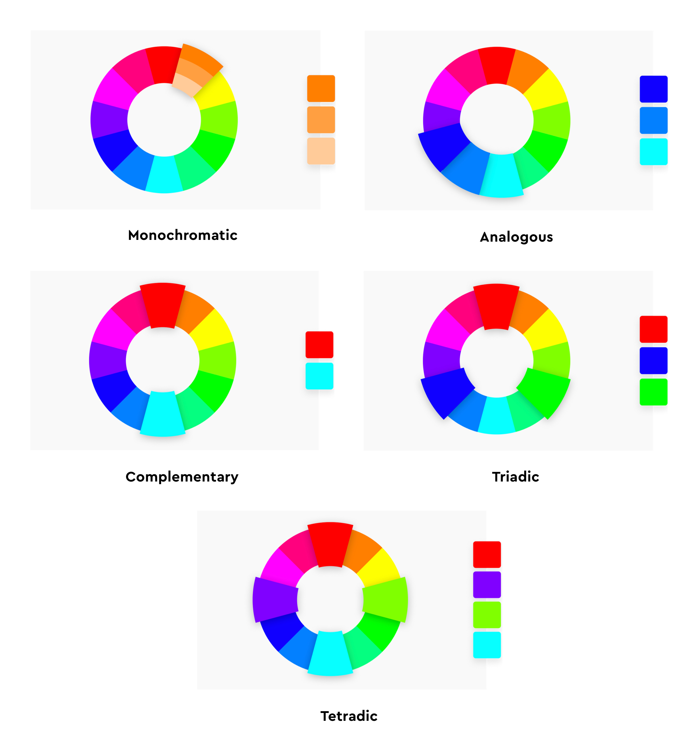
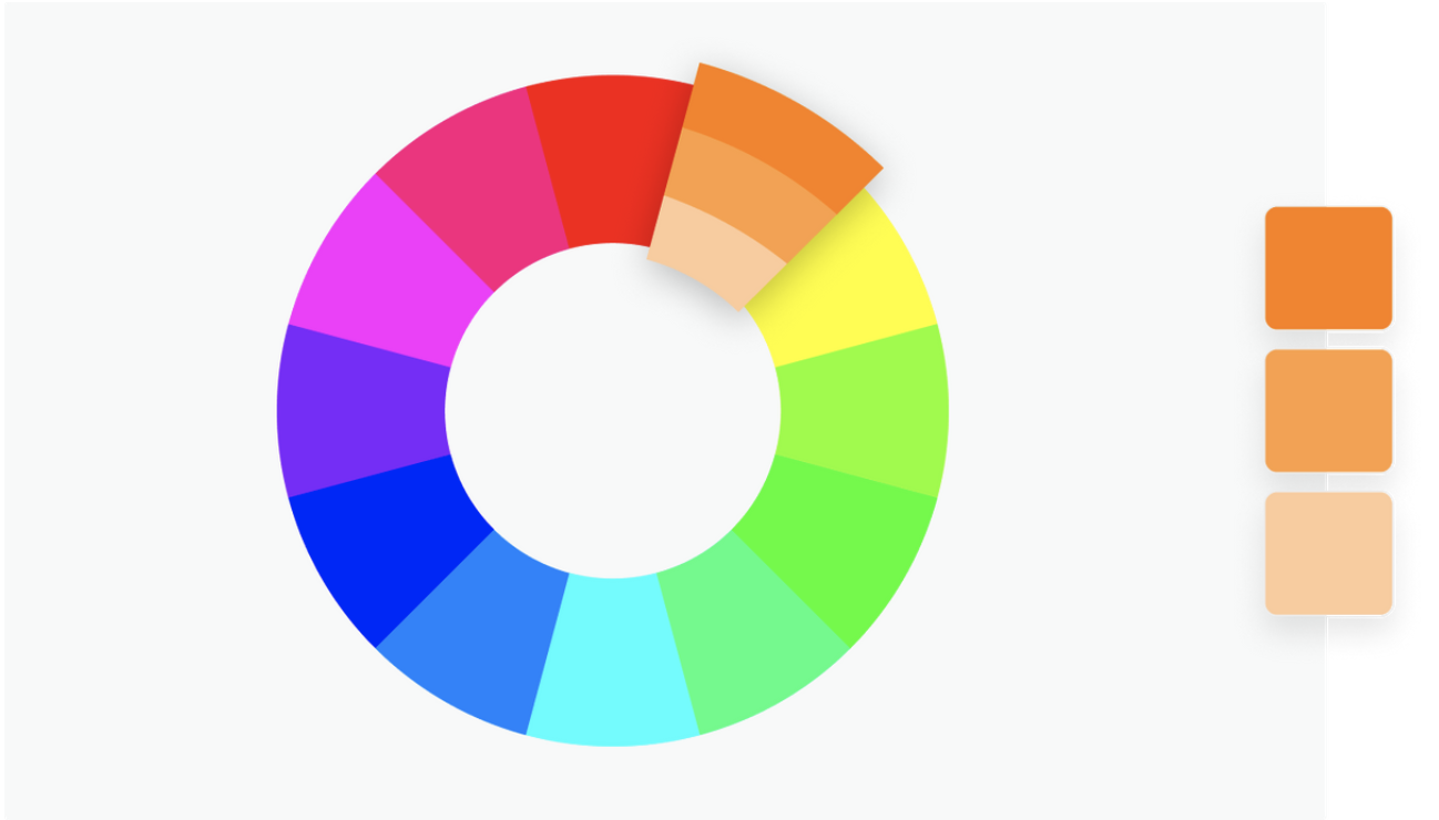
Monochromatic
In this kind of combination all colours are tones, tints, or shades of one base colour. This approach is characterised by being subtle and easy to use. However, we must be careful not to choose this as our default option simply because it’s easier. In fact, if not used properly it can make a design feel boring and lazy. In other instances, if used correctly it can be a good example of the saying ‘less is more’. A good use of this type of combination might be in a product that needs to be strictly kept in brand. In this case, playing with a monochromatic palette of the brand colours might help.
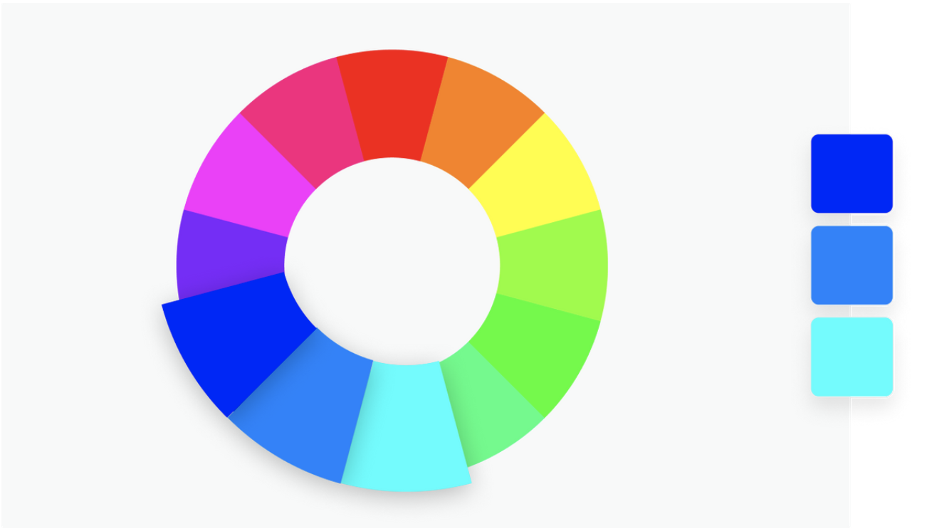
Analogous
This combination focuses on matching colours that are next to each other on the colour wheel (in either direction). The main advantage of combining colours in this way is that it’s flexible and versatile as it allows you to play with different hues but without having to think too much about how they will interact with each other since they are similar in nature. On the one hand, this combination can help your design look uniform and consistent. On the other hand, it can become overwhelming if there are too many colours. To avoid this a good solution might be to pick one of the colours to be the dominant hue and use the others as accents or secondary colours.
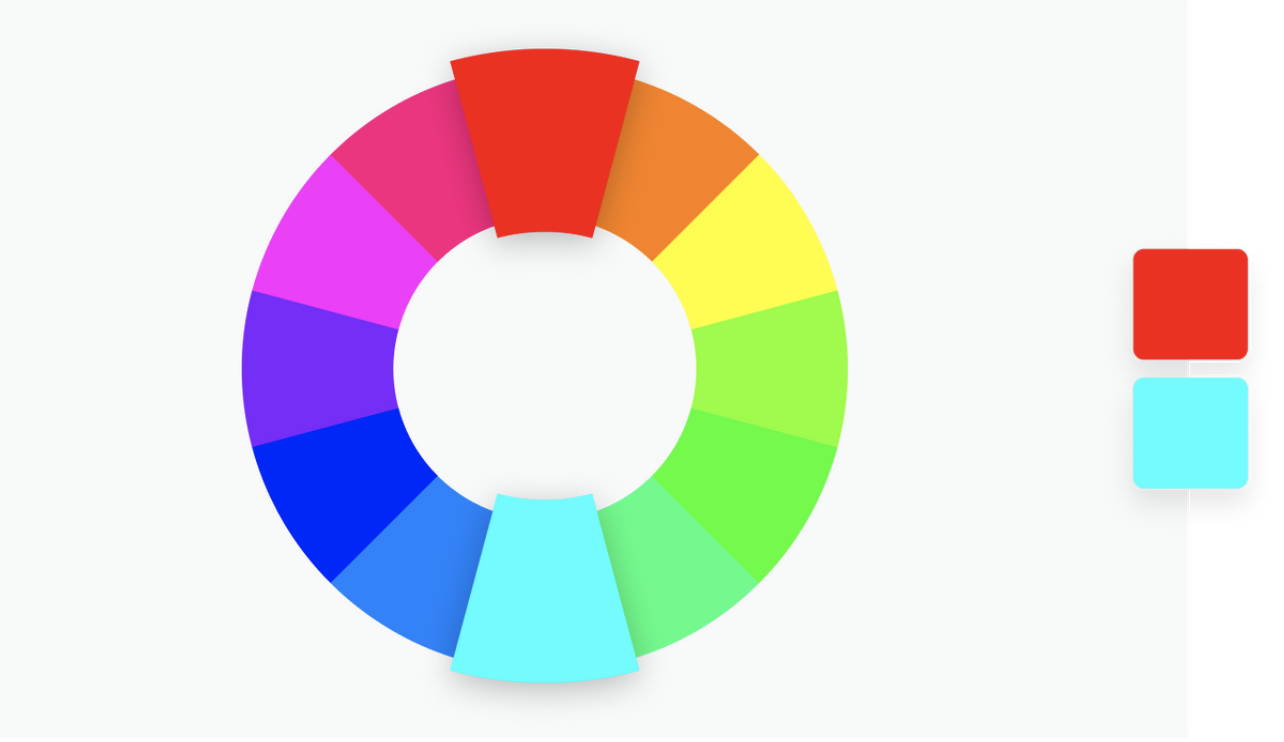
Complementary
This combination takes colours on opposite sides of the colour wheel (such as red and green, blue and orange, etc.). The main advantage of this kind of combination is that the two colours combined appear to be even brighter than they do on their own. This is a high-contrast combination and it usually has a strong impact. However, keep in mind that when using this combination your design might benefit from adding tones and tints of each colour in the same way the monochromatic combination does. This will make your UI appear more balanced and less jarring.
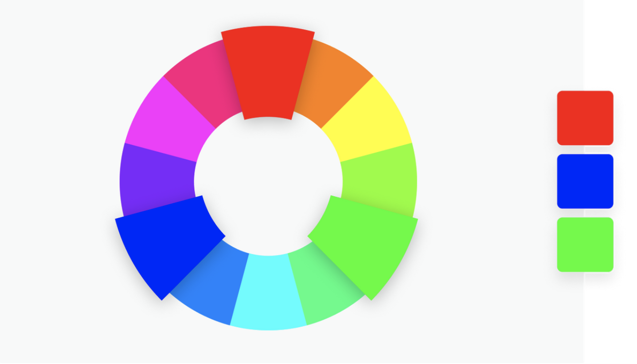
Triadic
This combination takes three colours that have equal space between each other within the colour wheel (meaning the colours are at equidistant points). This way of choosing colours provides a high contrast and impactful colour palette, much like the complementary colour combination. Having three colours means this option becomes more flexible.
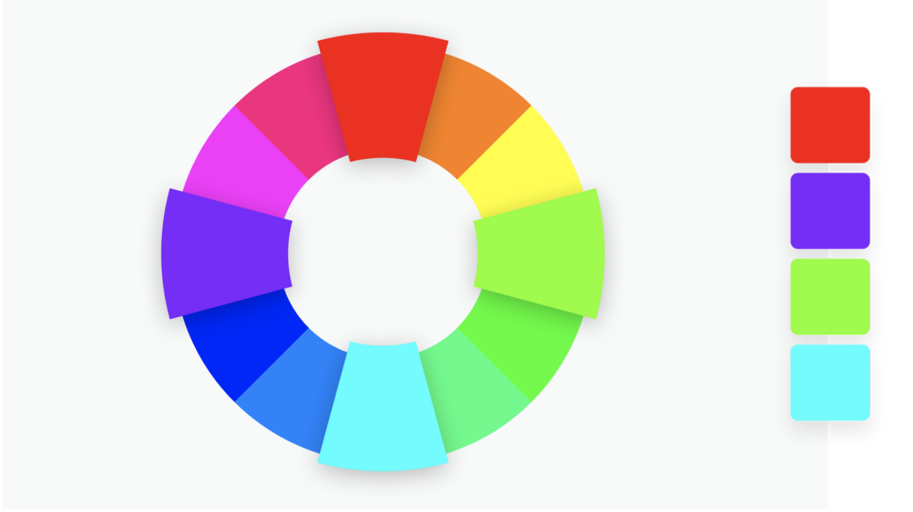
Tetradic
Tetradic colour palettes use the same concept as triadic combinations but they add one more colour: taking four colours from equidistant points on the color wheel. The more colours you have, the more flexibility you gain with the palette. However, it can also become more difficult to balance.
Tools for creating a colour palette
There are many tools out there that help you create a colour palette but here are my personal favourites.
Canva colour wheel
The Canva colour wheel allows you to create colour palettes using specific colour combinations like the ones described above (monochromatic, complementary, analogous, triadic and tetradic). This tool also offers great summarised information on colour theory and terminology.
Coolors.co
This website has a more randomised way of picking colours but is more fun than other tools I have used. Another great thing about this tool is that the colours take most of the screen which is good as it gives you a better sense of the palette you’d be creating. They also offer unique features like colour blindness view or the ability to create a colour palette from a photo.
Adobe colours
This Adobe tool is quite similar to the Canva colour wheel, however, it has more colour combinations for you to play with and it allows you to select a base colour and change each colour independently. It also provides you with the ability to test accessibility.
Color Tool - Material Design
This tool can come in handy to see how your colours would be applied to different UI components and test their accessibility.
Curls
This tool is great to read a short reminder on each of the combination types as well as to get inspiration for potential colour palettes on each of these combinations
Find more tools
As mentioned these are just my personal favourites. However there are many more. Check them out! Let me know if you think any of these are better than the ones in my list (I haven’t tried them all).
Conclusion
As outlined in this post, colours are a key aspect of the user interface, and play many roles ; from setting the mood, creating hierarchy, supporting accessibility, and more.
The creation of a colour palette can be tricky and to some designers it will come more naturally than to others. However, there are some tips and tricks to help you put together a successful palette in a more practical and methodical way. Tips such as knowing the purpose of your palette, understanding rules of thumb for combining colours and using online tools.
So next time you are asked to create a ‘quick’ colour palette, I hope this post will help you articulate why creating a colour palette deserves more than a moment of your attention and why it’s so important to get this key foundation element of the design right from the beginning.