
Design systems have recently increased in popularity in the design world. These days there are so many terms in use, terms such as ‘pattern library’ or ‘component library’, ‘style guide’ or ‘design system’. I’ve heard them being exchanged for one another or used alongside each other.
Personally, I think sometimes the design industry gives too much importance to the differentiation of these three terms. However, there is a specific definition for each term and it’s useful knowing what each entails, not so much for terminology’s sake but to know how to make the most out of each and understand what you might need.
In this blog post I will define these terms and outline how a design system might be beneficial, as well as some of the drawbacks. I will also talk about how important it is to create a system that is customised to your project.
Before we start, it is important to understand that the most important thing when creating a design system is for your team to be on the same page. There might be some designers that understand something slightly different for style guide, pattern library or design system. This is not unusual as these terms often overlap. However, the key takeaway is that everyone on the team should speak the same design language by having terminology that everyone agrees on and uses.
Style guide
A style guide is closely related to the brand guidelines. The style guide of a design system includes information related to colours, typography, icon style etc. In my experience, colours and typography take centre stage. The style guide only takes the relevant aspects of the traditional brand guidelines (ie. it wouldn’t include rules for print materials).
How you create the style guide and what you include in it might also be dependent on various factors such as:
The dev hand-off tool you use (eg. Zeplin, DSM, Avocode, etc). All tools have their unique features as well as limitations and each allows you to organise information slightly differently (I will talk about dev hand-off platforms later on this post).
The project’s needs: Every project is different and therefore the content of the style guide can vary. Some projects might need special attention to typographic rules while they might not have many icons and therefore a section addressing icon style might not be needed.
Pattern library
The pattern library is exactly that, a library of patterns. When designing a complex (and not so complex) website or app it is often not viable to design every single page, it is also not an efficient way of working. Ultimately, if you design every page individually, you are giving way to more inconsistencies and duplication on the design. Creating a pattern library or component library means that the whole design is broken into pieces, as if it were a puzzle. Each piece can be used and reused in multiple instances of the design. In this way we don’t create a new design for every element that comes our way.
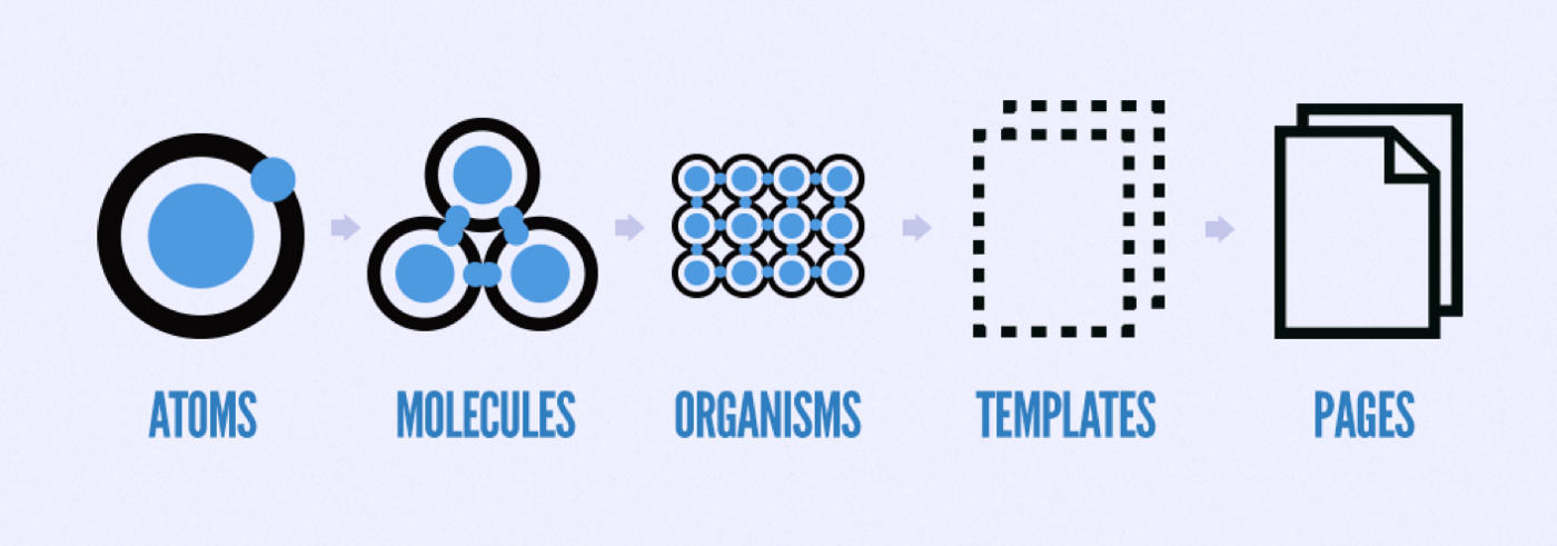
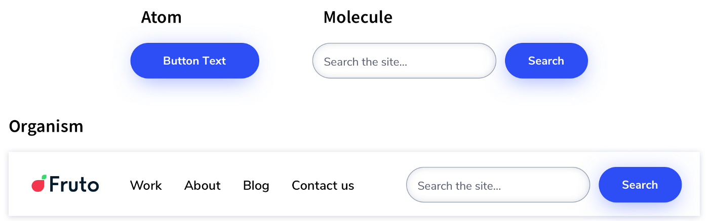
To better understand how a pattern libraries are built it’s worth looking into ‘atomic design’, a term conceived by Brad Frost. Atomic design makes a parallel between chemistry and design. The concept is based around the idea that an interface is composed of very small components (atoms) which then get together to form bigger, slightly more complex ones (molecules) which then combine to create what could be understood as a more distinct section of the interface (organisms). These organisms then combine to create templates which then develop into specific pages.
Pattern library in relation to the style guide
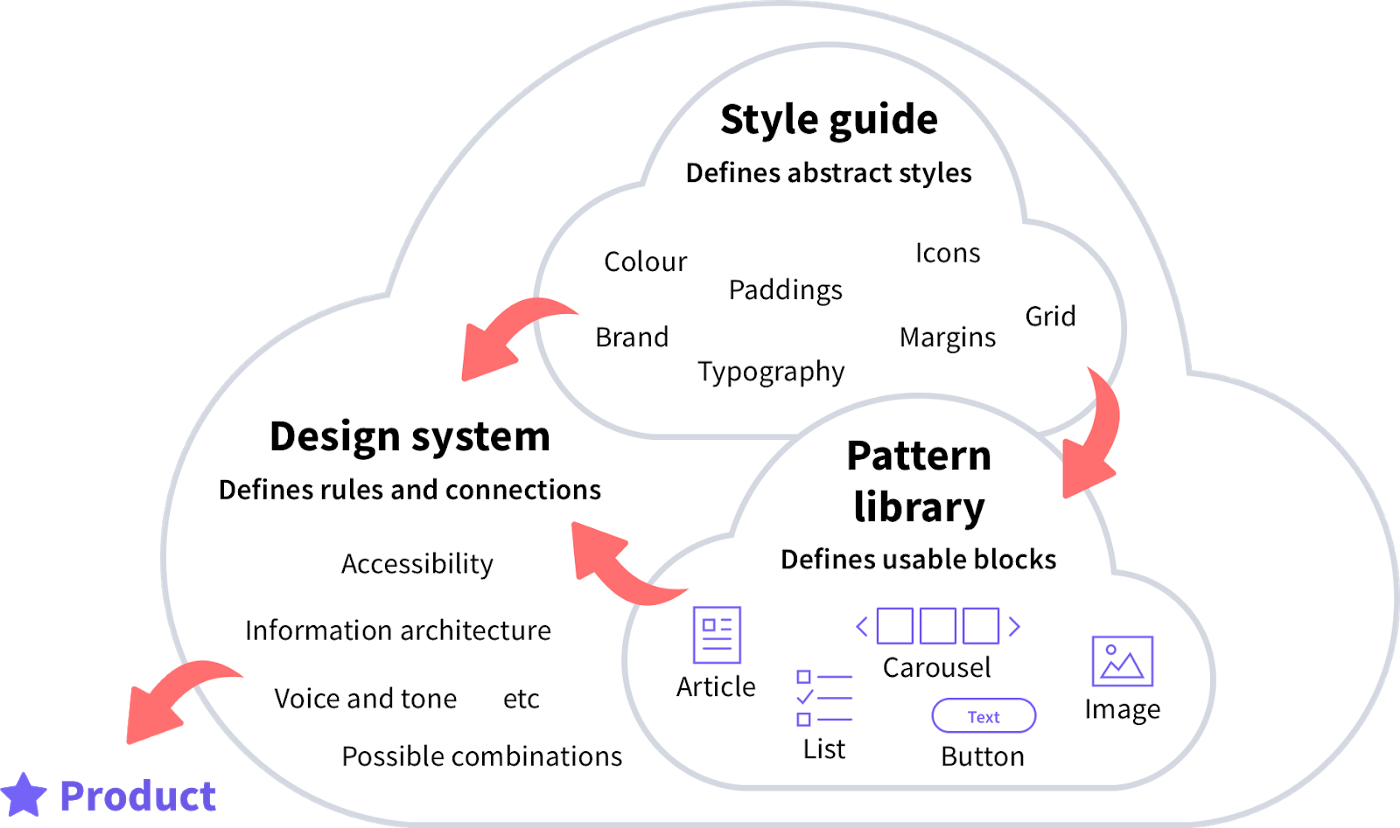
The components in the pattern library are influenced by the style guide and follow its rules of colour, typography, margins, etc. Some of the components we might find in a pattern library are buttons, forms, different types of cards, navigation and miscellaneous items such as carousel or pagination components. The style guide applies the relevant elements of the branding while pattern libraries apply layout and structure. Ultimately, the style guide feeds the components of the pattern library with the appropriate styling.
Design system
As outlined by Jan Toman the design system is where it all comes together. The design system is the bigger picture that is fed by the style guide and the pattern library. Sometimes the style guide and pattern library form that design system and other times the design system takes existing rules and expands on them. Some of these rules might relate to content principles, information architecture, possible combinations of different elements, etc.
Benefits of a design system
The main goal of a design system is to safeguard consistency and aid on the maintenance and potential expansion of the site or app. However, design systems have different benefits for different types of users.
For customers (users of the site or app):
For the users of the website or app it’s all about usability which can be partly achieved by having consistency. In a large website or app there are many voices that chip in to create the final outcome. This can lead to a fragmented interface with many inconsistencies if there is nothing in place to prevent it. A design system can help with this. The consistency they help create can aid the user in various ways:
The learning curve is reduced: Reducing the number of representations for a certain action or element within the interface avoids the user having to learn new representations for each action or task they undertake.
Avoiding confusion: By striving for a consistent user interface that follows standards and conventions we are making the users’ lives easier. Users come into a website with their own set of expectations based on what they have learnt elsewhere. We shouldn’t reinvent the wheel if there is no need as this will challenge their expectations, which could lead to confusion.
A faster experience: By making use of components in the pattern library the user will also have a faster, leaner experience. This is because fewer and more consistent components mean cleaner code, which in turn means better performance.
For the team:
For the team of designers and developers creating the site or app, a design system means being more efficient. This efficiency can be attributed to:
Respecting the brand guidelines (designers): By having a design system, we can ensure all components follow certain rules dictated by the style guide.
Maintaining consistency (designers): Having a design system helps us keep our designs consistent which in turn means leaner and faster design as we don’t have to think of a new design for each new element.
Documentation for future designs (designers): When new designs are needed, with a design system we have somewhere to start.
Less code (developers)
Independence for developers: By having a design system we can avoid potential blockers where the dev team might be waiting for a specific person to provide designs and documentation. All components are available to the whole team.
Documentation for developers: Good documentation will help the dev team understand when and how to use each component.
For the business owner or organisation:
For the organisation a design system can help:
Keep costs down: By reusing components and therefore functionality.
Happier users and potential to attract new ones: By having a design system your product will be more consistent which would translate in better usability, leading to happier users.
Longevity: Having a design system will also mean a longer life span for the website as new elements are easier to create and tweaks are easier to implement.
Disadvantages of having a design system
It is only fair we outline some of the drawbacks that design systems have. I have to say there are more advantages than disadvantages, that is for sure. Nonetheless here are some of the negatives:
Design systems can become rigid if not revised with time.
When a design system has been in place for a while it can lead to a decrease in reflection, exploration and new creative ideas.
It can become very time consuming to maintain a design system. Every change must be accounted for and ultimately this is manual work. Having a design system that is always up to date is especially difficult for products which are constantly being iterated.
One could think that a design system might be restricting. Although this can be true, in my experience those restrictions have pushed me to be more creative and improve the usability of my work. The truth is, often, the statement of wanting to have complete freedom and creativity is an excuse that we put to ourselves to justify our unwillingness to follow a set of rules. It is sometimes easier to design without rules. However, when you put a set of rules in place and stick to them, the overall outcome breathes quality, harmony, and a sense of solidness that a design without restrictions wouldn’t.
I have learnt to not look at rules as restrictions, but understand them as guides. When you don’t have any rules you get to a point where you are frustrated because nothing fits together perfectly, and creating a new element to go with the whole becomes an unnecessary challenge. By creating a system, those restrictions put my design work on a more focused path and give my creativity a reasonable framework to express itself without putting the usability of the product at stake.
Learn the rules like a pro, so you can break them like an artist — Pablo Picasso
Do you need a design system?
This is the first question you should be asking yourself before you jump in to creating a design system for the sake of having one. Not all projects need one. It might be that the project you are working on is a very simple marketing website. In this case a design system might still be beneficial but it could be that it’s faster to fully design all the pages of the site rather than spend your time in creating a complex design system.
It might be that you need a simple design system. Perhaps, a style guide with colour and typography and a couple components in your pattern library will be more than enough to have that useful documentation and guidance.
This brings me to the next section which is making a design system that works for you and your project’s needs.
A design system that works for you
I would like to highlight the importance of creating your own design system. What I mean by this is that not every design system will look or work the same. Different projects and clients have different needs.
For instance a content-heavy website might need more attention on typography use, while a marketing website might need more guidance on use of colour and layout. Your design system should adapt accordingly, giving extra support in the areas that need that extra documentation.
When we talk about the transition between UI and development, it’s worth mentioning the gap in communication that can exist between these two stages of the process. This gap can be frustrating for both designers and developers alike, and can lead to issues with the product further down the line.
Having a design system can be a huge help to bridge this gap. It will help organise things and provide good documentation for the dev team to understand the underlying rules of the design. However, even with the most comprehensive design system and hand-off instructions, it is important to work together from the beginning to the end of the project, and even after the design has been implemented to ensure there is no room for interpretation.
Something that has helped me a lot when building design systems is trying to identify common problems within this gap and producing specific documentation to address them. It’s all about customising your design system. For example, as a designer I often see a lot of mistakes being made regarding spacing (spacing in between text styles, visual elements, padding etc.). To address this I provide extra documentation for this area.

Design system and dev hand-off platforms
There are many dev hand-off platforms out there. As mentioned at the start of this post, they all have unique features and their own limitations. At Fruto we use Zeplin. When using these tools, even though you will encounter some limitations for creating a very complete design system, you can always add some extra documentation in your own format.
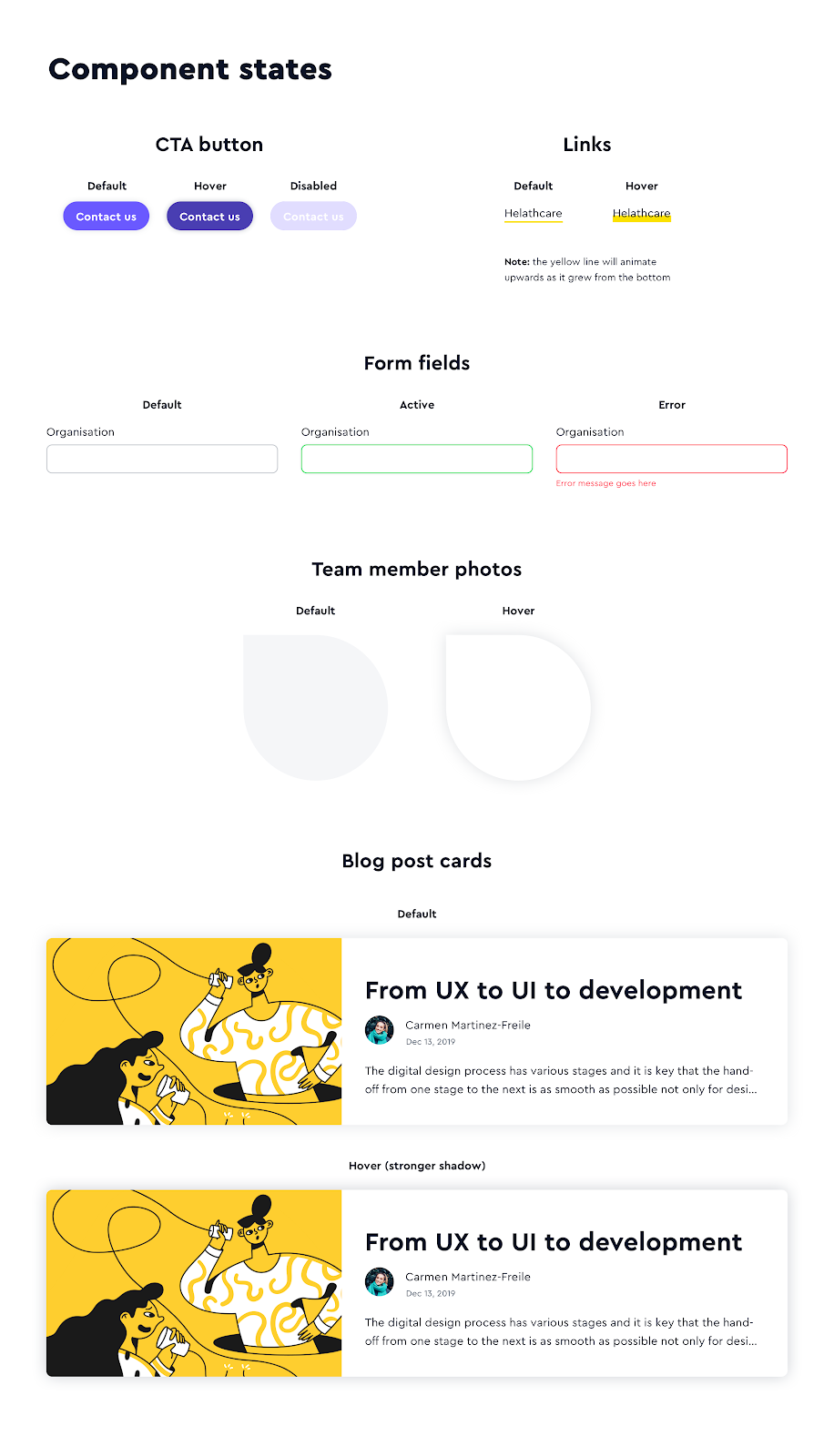
For example Zeplin has a great way of organising components but in my opinion it lacks a space for describing certain rules and elements (ie. you can’t rearrange text styles on the type scale and you cannot add descriptions to go with these). To help with this, what I do is create a separate artboard on Sketch and put in there the set of rules I need to communicate. I will then upload that artboard as another page and make a section for it called ‘Guidance’. These ‘sticker sheet’ artboards can contain anything you need to explain or even function as a summary of what could otherwise be appreciated in the components area (ie. an overview of the states of interactive elements).
Conclusion
The two main elements of a design system are the style guide and the pattern library. These two feed the rest of the rules that are expanded in the design system. There are some clear benefits to creating a design system: the main one being consistency. This increases efficiency for the team, and ultimately, improved usability for the users. Most of this consistency comes from having a set of rules that apply across the website or app through the design system. These restrictions help us focus and polish our work.
It is key that you make your design system work for the project in hand, and that you look for ways to make it as complete and helpful as possible. It is also very important that the whole team understands and agrees on the same terminology within the design system, as well as the terminology of each of its components.