GDS-compliant UI design and User research for the self-service Heat Pump Check Service
Department for Energy, Security and Net Zero (DESNZ)
What they needed
To support this initiative, DESNZ wanted to create a self-service Heat Pump Check Service that the public could use to learn more about the different heat pump options and which were most suitable for their own circumstances, plus providing more information as to how to find an installer.
DESNZ had already identified Energy Systems Catapult (ESC) and System C (previously Oxford Computer Consultants (OCC)) as partners for the project. System C then approached Fruto to provide the UX design expertise for the project - which needed to comply with the Government Design System (GDS) style guide.
What we did for them
System C had already completed some initial stakeholder engagement with a heating industry specialist and gathered the requirements from DESNZ and ESC to better understand the existing alternatives and requirements for the new digital service.
Initial UI design
Using best practice UI design principles to come up with a first round of page designs, ensured:
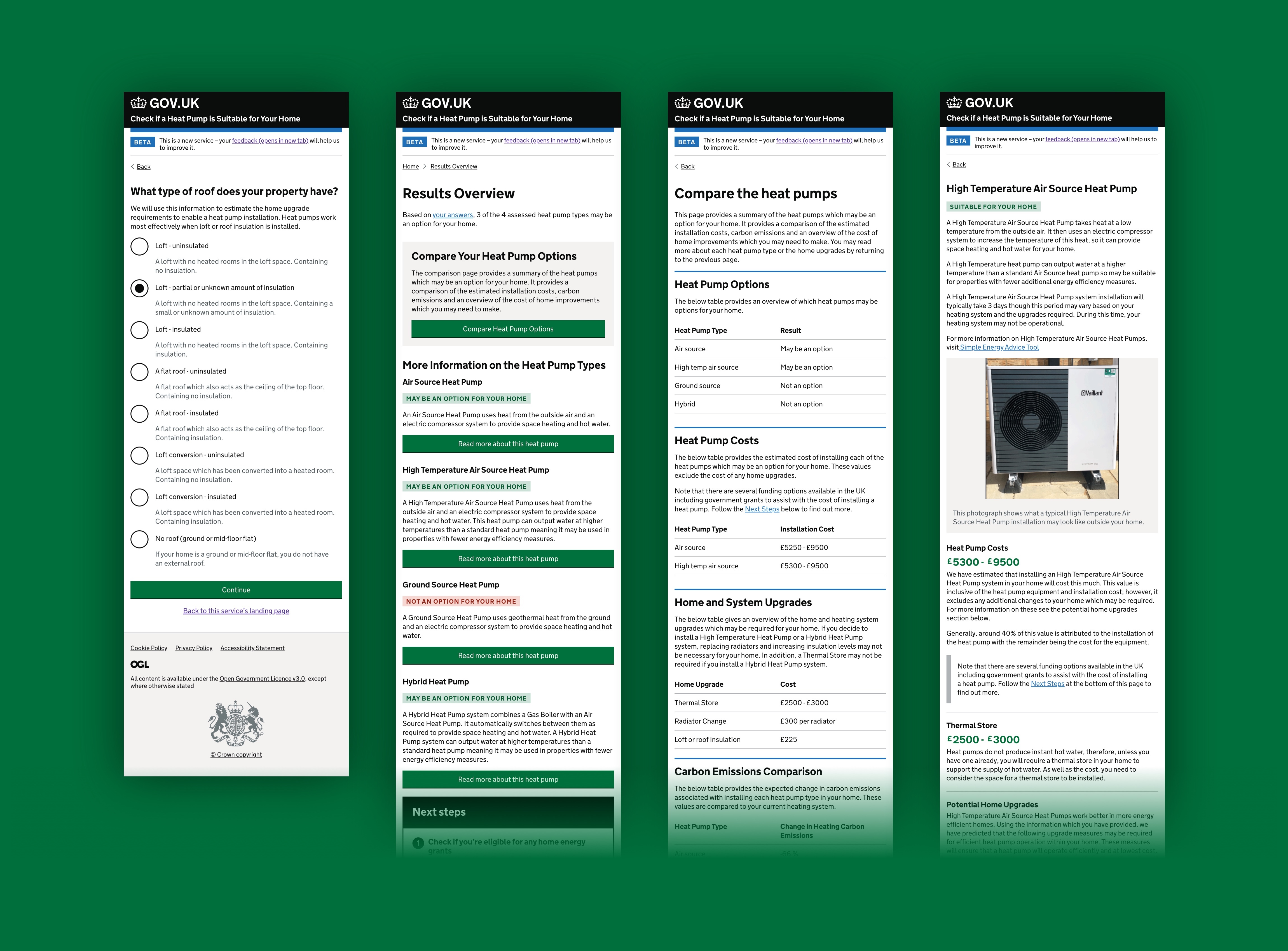
Only 1 question was asked per page
A clear call-to-action was present at the end of each step
Highly-relevant imagery was used to support test-based descriptions
Inclusion of progression components
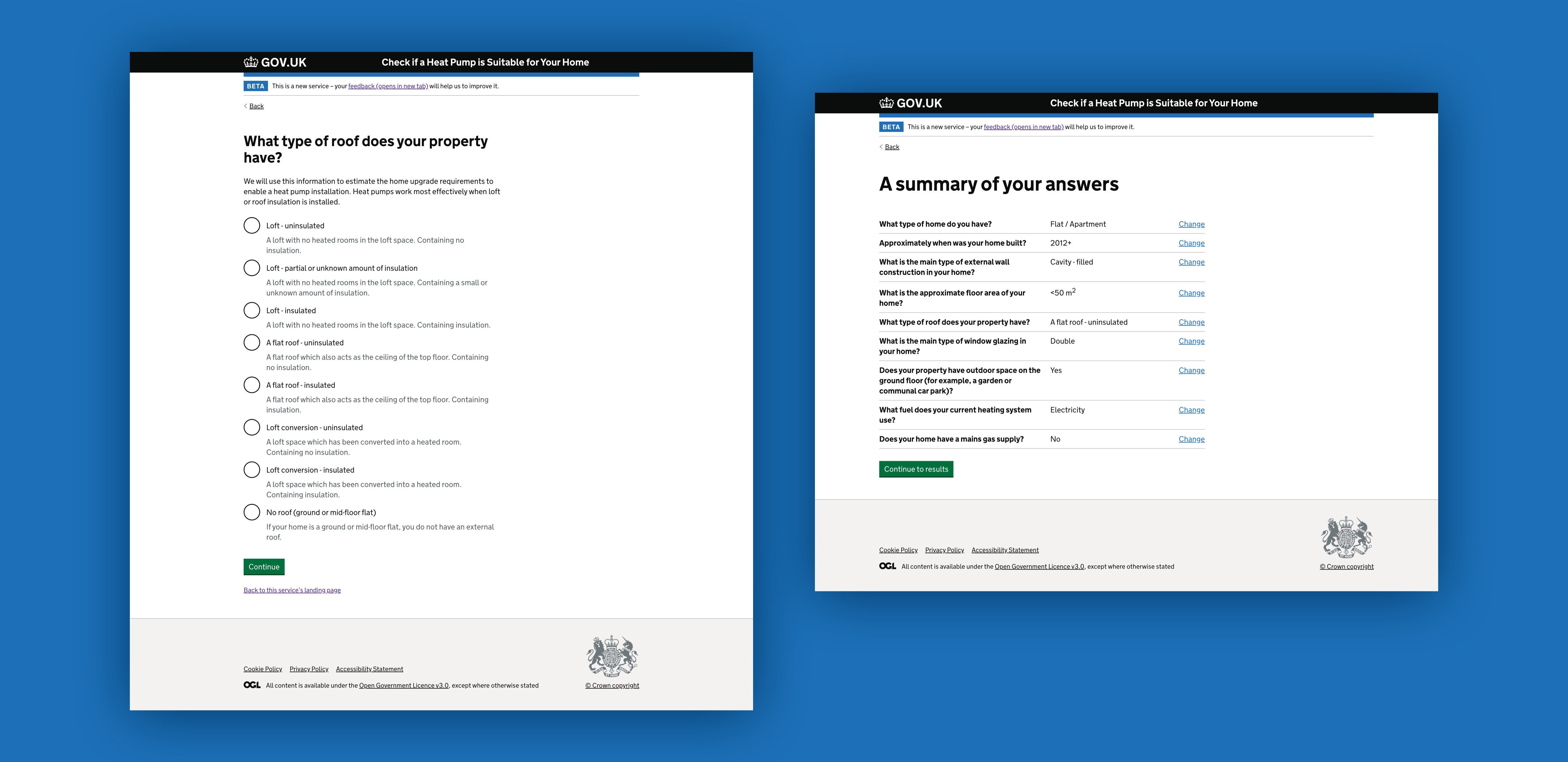
Summary and option to change answers before submitting
Usability tests
We conducted usability tests on the initial designs to help us to understand what questions and expectations users of the service (homeowners) had, as well as friction points in the early design. For example, information not being presented in the right order, or in the right location on a page.
We compiled this research into a report that covered all the major issues, along with our recommended solutions and the proposed journey flow.
For example, our research suggested that this information was presented too late in the user journey, so we came up with an alternative solution that meant we could present this information wherever it would be useful.
Once reviewed by the key stakeholders, this was then used to guide a revised version of the design that was fully in keeping with the Government Design Style (GDS).
Adhering to the Government Digital Services (GDS)
As this project was commissioned by DESNZ, the GOV.UK design system was chosen as the design system to use for this project for two main reasons:
Firstly, GDS is a well-established, robust design system that’s been rigorously researched and tested - this gives the designer confidence that when followed result in a user-friendly, highly-accessible design.
Secondly, it ensured that the design would result in a site that was in keeping with users’ expectations as it would look, feel and behave like any other gov.uk services that they may have used previously.
This second point was reinforced by our user research, with most participants mentioning that having the logo or stamp provided by the government or a trusted authority would help build trust in the service.
Using an existing design system (rather than creating a new one) meant that the UI design needed to follow specific page templates and match comprehensive design rules that cover everything from the use of colour and imagery, to layouts, spacing, and typography.
Because the new tool needed to be in keeping with other digital services from GOV.UK, certain elements which are considered patterns in the GDS (such as “Postcode”), dictated how that part of the user journey needed to look and function.
However, there is some flexibility in the guidelines. For example, during our usability testing it became apparent that some key information was presented too late in the user journey, and would benefit from appearing earlier and in a more obvious, above the fold, location. Unable to find a suitable existing solution using the online tool, we presented our case to the GDS and had our proposed approach for the ‘Next Steps’ table accepted for use.
Page flow and information architecture design
Similarly, although many aspects of the UI design is covered in the style guide, there are some elements of the design that are not - such as page flows and information
architecture. When using a design system, this is often where a large portion of our effort is spent.
Designs were created for all parts of the user journey - including ‘No results’ pages, and manual entry of EPC information. However, as our research suggested that most people using the service would do so on desktop (or other larger screen), mobile screen designs were limited to key pages with behaviour annotations.
Results
This was a multi-layered, highly collaborative project, with lots of stakeholders and partners working together to deliver the project for DESNZ.
Following the GDS style guide resulted in a consistent and trustworthy design that took into consideration not only what information users’ would need, but when they would need it, and in what format.
The new Heat Pump Check Service digital service went live in July 2022.
As a UX design studio, one of our guiding principles is that design should be used to help improve people’s lives, and we were delighted to be part of this project.