When designing educational digital products for school-age children, the right font can make a world of difference. A well-chosen font not only boosts readability but also keeps young learners engaged. Here are some practical tips based on insights from Fruto Studio’s blog on digital design tailored for different age groups.
1. Match handwriting style
Choose fonts that resemble how educators teach children to form and recognise letters. Fonts that mirror early handwriting styles help kids connect printed text with how they learn to write by hand.
2. Prioritize Sans-Serif fonts
Sans-serif fonts, which lack decorative flourishes, are generally easier for children to process and recognise. They tend to align more closely with handwriting and provide a cleaner, simpler look, which makes them ideal for young readers.
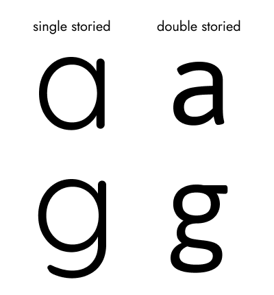
3. Look for single-storied characters
Fonts with “infant” or single-storied characters for letters like “a” and “g” (which are often double-storied in other fonts) make letters easier to recognize and distinguish, helping early readers avoid confusion.

Singled-storied versus double-storied styling for letter ‘a’ and letter ‘g’
4. Distinct mirrored characters
Characters like “p” and “q” or “d” and “b” are often mirror images, which can challenge young readers. Choose fonts that have distinct design elements for these mirrored characters to help children differentiate them more easily.
5. Friendly letter shapes
Look for fonts with “friendly” shapes, particularly rounded counters (the enclosed spaces within letters). Rounder counters improve readability, especially for children who may struggle with fonts that are overly condensed or too wide.
6. Balanced Weight Range
Opt for fonts with balanced weights or a moderate range of weight options. Avoid thin or extra bold fonts, as these can compromise readability. Aim for a font that is neither too heavy nor too light to support easy reading at all ages.
7. Extended ascenders and descenders
Longer ascenders (the parts of letters that extend above, like in “h”) and descenders (parts extending below, like in “g”) help children distinguish between letters. Fonts with these features can reduce letter confusion and enhance comprehension.
8. Suitable font sizes
Choosing the right text size is crucial. Here’s a general guideline:
Body text: Around 20px on digital platforms or 14pt in print.
Titles and headers: Progressively larger than the body text, with H1 being the largest.
Less important text: Smaller than body text, ensure it doesn’t drop below a minimum size for readability.
9. Avoid all-uppercase text
Using all-uppercase text can decrease readability for both children and adults. Stick with sentence case or title case for better readability.
10. Skip decorative fonts
While decorative fonts may look playful, they often sacrifice readability. When in doubt, prioritize fonts with clean, simple shapes and avoid overly quirky or intricate designs.
Choosing the right font is crucial to creating accessible and engaging educational content. By following this checklist, you're sure to foster a more user-friendly learning experience for children.
For further insights into digital design for kids, be sure to check out our complete blog post on the digital design considerations for child vs adult user groups.


