
Children are now more than ever, learning and playing on their screens from a very young age. As UX designers, we have a responsibility to offer children the very best experience we can craft.
If you’re someone that has experience in user interface (UI) design for adults, you might be reading this thinking you have a rough idea of what to expect and how you can adapt to designing for a younger age group(s).
But as I’ve found out through my research and client work over the past two years or so, there’s a whole lot more to designing digital interfaces for younger audiences than might first meet the eye. Designing for children is so much more than making things huge, colourful, and noisy.
Designing for children isn’t as straightforward as it might first seem - in fact, it’s more difficult than designing for adults as not only is it so much more challenging to do any user testing to inform your design decisions, you also need to account for so many different factors depending on the age range(s) you’re designing for.
In this post, I’m going to share the key things I’ve learnt when it comes to interactive and digital interface design for children, and also some of my thoughts on the more questionable aspects of the designs prevalent in so many products on the market today.
Is designing for children really that different from designing for adults?
In a word, Yes!
When it comes to digital interfaces, designing for children is very different to when you’re designing for adults - and it’s not just a case of making things bigger, or “brasher”.
Reduced physical- and mental dexterity
Kids have shorter - often sticky! - fingers, so they are more limited in what they can do and the movements they can make are largely determined by their level of motor skill mastery (with fine motor skills usually not fully developed until age 7), which means that for children under 9, gestures should mainly be swiping, tapping and dragging.
Their reduced motor skills also affect the type of devices they use. Younger children (especially those under 6) prefer touch-based devices such as tablets because they don’t have the motor skills needed to operate a screen in combination with a mouse and keyboard, whilst older kids (especially above the age of 7) can better handle other devices that are not solely touch based.
Children also remember through muscle memory - especially at younger ages when they are unable to read - whereas adults have mental models to help them navigate the tasks they are presented with. So, where adults might get bored, children need to repeat their actions over and over to build up their muscle memory in order to accomplish even the most everyday of tasks.
The cognitive development of children also varies hugely between age groups (an 11 year old can handle much more cognitive load than a 5 year old, for example) and this needs to be reflected in the designs we produce. Not only in terms of the components we choose to use in the interface, but their styling too.
One thing that it’s very important to understand here is that children are not merely small versions of adults. And it’s not that they are “less intelligent” either; it’s that they literally think very differently from us.
Lower levels of concentration
Children also have much lower levels of focus and patience than adults. Coupled with an inability for abstract thinking (until age 11/12), it means they are less capable of understanding the outcomes/consequences of their actions or even the ability to wait to see what those are - especially in younger age groups.
Likewise, although kids have a different (pre-)disposition to digital than do adults (due to interacting with technology much earlier than most of today’s adults did when they were young), quite often, if they aren’t having “fun”, they’ll quit.
Because children do things for entertainment (not to get things done, as is usually the case with us adults), gamification is a huge thing in children’s-product design. In fact, they actually rely on things like point systems, in-app currency, quests, badges, and avatars to keep them interested. Whereas adult games are more narrative-led, children's games are designed to have much simpler goals and rewards.
Fast-paced development
Children develop much faster than us adults; a few years for them means a lot in terms of physical and cognitive development. This is not the case for adults and a digital interface designed for a 25-year old will work just as well for a 65-year old. There might be a few differences, such as worsened eyesight for older user groups but overall, their cognitive and physical abilities are largely the same.
However, because of the speed at which children develop, design considerations for children must be largely based on their age group, each of which should have no more than a 2-3 year gap. For example, in Apple’s AppStore, age groups are categorised as ‘5 and under’, ‘6–8’, ‘9–11’, etc.
Bias for exploratory behaviour
Similarly, as a child’s behaviour is largely exploratory, you need to ensure there are multiple ways to achieve the same thing (action/objective). Unlike when designing adult interfaces where it’s likely there will only be a limited number of ways to achieve a particular ‘goal’.
A good example of an interface that allows children to explore is this game called ‘The Robot Factory’ where children are able to create robots with a huge amount of possibilities. They are able to explore different ways of building a robot whilst personalising their creation.
The game allows for almost any part to be added to these magnets that appear as you bring the part closer to the body of the robot (there are no wrong ways of adding parts), the game then allows children to test their robots in different environments and see if they pass the ‘test’ or not.
A child’s exploratory behaviour also means that they don’t get frustrated the same way we adults do when there are slight interruptions - or “micro-conflicts” - in their journey to the goal.
If you’re looking for a quick reference of the differences between designing for children and adults, I found Nielsen Norman Group’s overview helpful.
So, how can we design better digital interfaces for children?
It’s important to note that when designing for children we shouldn’t abandon all good design practice (and common sense). Many design principles that work for adults also work for children, such as consistency and user control amongst others.
Even though kids are more interested in the “journey” and less bothered by “distractions”, we should be wary of having too many of them and asking children to multi-task. The interface should still prioritise a clear goal and allow children to perform one task at a time.
Although in this post I am focusing mainly on mainly UI recommendations, these are not the only considerations you should take into account when designing for younger user groups and it’s worth noting that interaction design considerations are also key when it comes to these interfaces. We will cover some of these lightly but our main focus will be UI design.
Overall styling of the interface: skeuomorphic, material or flat?
Over the years there have been multiple UI design trends. The first to emerge was skeuomorphic design.
In this particular UI design technique, objects mimic their real life counterparts - for example a recycling bin icon looking like an actual rubbish bin, or folders literally being represented as physical paper folders).
One of the main reasons for this early type of UI styling was that most people weren’t familiar with digital interfaces and it was a common belief that by making user interface components look closer in appearance to real objects, it would help users navigate the interface and reduce the learning curve.
For example, this design approach could be seen in the first iPhone (where touch screens weren’t as big as they are today) as a way to help users transition to a new type of device, environment and interaction.
Flat design was the successor of skeuomorphic UI. In this type of design much of the detailing and realistic styling was lost. Once users had those mental models formed they didn’t need as much detail to understand the different components.
Abandoning such details was also beneficial in terms of the scalability of the design since components became easier to code and render as many of the original skeuomorphic design components needed png textures and effects which slowed down performance.
Material design was released in 2014 by Google and it could be understood as a mix that leans more strongly towards flat design but keeps a certain level of detailing and skeuomorphism.
It’s probably the most common type of styling today although designers have included their own variations to it and most apps don’t use true, unaltered, material design and styling.
Personally, I feel that many children’s interfaces have an over-reliance on skeuomorphism.
In a way, this approach makes sense because children are much more connected to the world around them, and therefore a certain level of skeuomorphism may be beneficial. However, there is evidence that suggests that this type of styling could have negative consequences for children on the Autism spectrum, and it certainly makes for very visually busy (and slower) interfaces, which itself has an impact on the ease of use.
Skeuomorphism undoubtedly has its place in UI design for children. But we need to be careful not to overdo it to avoid causing confusion around what actions are expected of them in the interface - especially when there are other affordances that can be made (through colour, animation, etc) in order to make certain components look interactive.
Use of buttons when designing for children
Buttons are perhaps the most common and basic user interface component. They are also probably the most versatile.
The number of actions that can be triggered by a button is huge. You can trigger a message, a pop-up, a sound, open a new website, link to a different part of the interface, and so much more - and the interactions required to trigger a button are fairly simple.
This makes buttons a key component in children’s interfaces; perhaps even more key than in adult ones, and therefore deserving of a section of their own in this blog post.
Size matters
There is a common misconception that to design children’s interfaces all we have to do is “make things bigger”, especially buttons. Although this is true to a certain degree, there are many other considerations related to buttons that are key in children interface design.
Even though size is not the only important factor it is still key. According to Apple's Human Interface Guidelines the ideal touch target for adults is 44px tall and 44px wide (although the button’s width will depend on the text inside it if there is any). For children it would be 2 x 2 cm, which means buttons that are at least 75 px tall. The older the kids the closer we can get to the touch target for adults.
For reference: 44px relates to approximately 1 x1 cm (it’s important to talk both in pixels and cm as cm are how we measure the ‘real’ world).
Designers can make a conscious choice to go over or below this size depending on the place of the button within the interface’s hierarchy and the age group they are designing for. And as part of sizing we also need to consider “safe space”...
It’s key that we consider space in between buttons so that we can avoid children “tapping” unintentionally, because, as previously mentioned, their motor skills are still in the works and they are less precise with their movements.
Button styling
The most important thing to keep in mind when styling children’s buttons is to avoid making everything look like a button. Instead, reserve button styling to guide children through the interface and don’t overwhelm or confuse them with items that look clickable when they aren’t.
It’s important that a button looks clickable/tappable and this can still be achieved without layering many effects. Gradients can help create a sense of 3D as well as soft shadows and slight animations.
Also, remember to take into account the following:
Stay away from true or complete skeuomorphism, instead designing buttons in a style between that of skeuomorphism and flat design
Hover effects can play an even bigger role than they play in adult interfaces. Children need more feedback as to what’s going on in the interface, so the effects on children’s buttons can be slightly more exaggerated and exciting
Round corners or pill shapes are best. These types of shapes also relate to how children experience the world around them; with no sharp corners!
Colour is a key styling element for buttons. Create hierarchy by reserving the brightest most high contrast colour combinations for important buttons
Visual elements can help make buttons more engaging and help children that are not as comfortable reading - but make sure the icon you incorporate directly relates to the action that button triggers
Consistency is king. Children are forming their first mental models when it comes to digital interfaces and if we decide a ‘continue’ button is green and has an arrow shape, let’s keep it that way across the interface to avoid them having to learn new UI patterns unnecessarily
Allow for repetition
Children also have a predisposition for repetitive behaviour and your buttons need to take this into account.
As adults we have enough patience to click/tap a button and wait to see what happens. This doesn’t hold true for children: they will tap on a button 5 times in a row - if not more! - and the design needs to allow for that.
For example, when my Godson was about 4 (he’s now 6) he often played with an iPad game about animals and the sounds they make. It was generally well designed, but he would happily press the cow button (which made a long ‘Mooo’ sound) a bunch of times in a row before he even listened to the full sound.
This resulted in a constant overlapping ‘Mmmmm’ noise that sounded nothing like a cow and, more importantly, drove everyone else in the vicinity a little crazy! (Thankfully he has a little more patience now - albeit not by much!)
Use of images and icons when designing UI for children
User interface icons are graphical representations of certain functionalities within said interface. They are a core building block in interface design but are especially key in children’s interfaces because they enable them to process concepts without having to read text and provide more clarity on certain concepts when accompanied by text labels.
Opt for literal over abstract
As we have already discussed, children need more literal representations of things in order to understand their meaning. This has a huge impact in icon design for children and it also brings about certain challenges when it comes to more abstract concepts that are not so easily represented.
Some examples of abstract icons are the ‘on/off’ icon, the ‘save’ icon and the ‘play’ icon, amongst others.

Conventional icons
We need to keep icons as literal as possible the younger the age group and take into account the age differences we talked about earlier. One icon will not be the right one for all age groups but we can adapt them.
But, what do we do about concepts that are difficult to represent literally? I hear you ask.
Well, we need to think if representing said concept literally would be more misleading to the child to begin with.
Trying to come up with a literal concept for certain icons would be almost impossible - and it’s better that children learn these abstractions as early as possible. If we go too far to reinvent the wheel for certain concepts we might end up confusing younger age groups due to them having an array of products at their disposal that aren’t all doing the same thing.
As such, certain icons (i.e. on/off, play, home, etc) need to be kept abstract in order to aid cross-product/interface understanding and experience.
Use of colours when designing for children
A key element in any user interface design is colour. In fact, if you ask me, it is, perhaps, the most critical as it’s the first visual cue that we process and the one we process faster, it sets the mood for the whole interface, it reinforces the brand, and it helps to guide users through it by using it as a means to create hierarchy.
Colour plays an even bigger role for children than it does for us adults.
How is colour different for children and adults?
As adults we can categorise and identify objects according to various characteristics of an object, meaning that colour is not the only characteristic we use to define said object. You could show an adult a photo of an orange in black and white and we are likely to use shape and texture to identify said object as an orange, for example.
However, this is not the case for children - especially young ones (aged 5 and below) - as their main means of categorisation and identification of the objects in the world around them is colour.
For them, as colour is the most prevalent characteristic, an orange is “orange” before its roundness becomes a key characteristic by which they (can) use to categorise.
There is another difference when it comes to colour usage between adults and children. Kids (especially young ones) don’t have as many tools to express their emotions and feelings since they are unable to read and write. This means they rely heavily on visual cues to communicate. Colour plays an important role in helping them do this.
What makes a great colour palette for children’s interfaces?
Let’s start with what doesn’t make a good colour palette. The simplest answer is: an endless rainbow-like interface with highly saturated colours.
I see this mistake in plenty of interfaces.
There is a common assumption that because the interface is for children we can use every single colour we come across without any sort of reason or consistency in order to make it look ‘fun’.
This is counterproductive in many ways and makes for an unaesthetic and brash interface that could easily confuse and overwhelm a child (not to mention the problems it can cause in children with sensory processing difficulties, such as those on the autism spectrum).
Yes, it’s true that young children have an inclination towards brighter colours and bright colours are great. But they need to be used purposefully and in a way that helps the child navigate the interface as well as develop a certain aesthetic sensibility.
BTW, if you’ve not already read it, I’ve previously written a short guide on the use of colour in UI design that you may find useful - the same principles apply to children’s design. |
The importance of accessible colour palettes
We also need to remember that the inclination towards very bright, saturated colours is mostly present in very young children, whereas older children can appreciate more complex palettes.
By being more purposeful with our use of colour for children we can help them navigate the interface and provide clearer feedback. If everything is very bright and shouty, how will a child know the difference between the normal state of a certain element and an error or success state?, for instance.
Fiete Math my Godson plays often which I think does a great job at reserving very bright colours for feedback messages. The error message is also accompanied by an ‘error sound’ as well as the face and body language of the character.
Another key consideration needed to create a successful colour palette for children is accessibility.
We pay so much attention to making products that are inclusive and accessible to all adults, but what about kids?
There are many children with the same disabilities we consider when designing for adults, and yet you rarely see accessibility playing as big of a role when it comes to user interface design for kids. As designers, we should always design with accessibility in mind so that our designs can be used by any child, regardless of any physical, mental or cognitive disability or impairment.
When talking about an “accessible colour palette” the main element to pay attention to is contrast - and in particular, background-to-text contrast. I also recommend you pay extra attention to accessibility in key elements of the interface such as buttons and forms.
There are some really useful guidelines in place, such as the Web Content Accessibility Guidelines, that will help you create an accessible product - so there is really no excuse for designing interfaces that fall short in this area.
Use of typography when designing for children
Another common misconception I’ve noticed is that more quirky/fun/intricate fonts are better for children or that they make an interface look more “fun and appealing”.
This is not the case, and by choosing the wrong typeface, you might in fact be making your interface very confusing for your young audience.
Typography in children’s interfaces should be mostly purposeful - even more so than on adult’s interfaces. Mainly because for younger kids (aged 7 and below) your interface may well be one of their first (or early) encounters with text, and therefore reading.
Young children need more consistency when it comes to typography.
For example, one could put any style of the letter ‘e’ in front of an adult and most likely we would still be able to identify that what we have in front of us is, in fact, the letter ‘e’ styled in different ways.
This same principle doesn’t stand true for children, however.
When children begin to learn how to read, they are taught to look at letters individually and associate certain sounds to certain shapes.
If we choose a very quirky or intricate font, we would be showing them something that is very far from the letterforms they are being taught in school and we might end up creating frustration. This might lead to the child abandoning the interface altogether.
So what characteristics should a font have in order for it to be appropriate for children’s use?
Well, there are a number of considerations we might want to take…
Choose a font that is somewhat similar to how educators teach children how to process letters and write them.
Sans serif fonts have a stronger track record with children as they don’t have decorative tapers or lines - which means they are simpler and therefore easier for children to recognise. They are also closer to the way we all write.
Fonts that have infant characters (also called ‘single-storied’ characters) can also help children, and apply to certain letters such as ‘a’ and ‘g’.
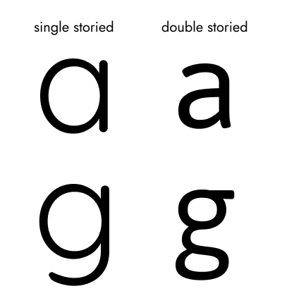
Singled-storied versus double-storied styling for letter ‘a’ and letter ‘g’
We might also want to look at fonts that introduce some kind of variation in similar characters.
For example there are certain characters that are pretty much the same but mirrored. This is the case of the letter ‘p’ and the letter ‘q’ or the letter ‘d’ and the letter ‘b’.

Mirrored characters with distinct features
These variations generally don’t have a negative impact on older, more confident readers so choosing a font with these features could be a win-win situation for all age groups.
When picking a font for children we also want to look for “friendly” letter form shapes that have rounder counters (a counter is the area of a letter that is entirely or partially enclosed by a letter form or a symbol, the counter-space/the hole of).
For this reason fonts that are very condensed or conversely, very wide, don’t perform as well with children.
It’s also recommended that you pick a font that is balanced in weight or that at least has a good range of weights to pick from. Stay away from Thin or Extra bold weights though as these very extreme weights can decrease readability.
Longer ascenders and descenders in a font also help children to distinguish between letters.
When adults read it might surprise you to know that we pretty much don’t! Or at least not as much as we think.
We read in large part, visually. We actually look at the shape of a word (especially the first and last letter) and fill in the gaps. These mental models about letterform shapes are in development during childhood so fonts that slightly exaggerate their distinctive features can help.
Size is also very important. The size of text will also depend on the age group, with younger children needing larger fonts.
As a rule of thumb:
a sensible size for body text would be anything around 20px, or 14pt in print
titles would progressively go up from that baseline, with H1 being the largest
less important text would progressively get smaller (without dropping below a certain size)
You should also avoid using all uppercase as it’s less readable (this holds true for both adults and children).
Finally, when it comes to styling, it’s key that we help children understand what pieces of text they can interact with (e.g. tap, click, etc), so interactive text should be much more stylised than non-interactive text.
Overall, when picking a font for children’s interfaces stay away from any decorative quirky typeface and prioritise readability above everything else.
Some typefaces that meet many of the considerations above are Gill Sans Infant, Heinemann Roman, and Andika (a free Google font) amongst others. |
Supporting children in their (digital) transition into adulthood
Before I wrap up, there’s something else I wanted to mention: ethics!
The longer I’ve been designing for children, the more I’ve started questioning the ethics of certain design choices that I’ve seen in so many digital products aimed at children. So before summarising, I wanted to mention a few things here that I’ll go into more detail on in a future post as I think they deserve more attention.
General safety
Safety measures are especially important when it comes to children’s interface design. These measures can be in several areas such as device usage, content consumption, and the marketing of products. We should ensure that children have a safe digital environment to learn and have fun.
Dark patterns
The use of dark patterns is an area that I think really needs to be controlled for - especially when it comes to ensuring that kids can’t purchase things (in-app) by clicking on buttons that look like they are part of the game they are playing/video they are watching. We should not be tricking children.
Gender bias
As adults we simply shouldn’t be putting children in boxes and dictating what they should and should not like just because products become easier to market. Gender bias is a huge issue in children’s digital products.
When it comes to digital interface design for children, there is no “one-size-fits-all”
As you’ll now hopefully see, understanding the age group(s) you’re designing for is super important. In no other area of (digital) user interface design is understanding the nuances between different groups so important.
To recap, some of the main differences and considerations that you’ll need to account for when designing for younger user groups include:
Physical limitations and remembering/learning through muscle memory
Cognitive limitations including a much lower understanding of written language and incapacity for abstract thinking
Having a primary goal of “entertainment” and engaging in exploratory behaviour where the journey to the goal is as big a motivation as achieving the goal is for adults
And although you can apply some of the basic principles that you’d apply to designing for older user groups, there are 4 particular areas that you need to consider when designing for each age group:
Buttons: Size matters but styling is key. Consider their placement and avoid the use of dark patterns.
Icons: make icons as true to real-life as possible when appropriate, especially for the youngest kids but don’t over think well established conventions for more abstract concepts.
Colour: use brighter colours for younger children but be purposeful and don’t mistake children’s lack of cognitive development for a lack of sophistication.’
Typography: legibility is key - this is not a time for fancy font choices!
If you’re ready to dive into the ethical considerations in more detail, check back soon for my next post.
In the meantime, if you’re interested in continuing the conversation and/or need help with designing your next child-friendly digital product, get in touch - we’d love to hear from you.