UI design plays a fundamental role in the overall quality of your end product. The UI not only supports the UX work, it enriches it and expands on it by bringing together concepts from interaction design, visual design, and information architecture. The results of a good UX and UI rely on knowing your users. Getting to know their goals, needs, preferences and tendencies. However, there are a couple of UI design principles that might help you improve the UI of your website or app.
Reduce visual clutter: This is one of the biggest issues in some interfaces. The whole point of removing clutter is to reduce the noise in the page so the most relevant pieces of information can surface and get the appropriate attention. Removing visual clutter will help your users complete their journey through your interface efficiently.
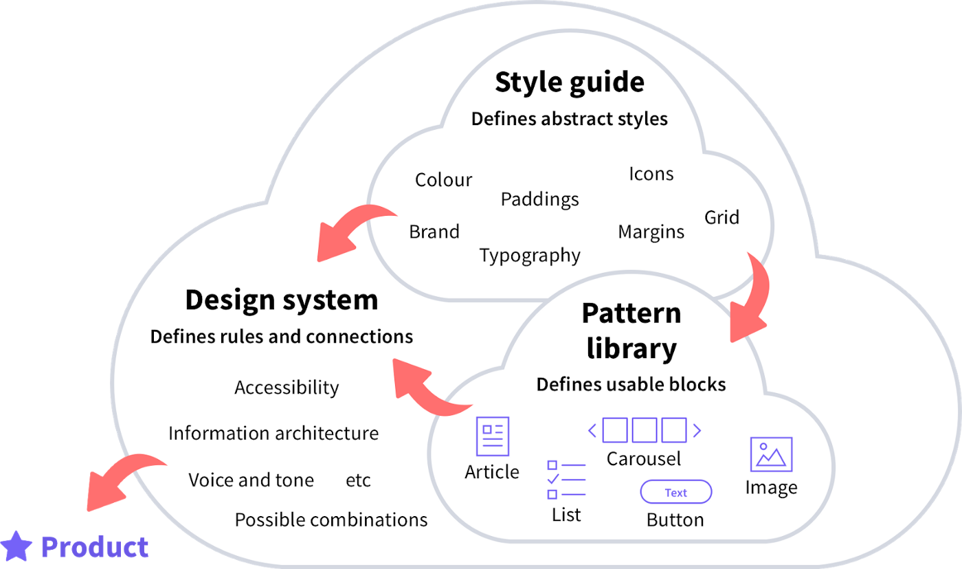
Consistency: Keeping consistency across an interface is not an easy task, there are many elements with countless variations. Designing interfaces has shifted from a very manual process (creating individual pages) to a more systematic one by designing with components. Components are the pieces of the puzzle that will come together to form the interface. This is when a design system comes in. A design system is mainly formed by a pattern library (where your components live) and a style guide. By having all your components and styles in one place you will be one step closer to having a consistent website or app.
White space has an impact: White space is simply unused space. It’s often tempting to make every piece of information available to the user. However, we must consider the cognitive load we are putting our users through. White space helps the user focus on one thing at a time without getting frustrated or feeling overwhelmed.
Use colour strategically: We often think of colour as a decorative element but it’s more than that. Colour not only helps to bring the brand into the interface, but it also helps us structure it and, if used strategically, it can give the user a clear path to complete their journey on the app or website. A clear example would be having a ‘call to action’ that stands out. CTA buttons will guide your user through your interface, indicating what action to take next. Clear CTA buttons will help users navigate your interface.
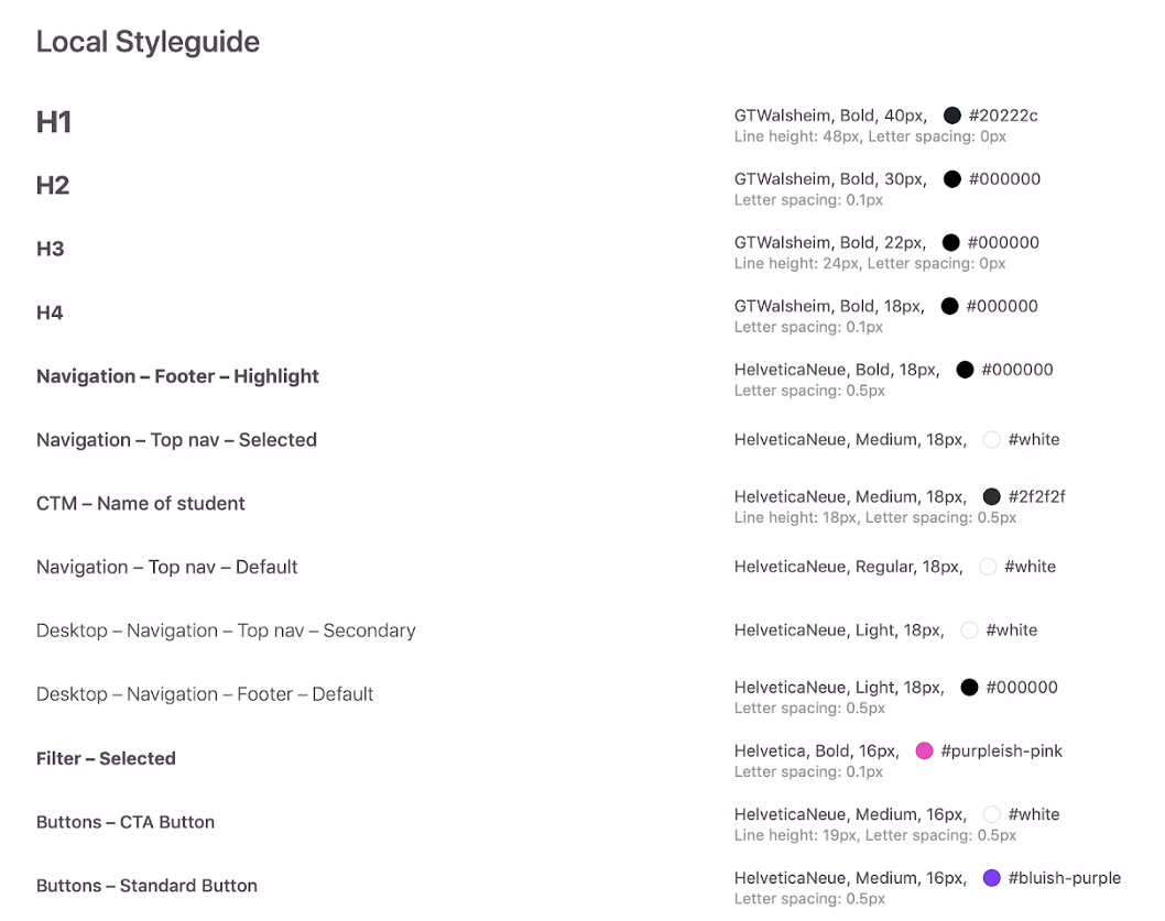
Typography creates hierarchy: Typography plays a key role on how your users consume your content. By having a clear hierarchy you will be ‘guiding’ the user’s eye. On your design system’s type scale you will see all the text styles that are being used across the interface in order of prominence on the page. A type scale will also help you achieve consistency.
Communication: Make sure your UI is communicating users what they need to know at each moment in time. This means visually reflecting what the user is doing in that moment. (i.e if a user makes a mistake on a field the UI should reflect so)
Taking the UI into careful consideration will get you one step closer to a user centred product. A successful UI will support your users’ needs, it will perfect functionality across your website or app and it will help create a strong connection between your users and your product.