What they needed
When users search for journal articles in scholarly platforms (such as Google Scholar), the results don’t always show which articles the user has access to. It might be several clicks before a user discovers they can’t get past a paywall to view the content.
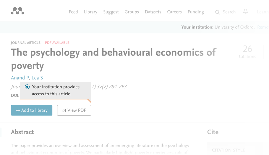
GetFTR aims to give researchers a simple way to see what articles they have access to on a search results page, by checking the article against the access rights of their research institution.
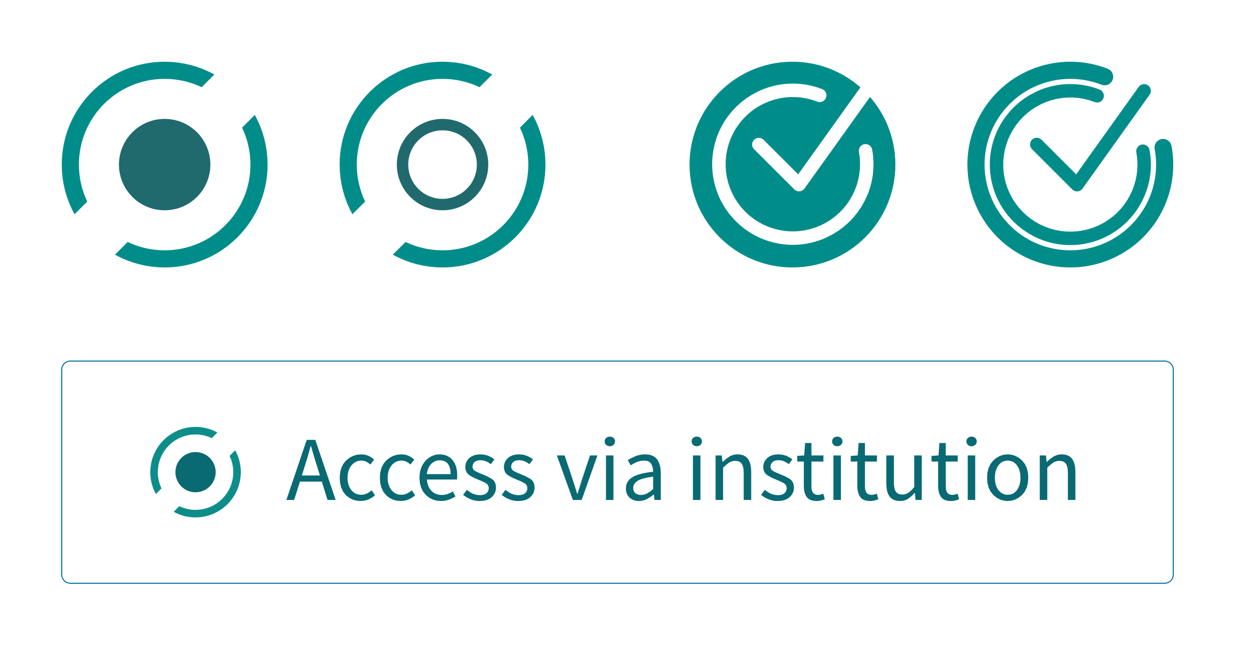
When they came to us, the UX team at Taylor & Francis had been testing some icons to indicate levels of access. For the next round of research, they needed some new unique designs for the access indicators in response to the findings from the previous research.
The brief was for a selection of icons and buttons for a live pilot study that would improve the users’ understanding of their article access permissions. The designs needed to align with the GetFTR brand and work across a number of scholarly search platforms.
What we did for them
We designed four unique icons that could be used as stand-alone indicators, or within a button. The digital assets were packaged with usage guidelines to support implementation across different integrator platforms.
Existing research review
Design concepts and review stage
Final icon & button assets
Usage guidelines
The assets had to indicate two levels of access: The full version of the article, and the best alternative version.


Results
The pilot GetFTR service started in April 2020, with six scholarly research platforms (Dimensions, Figshare, Symplectic, ReadCube Papers, Researcher, and Mendeley) testing the GetFTR indicator API on articles from 5 major publishers (American Chemical Society, Elsevier, Springer Nature, Taylor & Francis, and Wiley).
We are really pleased with the work from Fruto on the project. High expectations exceeded I guess is the best way of putting it.


