What they needed
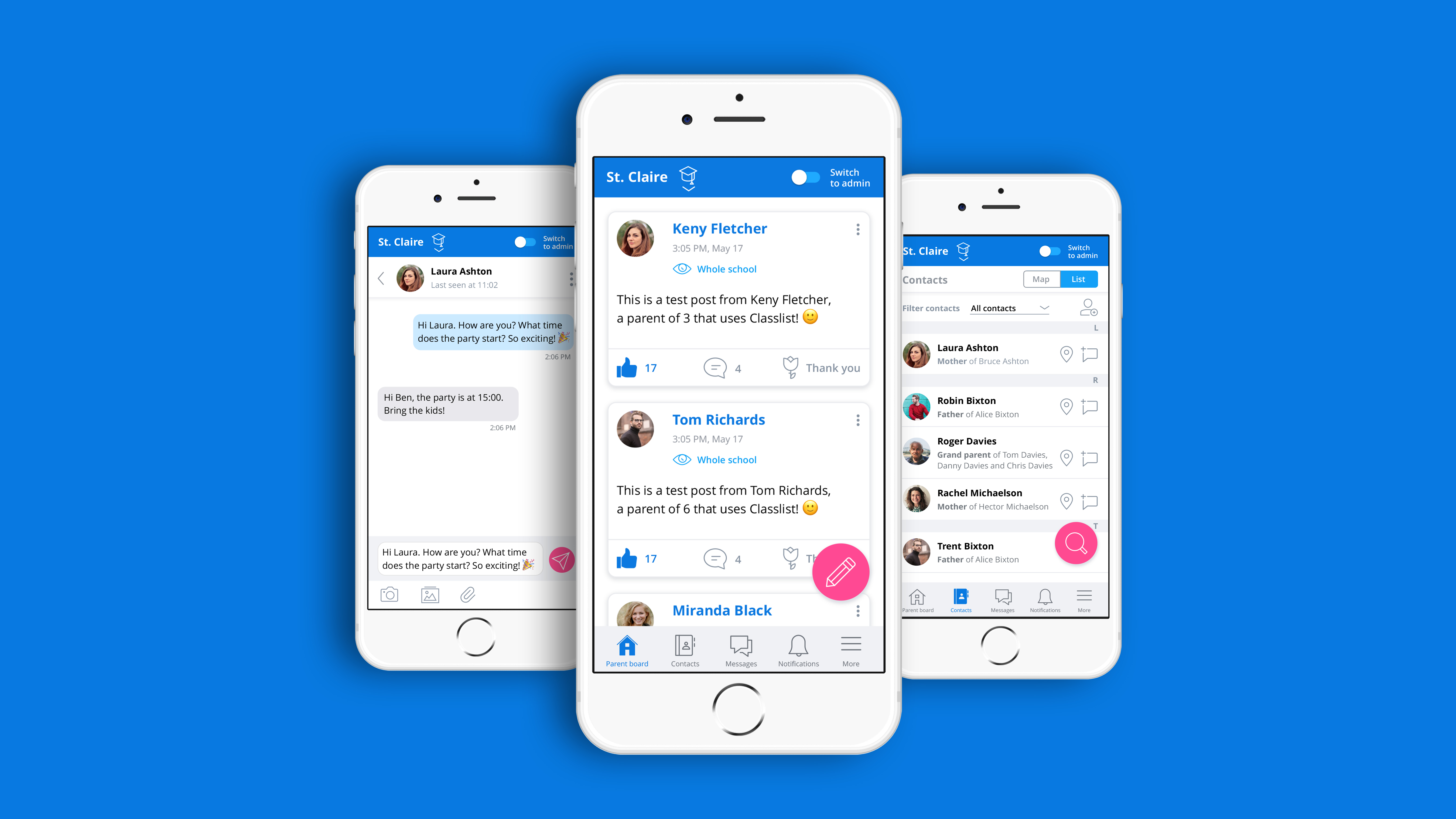
Improve user experience and customer satisfaction: Classlist had run a user survey with their users and found that some users were frustrated with the experience and usability of the app.
Guidance on priorities for the UX issues: Even though they were aware of some of the usability issues, they needed guidance on prioritising the UX issues.
What we did for them
Lean User Research: In order to understand the UX issues, we first talked to their users. We ran a series of one-to-one user interviews and usability testing sessions with 10 users to understand the users’ needs and goals, identify the key pain points with the app and what could be improved. This gave us an in-depth insight into why some of them were feeling frustrated and also what they liked about the app.
UX Review: We did a heuristic evaluation, reviewed the usability of the app page-by-page.
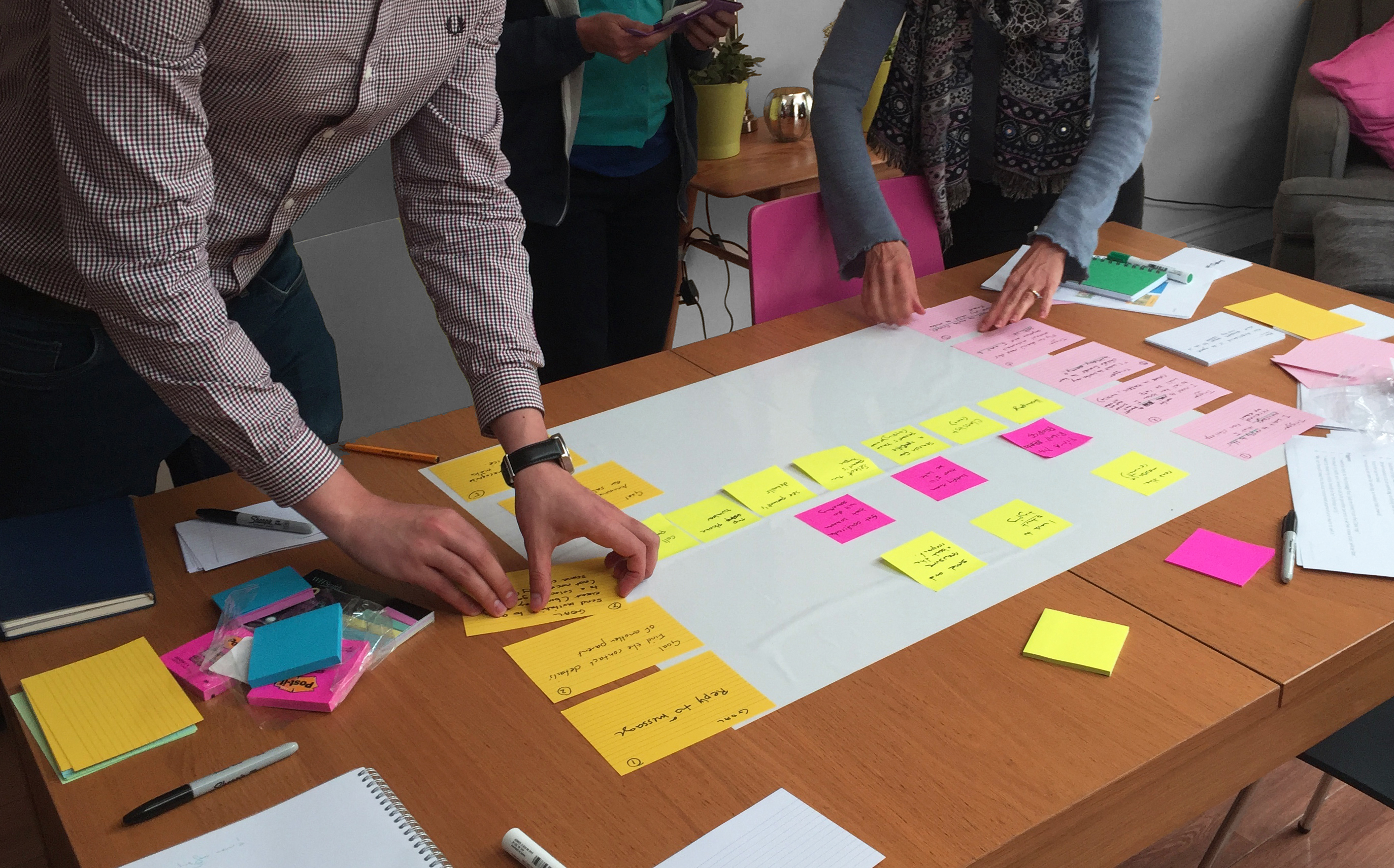
User Journey workshop: We ran workshops with the product team (CEO, CMO, CTO, Designer and Product Owner). We mapped out the user journeys, identified the key pain points of the journeys and possible solutions. We discovered how users’ mental models differed from the page flow in the app and that was the main cause of frustration.
Regular UX and UI design iterations.

Results
Classlist’s product team implemented recommendations and have since then improved the user experience of the app.
The product team learned a UX tool (User Journey Mapping) that they now use as part of their design process to ensure that the page flow matches users’ mental models.
Getting Fruto involved helped us define what we needed to prioritise to improve the user experience of our app. The insights we got from their work were eye-opening. We also learned some great UX techniques that we now use in-house.


