What they needed
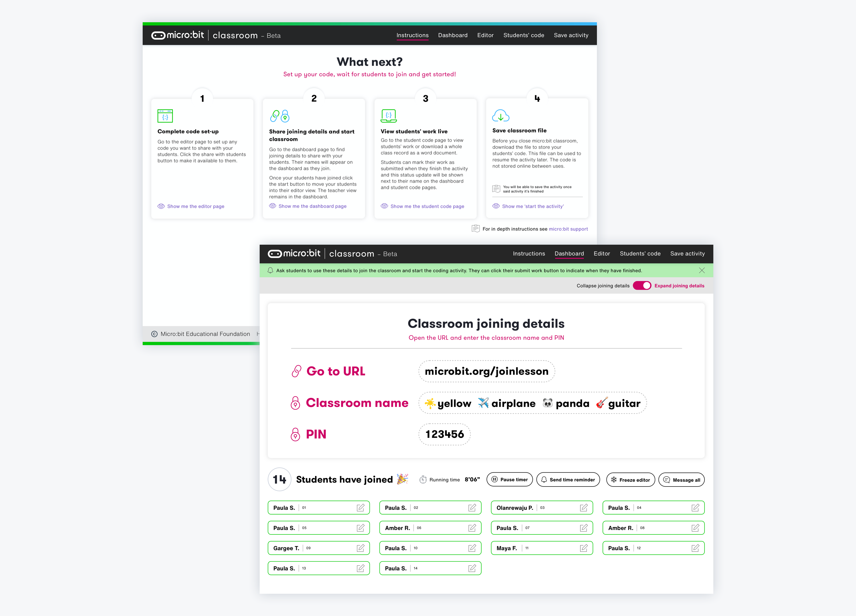
The Micro:bit Educational Foundation needed to improve the UX and usability of their website. They also needed an in-class tool to help teachers teach with micro:bit (The Class Management tool).
The aim of the project was to:
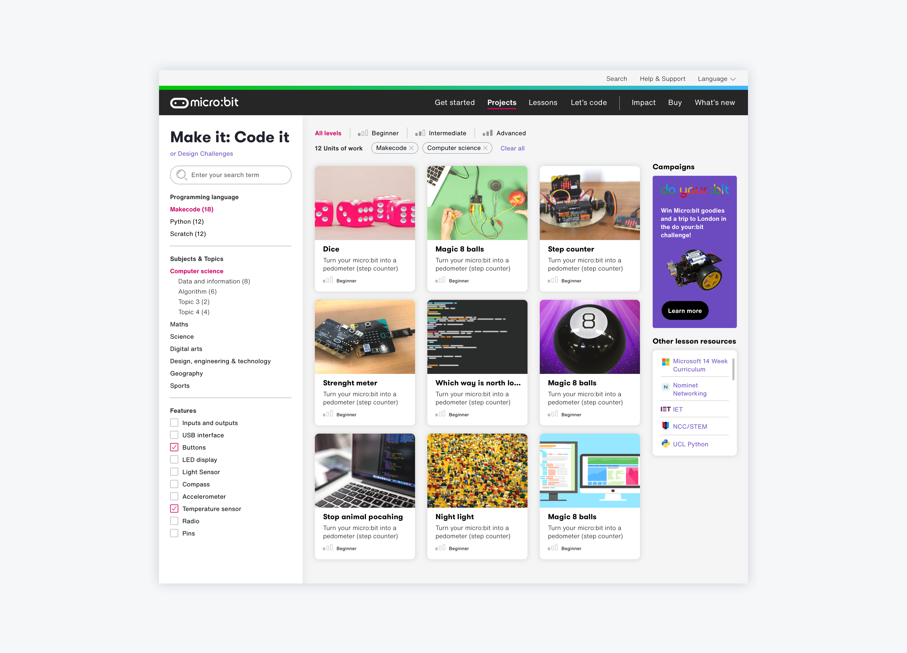
Provide teachers with an interface that improves the practicalities of teaching with the BBC micro:bit as well as improve the findability of resources.
Motivate teachers that might not be very comfortable with teaching technology to do so.
Inspire all children to participate in the digital world, with particular focus on girls and those from disadvantaged groups
What we did for them
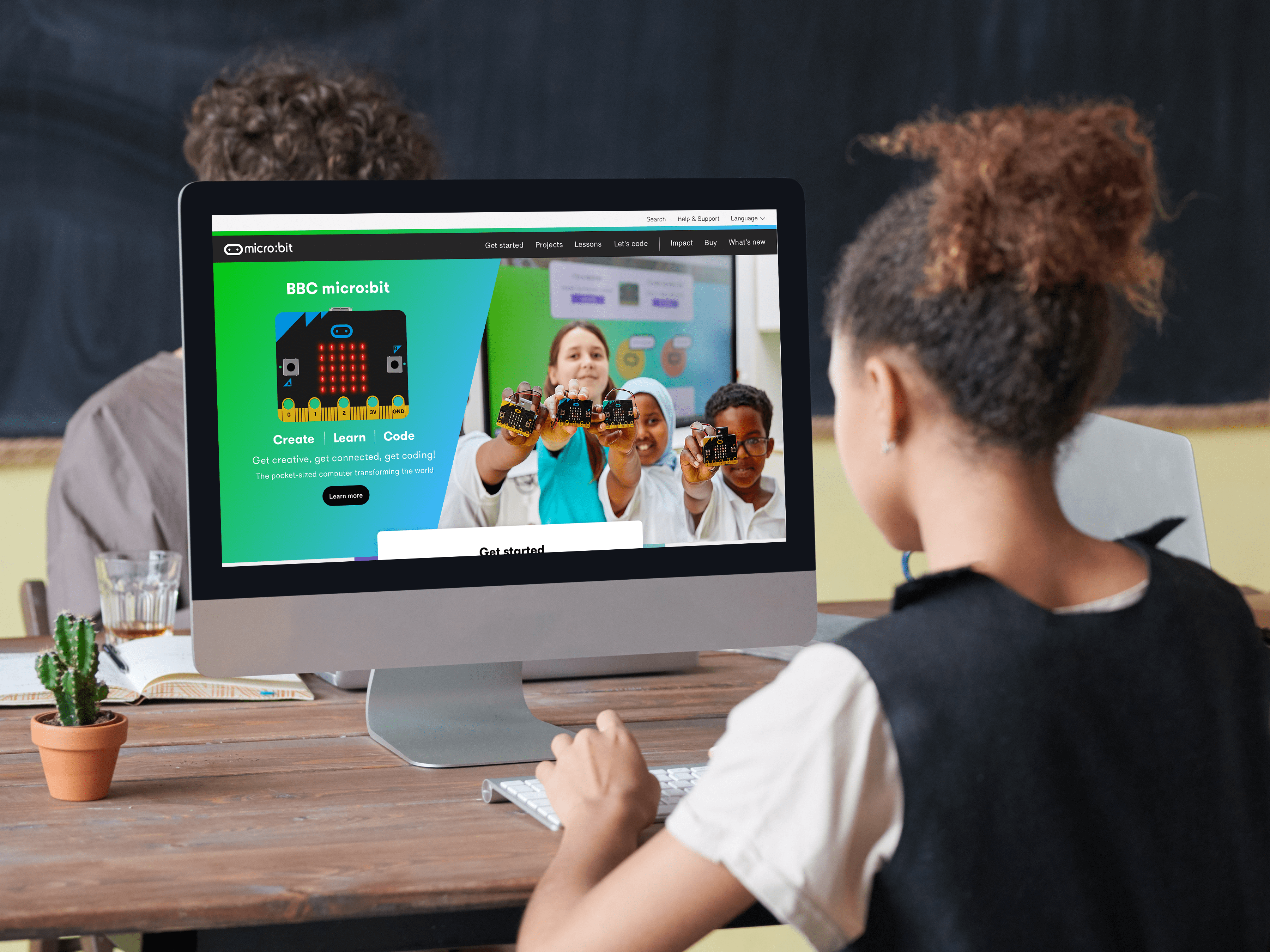
We worked with The Micro:bit Educational Foundation on the UX and UI of their website.
Tree testing: We carried out a research study to test the navigation structure and labelling of the website. An important part of the Tree testing was to ensure the grouping and labelling of content and functionality matched the perception and expectation of the user. We wanted to learn how users group content and to avoid pitfalls such as using internal terminology rather than terms that are common to the user. Participants were given set scenarios and asked where they would expect to find that piece of content or function. Responses and statistics were gathered online and presented in a report along with analysis and recommendations for next steps.
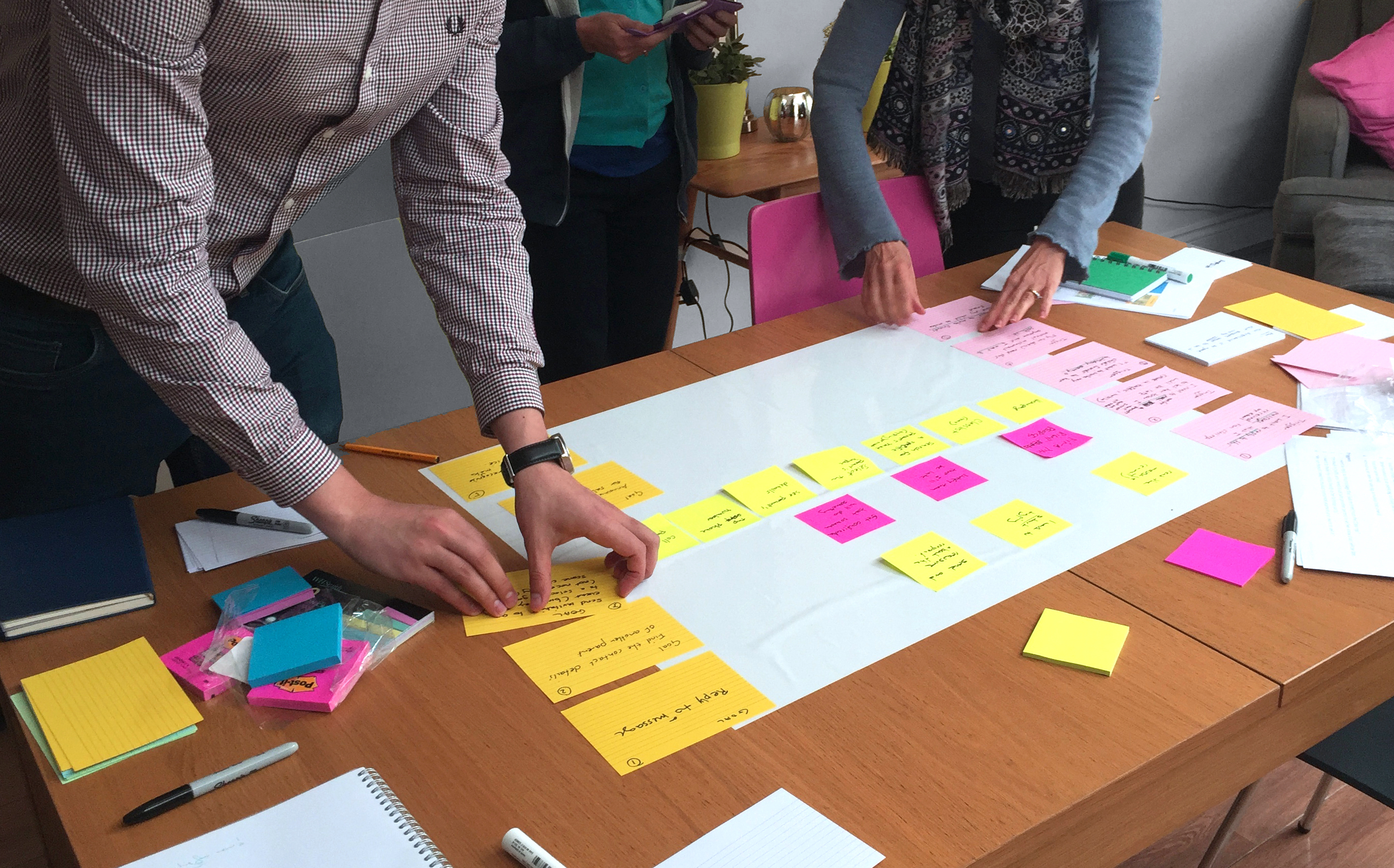
User research: We carried out one-to-one interviews with 12 users (5 educators and 7 students) and 3 stakeholders. The research aimed to uncover issues and insights around the online experience of evaluating, onboarding and finding resources on the micro:bit website.
Wireframing and prototyping: In this stage we applied what we learnt on the user research stage and applied it to the creation of wireframes of the website.. The wireframes were organised into templates for an efficient workflow and consistency in UX. We then created a clickable prototype to test the flow.
UI redesign: The main goal of the UI was to provide optimal usability and accessibility across the website and make the overall look and feel more modern. The designs were based on the micro:bit existing branding. From the very start we created a UI design system of reusable and modular components.
UI Design system: Having a design system ensures consistency which translates in efficiency for the team, and ultimately, improved usability for the users. We created a UI pattern library which was organised in the appropriate sections (buttons, navigation, icons, etc) and a style guide of colours and typography. Along with the pattern library and style guide we expanded on certain rules of spacing and text hierarchy by putting together relevant documentation. The pattern library, style guide and relevant guidance came together to create the design system.
Results
Micro:bit now has an inspiring and intuitive website that helps teachers find resources easily and efficiently. The new design helps teachers that might be less comfortable with teaching technology in schools do so. The work done on the Class Management tool will also help teachers smoothly run coding classes using the BBC micro:bit. The UI design helped achieve a more modern and bold look and feel for the website and the Class Management tool while supporting and enriching the UX.
Fruto were flexible and very responsive to our needs in completely redeveloping our website and creating a new online teaching tool. They took us from initial testing user journeys right through to producing finished designs we could implement in our CMS.
