
What is accessibility and why does it matter?
Accessibility can be defined as the quality of being able to be used by everyone, including users with a disability. In today's modern world where the use of technology is becoming a norm, incorporating accessibility requirements into your design work is crucial in ensuring that as many users as possible can interact easily with the interface.
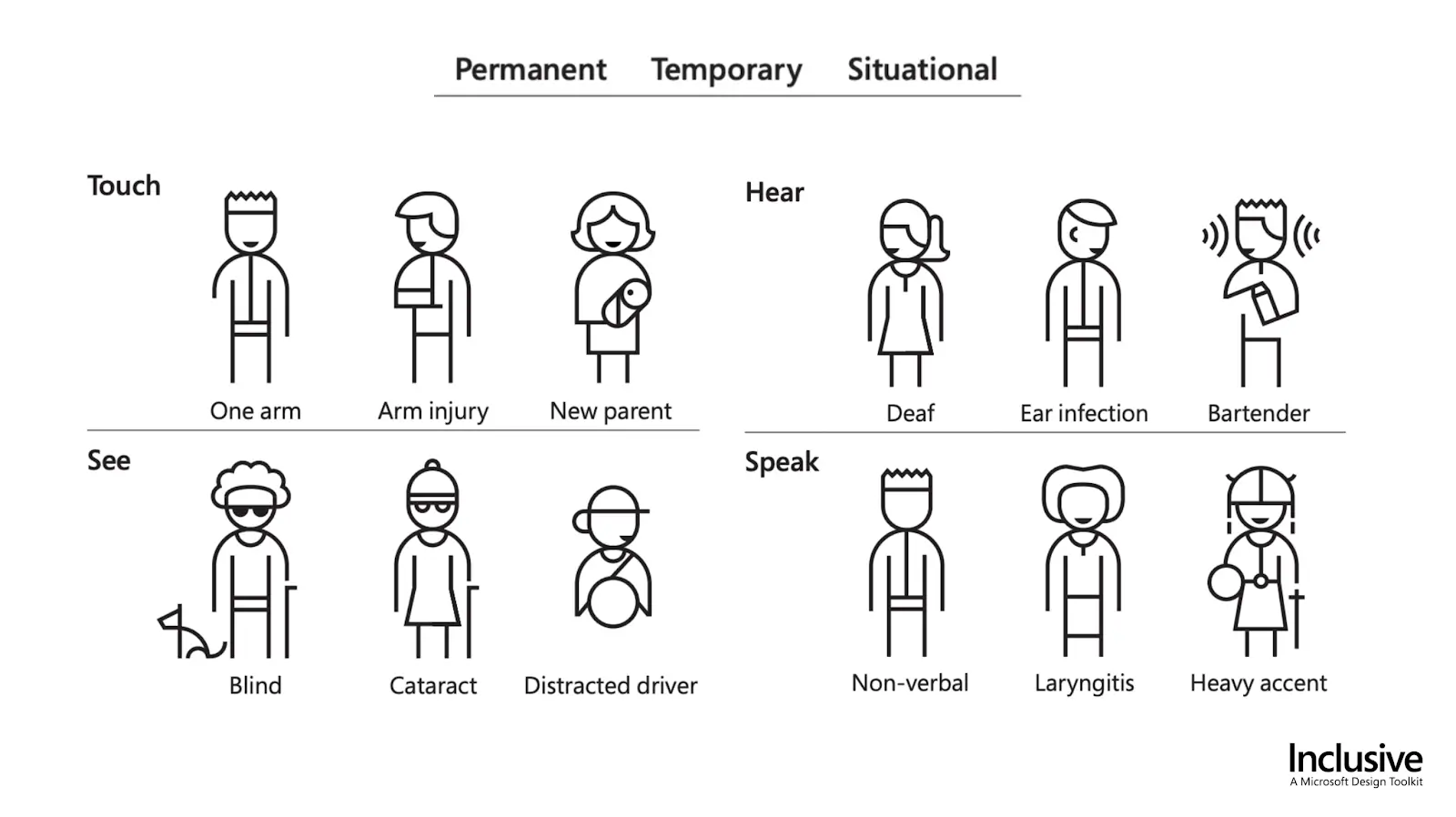
It is also important to note that accessibility can present itself in several formats. Whilst the majority of accessibility requirements are catered to users with a permanent circumstance, there are many occasions in which accessibility may be more situational. For example, users with a broken arm may temporarily struggle to use an interface that they previously would not have. Microsoft showcases this within their design toolkit which offers activities to allow us to better understand users with accessibility requirements.
Microsoft Inclusive Design Toolkit
As designers, it is our responsibility to society to ensure that we design for the widest range of users possible. By creating high-quality interfaces that everyone can use, regardless of their circumstances, we can create meaningful experiences for all users.
The WCAG (Web Content Accessibility Guidelines)
The accessibility of an interface can be evaluated through the use of Web Content Accessibility Guidelines 2.1 (WCAG 2), a guide based on four distinct design principles that focus on considering the different ways in which users may interact with interfaces. These principles are that the design should be perceivable, operable, understandable and robust, for example, using a screen magnification to enlarge parts of a screen.
There are three levels to the WCAG, each characterised by different criteria to determine what level of accessibility your design meets and are explained in more detail below.
Level A (Basic accessibility)
The criteria of the lowest level, Level A, are generally met without many alterations to the structure of the design. Level A implies that the majority of users would be able to use and understand your design effectively.
Level AA (Strong accessibility)
Whilst Level A conformance is a great starting point, Level AA goes one step further by ensuring that your content is practically accessible for most people, regardless of their abilities. Many accessibility laws require Level AA conformance for this reason. At this level, there are more criteria introduced to the interface such as colour contrast, text size, content flow, readability, recognition and descriptive copy. As a company dedicated to helping all users, Fruto strives to hit Level AA accessibility throughout all our work.
Level AAA (Excellent accessibility)
The highest level of accessibility that can be attained is Level AAA, where the rigidity of the criteria means that it is considered optimally accessible. This level may not be applicable or realistic for all interfaces, depending on their content and user demographic, but can help to guide the design of the interfaces regardless.
Typically the level required for most interfaces is Level AA due to its practicality, however, it is important to note that whilst your design must meet all of the criteria for each level to be compliant, ensuring that you’ve met as many criteria as possible is a good point to aim for to produce the most accessible design.
Despite designers taking the lead during the creation of interfaces, a significant amount of work also needs to be done in the implementation phase by developers. In order to achieve accessibility, it is best practice for design and development to work cohesively and understand the requirements at each stage.
Considerations
Below are some considerations to help you start thinking about how accessibility can influence your design. We recommend looking at a full list to help you cover as many areas as possible. The Gov.UK Service Manual is a good place to start to get an overview of the WCAG 2.1 and these considerations.
Colour
The use of colour can be helpful to identify and highlight key areas of your design, drawing the user’s attention. Colour contrast is considered as a ratio, ranging from 1:1 (white on white) to 21:1 (black on white), however, the WCAG states that to meet Level AA accessibility, a ratio of 4.5:1 should be the minimum. Colour guidelines should also be applied to elements that appear within images or icons to ensure maximum accessibility. For graphical elements, the minimum ratio should be 3:1 for contrast. (WCAG 1.4.3)
There are some exceptions to this rule including any large text, which is easier to read, allowing contrast to be lower as well as incidental text such as disabled or invisible elements. By following contrast guidelines, we can be sure that the design is readable by a wide range of users, including those with visual difficulties such as cataracts.
Top tips
Use a contrast checker during the design stage to make sure that your interface meets requirements. For example, Figma plugin, Contrast or websites such as: Web aim contrast checker.
For images and icons that have a lower contrast, use helper text, a caption or alt text, to increase understanding.
Try adding visual cues in situations where colour alone may not be understood. For example, underlining links as well as making the text blue.

Do's and Don'ts: Colour
Text
Having text that is readable by users can drastically improve the comprehension of your interface. Generally, if your text is too small or the font is too complex, users will find it difficult and take longer to read, add in users who may have visual impairments and the interface can become virtually impossible to understand.
The use of helper text or captions can be integral for users who may have accessibility requirements such as colour blindness, where images can be seen but further context is unable to be achieved without the clarifying text. (WCAG 1.1) Another approach to this could be to ensure that where there is text within an image, actual text has been used rather than embedded within that picture to ensure that text is high-quality and legible (WCAG 1.4.5) Finally, added features such as allowing the text to increase to 200% of the original size can be useful but only when it comes without the loss of functionality. (WCAG 1.4.4) This would typically be done during the development stage but it is critical that designers understand how their solution may need to flex to accommodate for this.
Whilst the WCAG does not recommend a minimum font size, we suggest that a minimum font size of 12px is used if needed, however, where possible, using 14px for body text can help increase the legibility for all users. For accessibility-friendly interfaces, this can be increased to a minimum of 16px. It is also useful to maintain a line length that is agreeable for users. Approximately 45-75 characters per line are recommended to ensure that your users are engaged and comfortable. This line length will also help to make it easier for the user's eyes to naturally find the next line to start reading.
Top tips
Make use of headings to establish a hierarchy of information and direct users to important information.
Choose a font that is easy to read. San serif fonts are typically good choices such as, Arial, Helvetica, Calibri or Verdana.
Consider the colour of your text and its background as that can affect your level of accessibility. Refer to the section above for helpful plugins and websites.

Do's and Don'ts: Text

Do's and Don'ts: Typography
Layout
The different elements of a website should be easy to locate and identify by all users. Extra consideration will need to be given to users who have visual and cognitive impairments as it may take them longer to orient and familiarise themselves with a website.
The WCAG suggests that content should be presented without loss of information or functionality, and without requiring scrolling in two dimensions. (WCAG 1.4.10) Therefore, we recommended that pages should have a clear title and description to guide users. Alongside clear titles, ensuring that pages are consistent with universal layouts, for example, that headings are usually displayed at the top of the page, can help prompt users to identify elements. Finally, it can be beneficial to acknowledge that users with motor issues may struggle to navigate an interface. Positioning related elements in suitable proximity not only denotes a group but means the user has less physical distance to move the mouse, tap or visually scan. Another alternative to alleviate pain points for users with motor issues is to employ voice-to-text speech or voice-activated controls. This gives users control of the interface elements without the need for physical movement.
Often, users with motor issues may also find challenges with the size of elements. As there is no direct guidance from the WCAG, we practise that buttons should be between 42-72 pixels, however, approximately 60 pixels can be considered as optimal. A larger button can allow users, particularly those with physical motor restrictions, to interact more easily, faster and with greater accuracy.
Top tips
Aim to group your related content without adding unnecessary visual clutter. Take a look at ways to do this with Gestalt Principles.
Consider the text size of titles and headings for helping users identify areas of content.
Try elements such as ‘breadcrumbs’ and ‘navigation menus’ to guide users through the interface easily.
Test your interface at different sizes, for example, mobile or desktop, to ensure that your elements still pass accessibility requirements on any device.

Do's and Don'ts: Layout

Do's and Don'ts: Button size
Icons and Images
The use of graphical representations such as icons and images can help increase the clarity of an interface. As mentioned in terms of colour, it is important to ensure that the contrast of images and their respective text passes accessibility requirements. Icons and images tend to be most useful when they are understood quickly and comprehensible, however, accompanying text can also increase the clarity. For example, a situation in which a user misinterprets an icon of a printer, having text can help reduce any confusion.
When it comes to icons, our approach is that a minimum size of 16px works best to ensure that the icon can be seen clearly and understood. However, in some circumstances, particularly when designing with accessibility in mind, sizing up to 20px will increase intelligibility. In addition to the size of the icon, the stroke width can affect recognition. A stroke width of 1-2px should be applied to icons to ensure that users can clearly understand the icon without additional cognitive strain. Your stroke width will depend on the icon size and relation to the interface so should be altered as needed.
Images are harder to constrain as the context will need to be carefully evaluated. Whilst a minimum size can’t be specified, it is useful to remember that users with visual or cognitive impairments may struggle to interact with the interface if images are too small. Text overlaid onto an image will need to pass colour contrast to meet accessibility. This is crucial in ensuring that users do not miss important information. One method of managing accessibility requirements surrounding images is through the use of alt text and captions (WCAG 1.2.5) Both of these interventions allow users to understand the images effectively by providing a wider frame of reference for the image within the context of the interface. A more simple approach to this issue could simply be giving the users the option to enlarge the image if they wish, allowing them to see elements more clearly.
Top tips
Make sure you view your interface at 100% during the design period to ensure that the size of icons and images is accurate.
Keep your end user in mind as they may need added features to accommodate their circumstances. For example, blind users will use voice-to-text to describe images, site structure, content etc.

Do's and Don'ts: Icons

Do's and Don'ts: Images
Accessibility cheat sheets
Remembering all of these accessibility requirements during the design process can be challenging but a checklist can help make the process easier. Below are some pages that offer resources to help with determining if your interface meets the necessary accessibility requirements.
Takeaways
Whilst considering accessibility may mean that your design has to be altered, in the long run, it will pay off. Doing this from the start of the design process, particularly during the wireframing and UI stages, allows us to incorporate accessibility from the initial point and produce a design solution that is highly inclusive. Moreover, by creating interfaces that can be used by as many users as possible, we can promote usability and create a more intuitive experience for the users themselves. Finally, following accessibility requirements doesn't mean that innovation and creativity have to suffer, if anything, the opposite can be said. Interfaces that encourage accessibility-friendly features can promote new and unique ways of tackling issues that previously could not be alleviated.
Accessibility-related projects at Fruto
Take a look at some of our work in sectors where accessibility was particularly important.