What is a design system anyway?
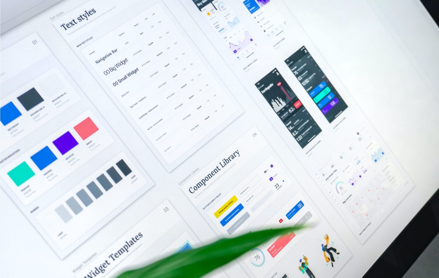
Many terms are thrown around when expanding on what makes a design system. Some of the terms used interchangeably are; pattern library, component library, design system, and style guide.
Here is a quick run-through of how these elements come together to create one part of a design system:
Styleguide
A style guide is related to the brand guidelines. It includes information and rules related to colours, typography, icons and spacing usage. It influences the style of all components and patterns, defining how the whole interface should look and feel.
Component library
Then we have the component library, which is the code equivalent of a UI kit. A component library would have code snippets for each component in the UI kit.
Pattern library
If we understand components as individual puzzle pieces, patterns are best practices for combining those components for specific user-focused tasks and page types. A design pattern is an evidence-based solution addressing a common design problem.
If you are as geeky as me about design systems, check out my talk, which discusses the ins and outs of building a robust design system foundation and the elements that come together to create one.
What is GDS, and why does it exist?
The Government's Digital Service (GDS) is a Cabinet Office unit in charge of driving digital transformation within the government. A big part of government digital services use this system for their design and development.
GDS has one clear goal:
"to build platforms, products and services that help deliver a simple, joined-up and personalised government experience to everyone."
GDS began in 2011 following the need "to champion a 'digital culture' that puts the user first and delivers the best, low-cost public services possible."
To deliver on this vision, they created a "new streamlined, agile organisation and an operating structure with an integrated, flexible team of skilled staff".
Benefits and drawbacks of using GDS
At Fruto we have experience designing for government websites (check out a recent project we did in compliance with GDS). In this blog I write about my personal takeaways when working with the GDS design system.
I found the GDS design system to be an excellent choice for several reasons:
It fosters trust in your service since its design must be approved by the government's high design and accessibility standards. Having the government stamp of approval on your service is a big deal.
By using a well-established design system, you benefit from the hard work and research others have done to ensure all your design elements fulfil user needs.
It's a public design system, meaning multiple teams can use it and contribute back to it. As a designer, you can easily share the right documentation and guidance for each component via a web link with developers and other team members. The documentation is straightforward and easily discoverable, which helps breed faster and more consistent design. The documentation is relevant for designers and developers alike and the way the GDS design system is structured reflects how we work as product teams; things are where you expect them to be.
It saves your digital team a lot of time and gives them space to solve other complex problems since it stops them from having to make meaningful but small design decisions (i.e. what colour should buttons be?).
The community and support materials make a difference. GDS has plenty of blogs and other resources available. I would recommend looking at their community principles, which outline how the design system users interact with it and amongst themselves.
It encourages users of the design system to contribute to it, provide feedback and improve it.
The GDS design system keeps excellent track of what components or styles are well-established and which ones are in the 'experimental' stage (meaning more research is needed). They also do a fantastic job of explaining what in that given pattern or component needs further research. You can even check what is currently in the roadmap here.
As I used the GDS design system I also found a few challenges along the way:
With a reduced number of options, you need to get creative to solve certain challenges. In the interest of maintaining consistency, the design system doesn't give much wiggle room for creative freedom. However, this has driven me to create better solutions for complex problems since you have to find ways of making the existing components and styles work together and find simpler solutions.
If you do decide there is a real need for a new style or component, you must get its look and feel and usage scenario approved by the GDS team. The process for approval can take a long time as the GDS team must see an actual pattern of use to okay it, and they are usually very strict with what gets approved. And for a good reason! They keep their design system full of reusable, scalable components and patterns rather than one-off snowflake components.
As a well-established design system, you will find people have different opinions about specific components or styles. For example, you might find that even though you meet the GDS requirements to use a component, some stakeholders might be opposed to its use in a given context because its use is usually limited to a particular category of services. An example of this is the Tabs component. This component seems to be usually reserved for education-related sites, although this is not necessarily evident in the component's documentation. Like anything, everyone will have an opinion, especially if the component or style is in the 'experimental' stage.
Design tools develop fast, and getting the latest version of the GDS UI kit to get started can be a challenge. I found it most helpful to download the latest available kit and compare the key components I needed with the latest public online guidelines. I then adjusted any component that differed from the guidelines.
There are very high accessibility standards which are necessary, and may I say, challenging for us designers to apply and meet consistently. Let's face it – It is impossible to know all those rules by heart and apply them consistently to everything you design. Even though in the GDS design system, most standards are worked into the styling and components themselves, there is still plenty to figure out in the design stage, and you need to be very rigorous. This excellent infographic resource helped me keep these accessibility considerations in mind whilst designing and acted as a checklist.
Responsiveness is not always built-in. For example, I had to switch between a desktop and mobile view to determine how the typography scaled. Having to work out some of the elements' responsiveness is no big deal but something to consider as it does increase the time.
Tips for using the government's design system
When using the GDS design system, here are some things that helped me, the wider team, and, ultimately, the service we designed.
Check out the service design manual for government services.
The GDS design system is only one piece of the puzzle. To truly understand the government's approach to designing digital services and products, you need to look at their service manual. You can find important information about user research, agile delivery, measuring success, and other key areas to delivering an excellent governmental service. The service manual is a valuable resource as the guidance for each of its areas has been thoroughly thought of, and it gives you a good idea of the elements you need to consider to design a good service. I often come back to this manual, even in projects unrelated to the government. Their 14-point Service Standard helps you have a checklist that ensures you think of users, solve the right problem, make your service easy to use, and much more.
Find the design principles that drive decision-making.
This might seem like an extra hassle before you start the design but being familiar with their five design principles is essential to speed the process and have something to refer to when you need to make decisions. The government's digital design principles help keep user needs at the centre of your decision-making.
Get to know the GDS components and patterns before you begin.
This is helpful if you've never designed a government service before. Exploring the system before designing any pages helps you know the available options. The design system also has design patterns that you can use for specific actions. For example, if you ask users for their addresses, they have a pattern. If you don't explore the system beforehand, you might miss existing patterns for certain user actions.
Get everyone on the same page.
Even though GDS has a public design system, you'd be surprised how often I had to clarify what this was and where to find things. Make sure the rest of the team knows where to find guidelines for their work area from the get-go. (i.e. developers need the code for each component whilst a copywriter might be more interested in any guidelines around copy and content). I found it helpful to communicate with developers throughout the implementation phase.
Don't forget you're still the designer.
It's easy to fall into the trap of pulling components and styles from the design system without much thought. As designers, we often create everything from scratch on other projects that don't have an available design system. Even though this is not the case with GDS, and it considerably speeds up the process, the design system was born to provide solutions to problems that multiple teams, products and services have had. That makes a public design system valuable; it provides easy access to solutions and designs for recurrent needs or problems. If there were a solution to every design problem in the book, the system would be useless and difficult to navigate. Therefore, as a designer, you still need to problem solve and ultimately design.
Read our case study on GDS-compliant UI design and User research for the BEIS if you want to know more about how we applied GDS and met the Service Standard.


