What they needed
The research team had a functioning prototype that they used to test in clinical environments and they needed a design consultancy to make the user interface more engaging and user-friendly. The objective was to improve the design, ease of use, and speed of use of the tool to favor its adoption in clinical settings.
Their tool aims to support doctors in communicating diabetes-related risks to patients in an intuitive way. The design needed to have a white label, i.e.unbranded, in order not to hamper dissemination of research.
What we did for them
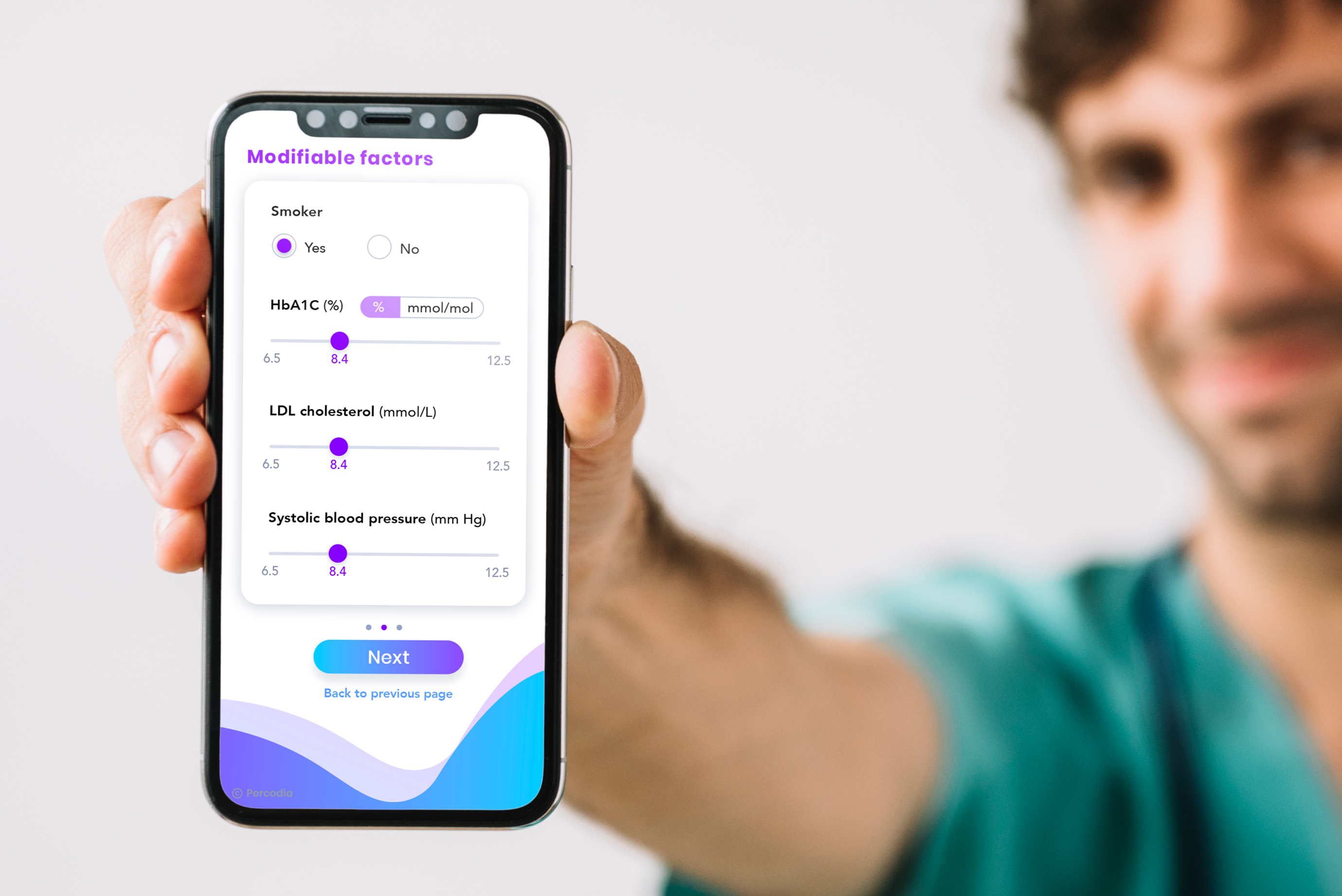
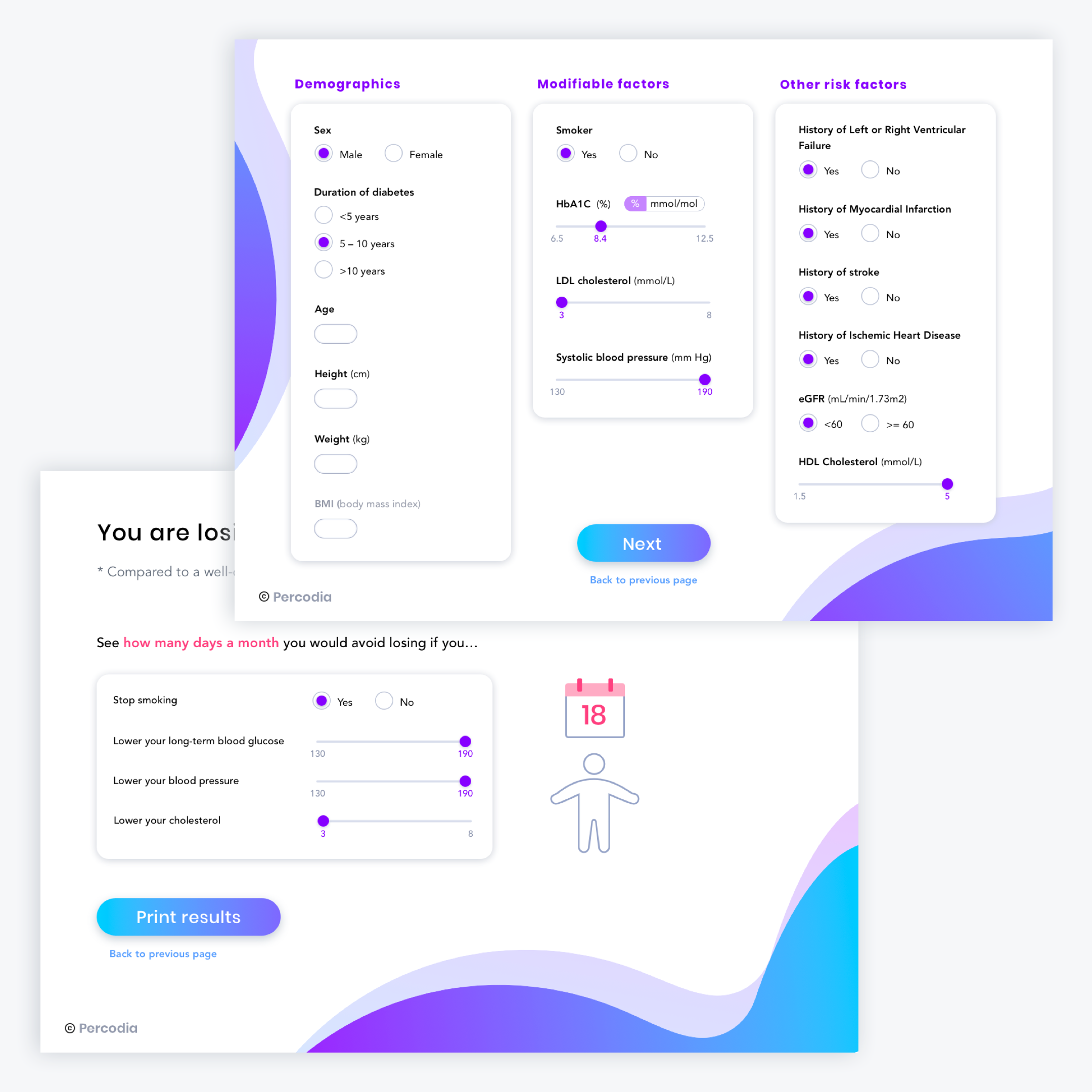
UI Design: An intuitive and modern-looking user interface that would help Percodia be adopted more easily in clinical settings. We used our expertise in usability conventions, design principles and experience to make improvements and redesign the prototype they presented us with.
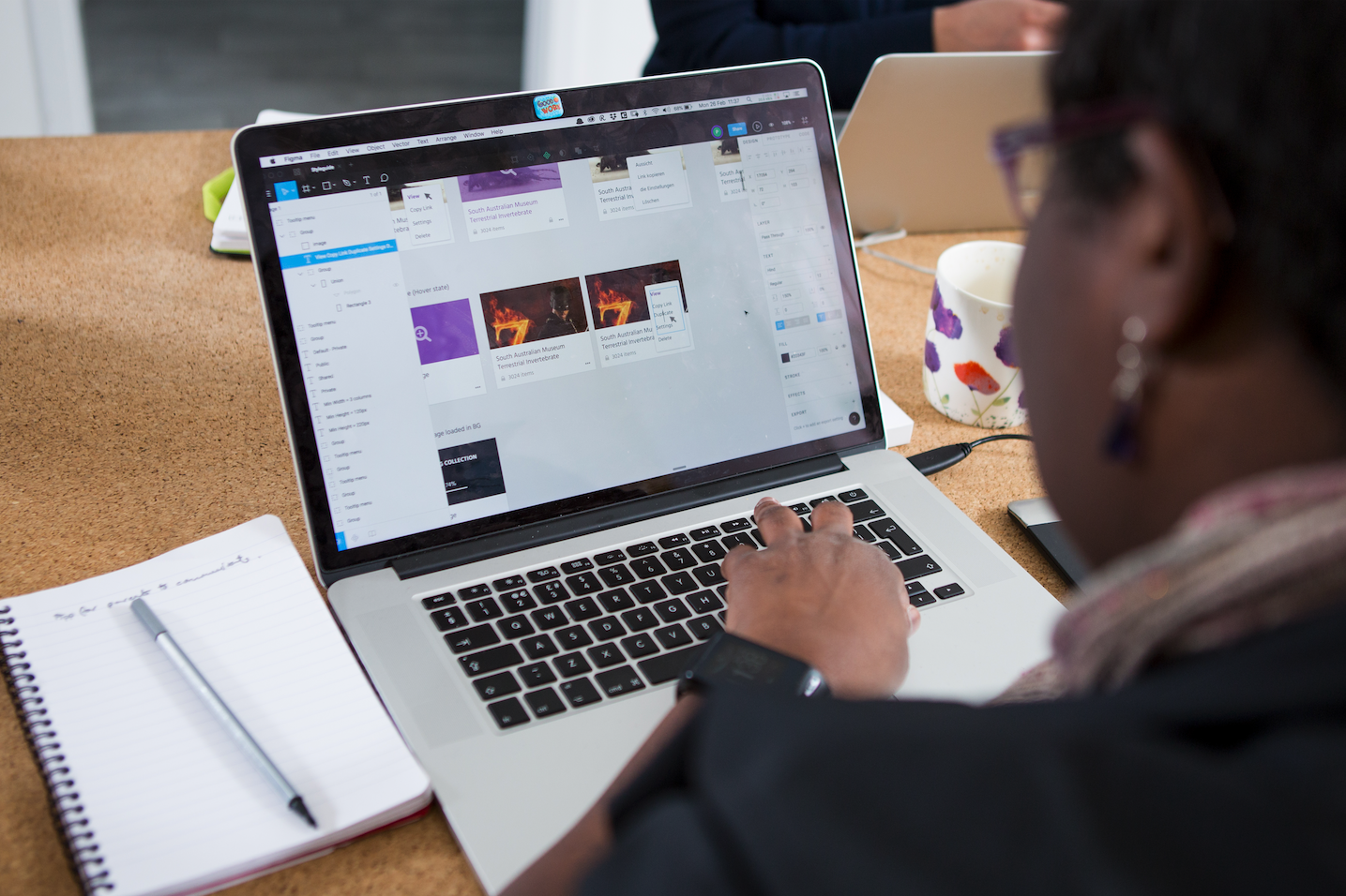
Front-end development (Responsive design, HTML/CSS)
Results
Percodia now has an intuitive and interactive interface to support risk communication in diabetes consultation. It is an attractive tool to be presented to target users.
Not only has Fruto Studio provided great UI design services; it has become a full member of the research team. They have quickly understood our needs and shown a lot of flexibility throughout the development process. Their work has been delivered promptly and in a highly professional manner. I would definitely collaborate with them again.


