What we did for them
We worked with Zegami to improve the user experience and user interface design of their app.
User research: We started the process by talking to their customers. We ran rounds of customer interviews and usability test sessions to understand users’ needs, expectations and behaviours. We needed to understand what attracted customers to purchase the app, how they were using it, validate some assumptions and get insights on key usability problems and areas for improvement.
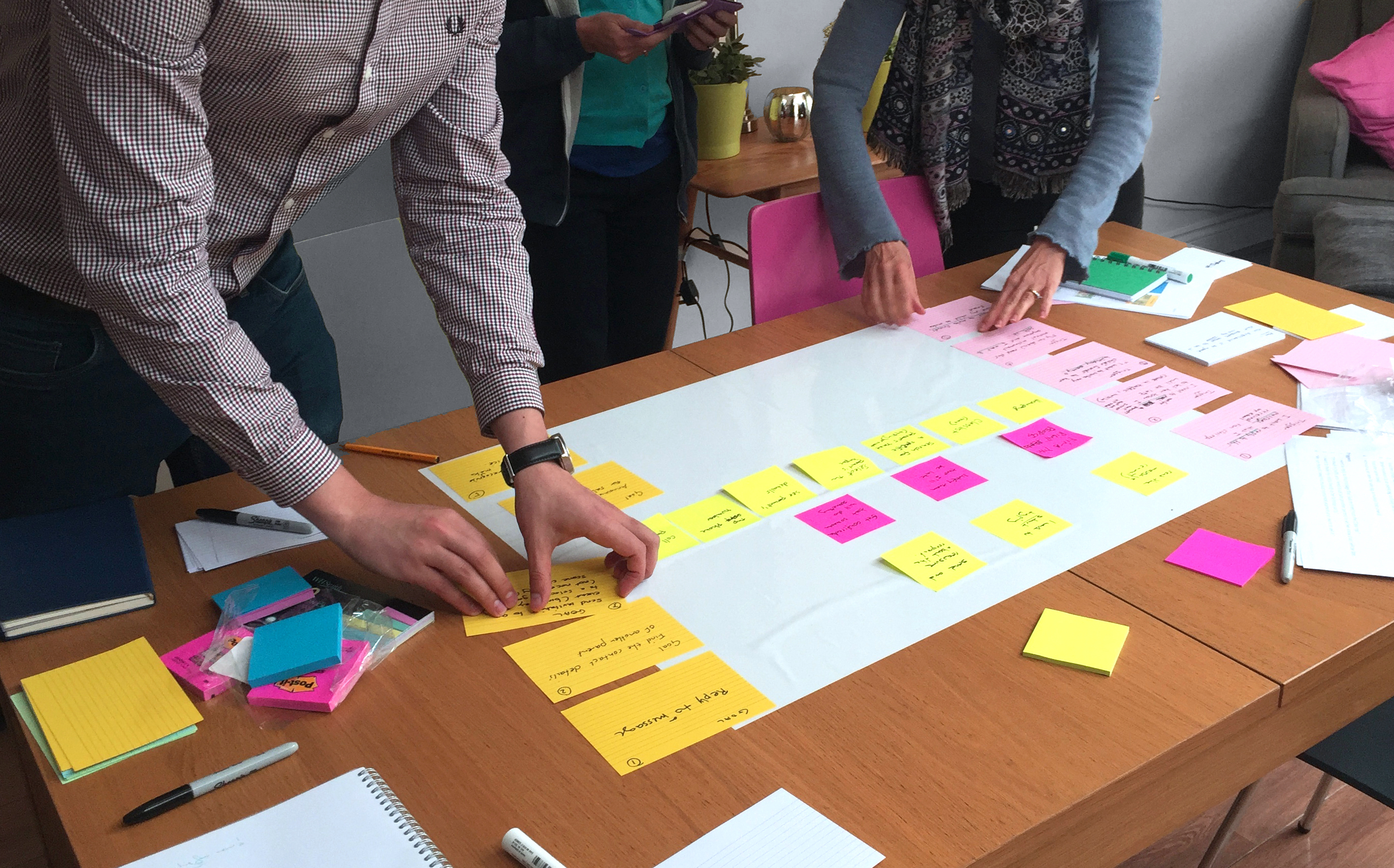
User profiling and user journeys: We profiled the user groups and mapped out a user journey to ensure that the experience that we were creating was streamlined and tasks were easy to be accomplished.
Prototyping: We created wireframes and a clickable prototype that we tested with users. This includes changes to the layout, functionality and page flows.
UI Design System: We created a modular UI design system and style-guide to allow the product to scale gracefully without becoming unusable. This gives the product team the flexibility to work in an iterative process and make improvements to the interface regularly.
Results
A modern-looking commercially ready interface with improved usability.


