What they needed
Cognitant already had an early-stage version of the app on the market, and their initial requirements were for a new UI design and pattern library that would work for both a native (iOS) app and new progressive web application (PWA) version that could be accessed via a standard web browser (on a desktop).
The Healthinote app contains a large volume of VR and video content, but existing user feedback from patients was that some of the content was overly clinical and actually put them off using the app. Likewise, as patients often experience anxiety when seeking health information, as part of the new UI design we also recommended a ‘3D character’ to help provide a more reassuring, productive and positive experience.
Finally, as Cognitant wanted to reuse the design elements used in the app across their other digital assets (such as the company’s website, social media, etc), a pattern library was needed. This would also ensure that the design would translate and maintain credibility as the App’s user base becomes increasingly global.
With this in mind, we set out to create not just a more modern, flexible, and welcoming user interface, but also a more accessible one for both practitioners/health professionals and patients alike.
What we did for them
As an iOS version of the Healthinote app had already been adopted by a number of users and a UX consultant had already undertaken some usability testing, user feedback was already available to help guide our UI design decision making.
Without the need for a dedicated UX design phase - and working on a retainer basis as an extension of Cognitant’s internal team - we delivered a complete design overhaul of the existing iOS app - and provided resources to aid the Cognitant developers to develop the new PWA/desktop version - within 6-months, including:
A brand refresh
Wireframes & prototyping for (new & existing) page flows and designs
Recommendations for a new “3D Character”
Design of user onboarding workflows
A detailed UI pattern library and style guide for both native and PWA apps
Brand evolution
When Cognitant first approached us with their requirements, they already had a basic Healthinote logo that had been used to influence the first iteration of the App. However the brand identity they had didn’t quite translate well onto digital and needed refreshing.
Although they were keen to jump straight into redesigning the UI and compiling the library of components that would result from that redesign, we first recommended addressing the brand identity as well as some of the accessibility issues we saw on the app before going any further, as this would set the direction for everything else that was to follow.
As part of the visual identity redesign we suggested a new (blue) colour scheme that was also more commonly associated with ‘healthcare’ - therefore increasing the level of trust users would have in the app. A new orange hue was also introduced as an accent - introducing a strong secondary colour whilst at the same time providing a nod to the original brand colour.
This new complementary colour combination now only allowed us to create bolder UI designs later on, but also enabled us to get the right balance of compliance with the new NHS Digital Technology Assessment Criteria (DTAC) whilst maintaining usability and design integrity in line with Cognitant’s own minimum accessibility requirements (AA).
We also took the opportunity to suggest a refinement of the Healthinote logo to make it more modern, flexible, and in line with their offering. The goal of the logo is to better serve its digital application (as an app icon) and to better align with the values and overall experience that Cognitant wants users to associate with the Healthinote brand.
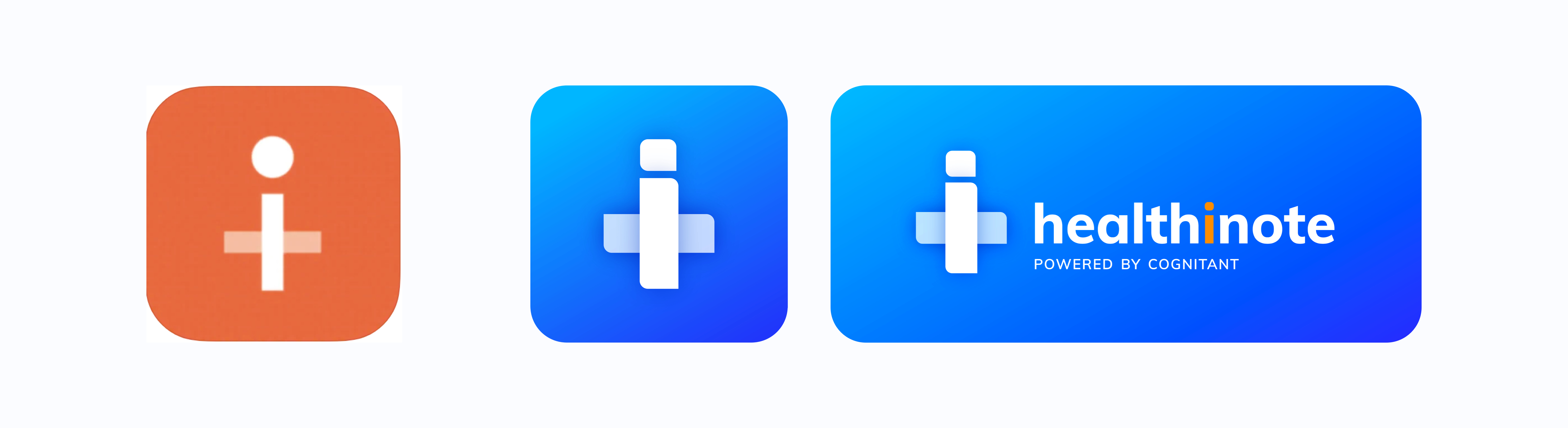
New logo design on the right
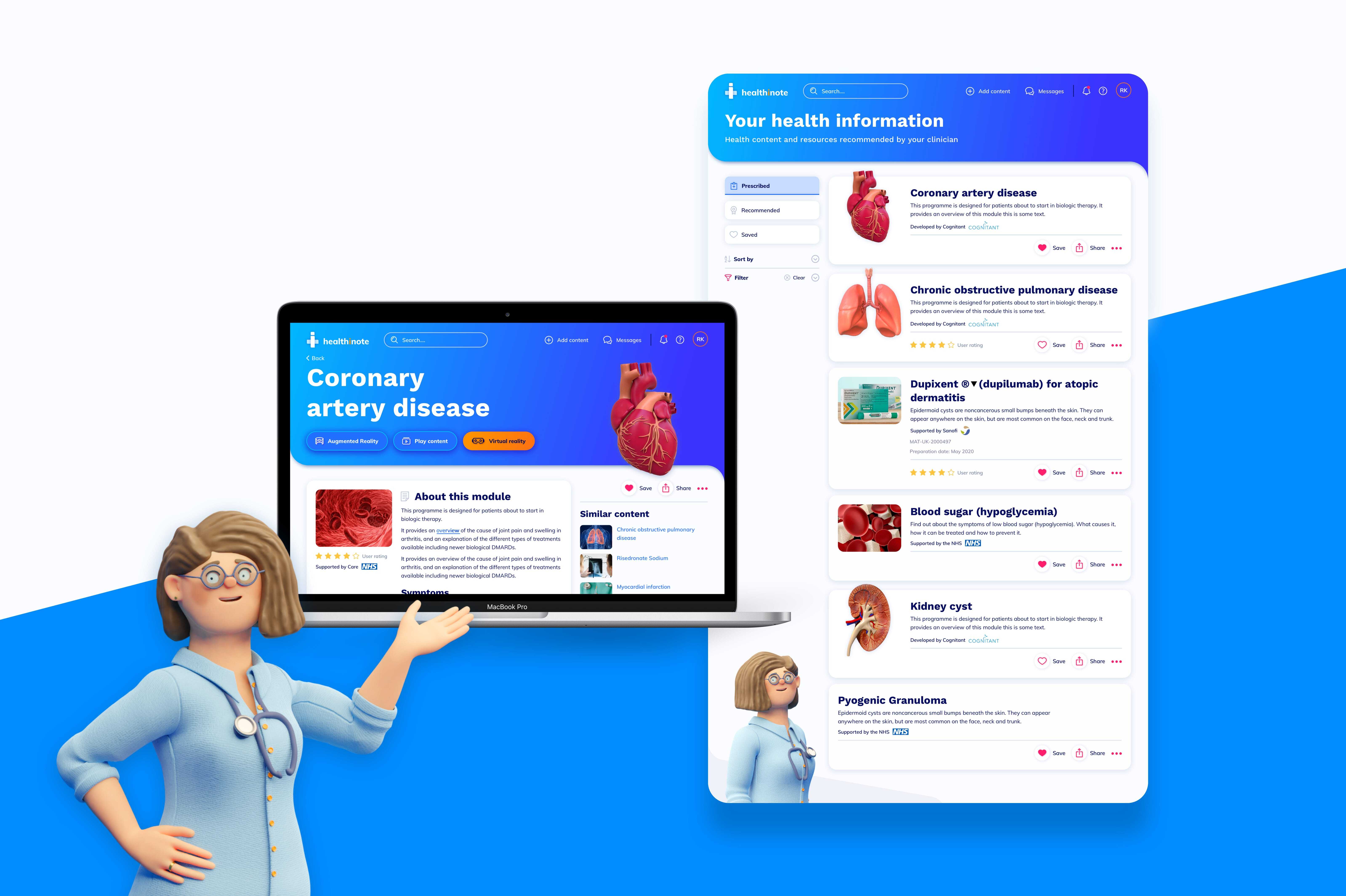
High fidelity UI mockups
Cognitant were keen to see how the app would look with the new brand applied, some UI mockups were created to show how the user interface design would change. We also provided recommendations on how to apply the new colour across different aspects of the app. These design comp of the module detail pages worked as a direction setter for the rest of the UI.
Having worked closely with their UX consultant to understand and re-design new user journeys across the app, we were then able to create further high-fidelity designs that included specific content for the core pages.
As Cognitant were very keen to see the new interface designs, we started looking at the UI early in this project compared to others.
Some of the challenges we faced with this part of the design were:
Designing for vast differences in the amount of screen real estate available between the mobile displays for the PWA and native app vs the desktop PWA version. There was a big amount of content for regulatory reasons and we needed to create designs that would work and adapt from larger desktop displays to smaller, more restrictive, ones.
Clearly differentiating between the different types of content available - both in terms of format (e.g. VR, standard video vs written) and ownership (owned by Cognitant vs curated Partners)
Working out where within the flow to prompt users with the opportunity to sign up. The goal was for users to create an account to get the full value of the app but we needed to offer enough value to them before we asked them to create an account. This would increase the chances of users signing up when prompted.
Accounting for the restrictions of the underlying Unity framework (which powered the VR content)
At this stage, we also recommended replacing the clinical image and video approach in the original app with a new illustrative design. This new stylised approach met the re-brand requirements, whilst also allowing imagery to remain ‘representative’ without being too ‘cartoonish’ - so it looked real without being too real. During user testing users pointed out that the new direction for clinical images was much less ‘scary’.
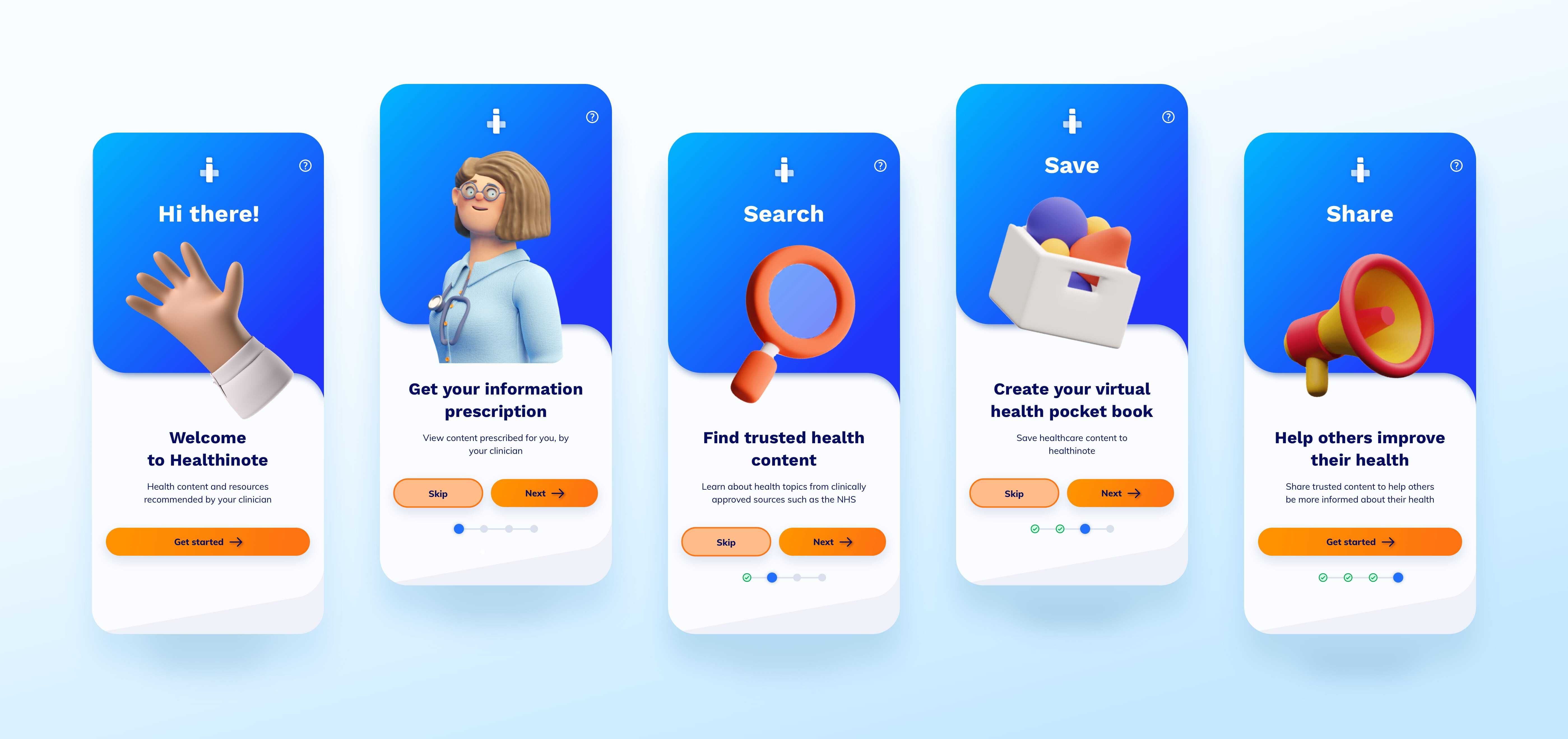
3D character development
We thought of introducing some form of character that acts as a guide for users through the app. This would make the experience more friendly and welcoming to new and returning users.
To ensure that the character would be seen as ‘credible’ and ‘relevant’ to the app, we recommended the use of a human character (rather than an animal or something more abstract) - this also best matched the requirement for the app to be seen as ‘personable’. We put together a brief and inspiration board to inform this character design
The character would then be used in other areas of the app (for example in the search landing page) to make for a more cohesive experience and to build trust.
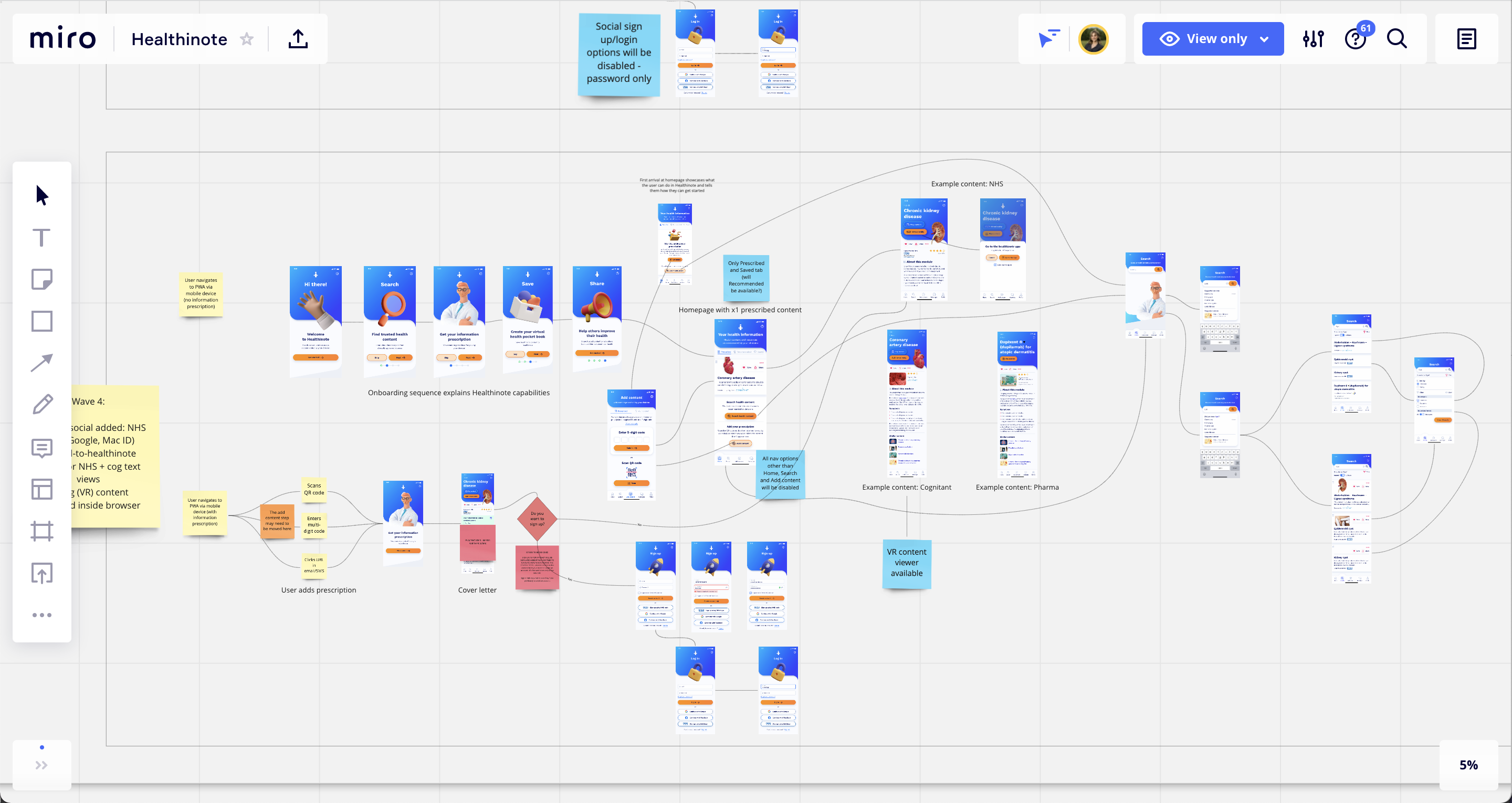
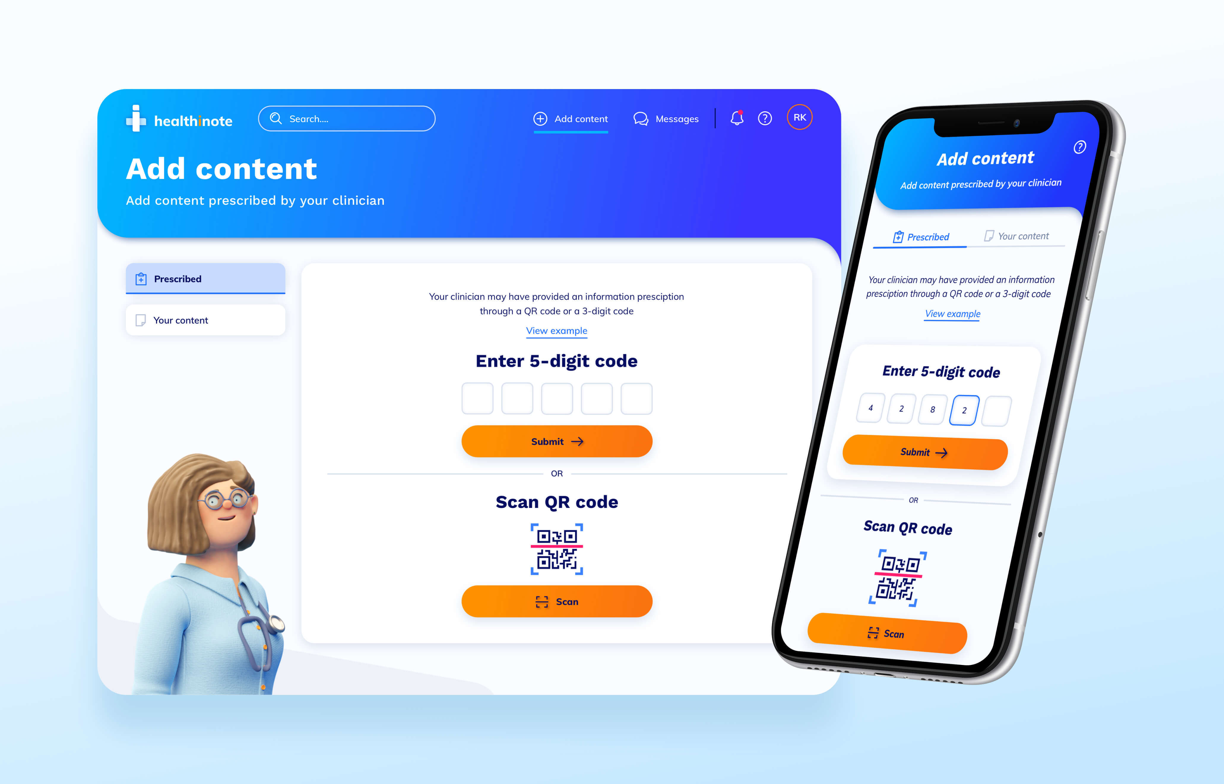
User onboarding & other in-app workflows
With the new visual design characteristics finalised and some of the main pages completed, we then turned our attention to reviewing the information architecture (IA), addressing the issue of users ending up in “dead ends”. We also introduced a new way for users to ‘Add content’ to their own app library and manage the order this content appeared.
As there were a number of scenarios through which a new user may wish to get started with the Healthinote app (e.g. referral from a GP, recommendation, personal AppStore search), we also and created a number of onboarding screens that would help users find their way around the app when they first started using it - aligned to whatever their starting point with the app was.
UI pattern library design
In parallel to the design work itself, we compiled a comprehensive pattern library and style guide which contained detailed information and examples of how to use and adapt the designs we’d use for both the mobile and desktop versions of Healthinote.
This was handed over to Cognitant’s development team in a development hand-off session. The pattern library and style guide would inform and support the implementation of the new designs for the native and web app - which were being rolled out in phases. This piece of work also ensured they had all the information they needed in order to achieve the same look and feel in their marketing website.
Results
Following the implementation of the new designs, the number of clinicians using the app has increased dramatically from a couple of hundred doctors to over 14,000 doctors across 1,700 practices in the UK now using the service.
Feedback from users has also reflected the improved usability of the app:
“It’s easy to read, everything is broken down into manageable chunks”
“The interface is great and it loads at a good speed. It’s a good concept.”
“I like the doctor - he brings a uniqueness. Health can be very serious so I like the light touch. It’s sweet and simple, not over complicated. Health can get complicated so making it understandable is key”
The new Cognitant website is now also live and not only delivering a more joined-up brand identity across website and app, but an improved user experience as a whole.
Fruto helped us transform our app into a modern, user-friendly interface. The redesign added the wow factor we were looking for in our branding and product. User feedback shows an overwhelmingly positive response to how personable the new interface is. The UI pattern library “future-proofed” the ongoing development of the platform and set the visual style for our marketing website.
 Dr Tim Ringrose, CEO at Cognitant