What they needed
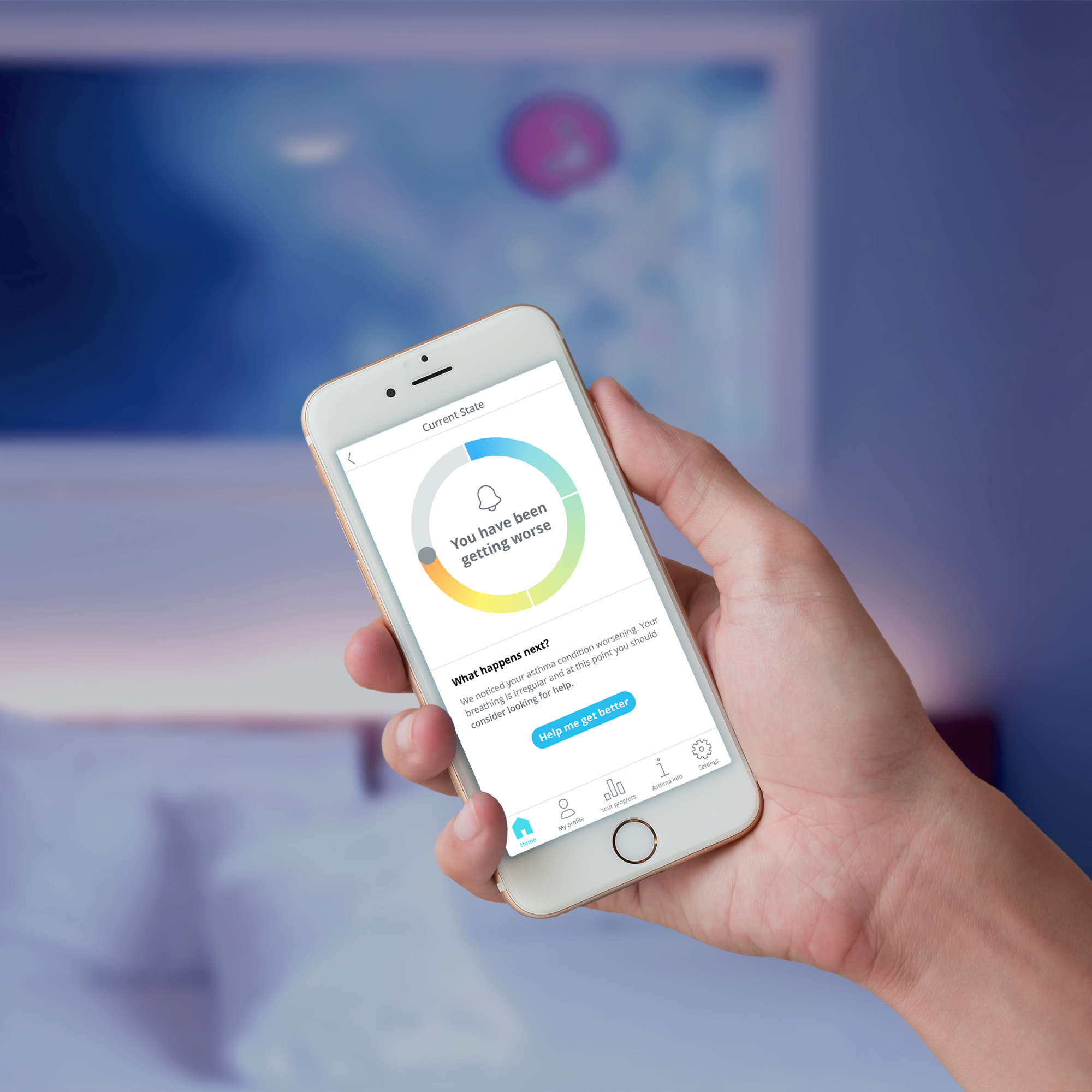
Improve the User Experience of their app for one of the user groups.
Guidance on what needed improvement and prioritising the UX issues.
What we did for them
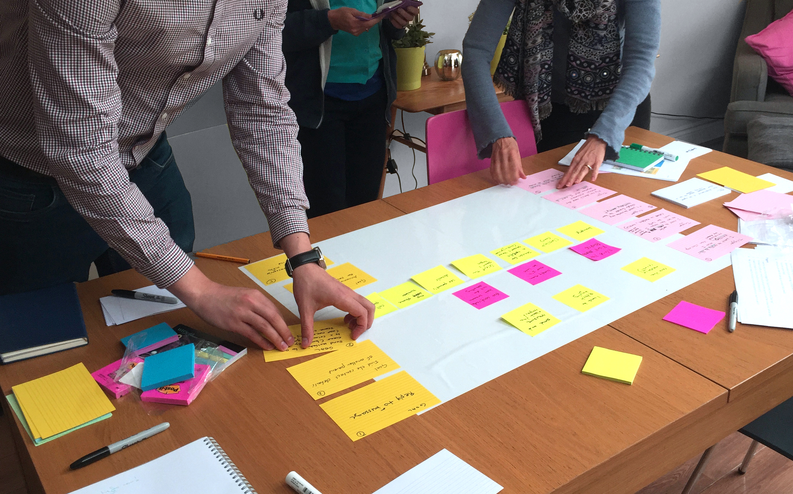
Lean user research: In order to understand the UX issues, we first talked to their users. We ran a series of one-to-one usability testing sessions with 6 users to identify the key usability problems with the app and key pain points. This gave us an in-depth insight into the user needs, their workflow and the areas that needed improvement.
UX review: We did a heuristic evaluation, reviewed the usability of the app page-by-page and mapped out the user journeys. We then presented the findings and recommendations to the product team.
Results
Hystreet followed the recommendations to improve the UX of their app.
Fruto have made us re-evaluate our own product and we’re following the recommendations. Brilliant. Thank you.


