What they needed
Impressed by our experience in the publishing sector, Taylor & Francis (T&F) first approached us looking for support with a UI Design project, but, this soon grew into a long-term partnership, covering a range of strategic and tactical initiatives across the organisation (including T&F sub-brands).
What we did for them
To date, we have provided a full range of UX and UI consultancy services with a strong emphasis on user research and UX strategy to help define the direction throughout.
Improving the author submission experience
One of our projects for T&F was to design a submissions landing page within their academic journals platform to give quick access to areas that users (Authors) were most interested in - such as submitting new papers and seeing the status of their submissions.
We suggested taking a tactical approach in order to fulfil their urgent needs and address the quick wins, with a follow-up project to address the key UX issues when time would be available to conduct more in-depth user research.
Reviewing the existing design enabled us to create wireframes and UI design for landing pages for the two main flows (submitting papers and status updates).
Once complete, we ran a usability test study with representatives of the main user groups to test the UI design, provided a report analysing the results and Accessibility recommendations, and made the necessary iterations to the design.
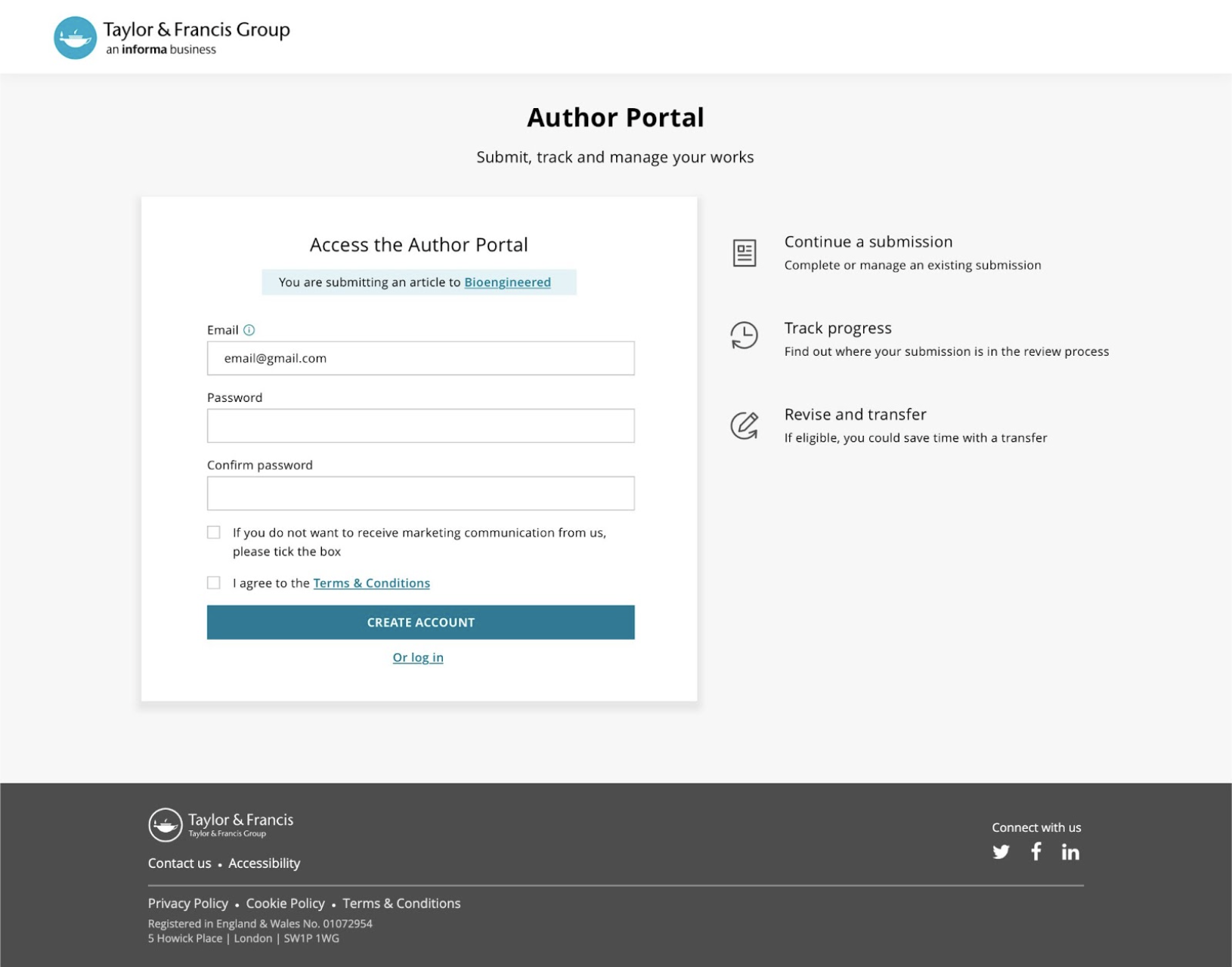
UX Strategy and future vision for journal author onboarding
In a continuation of this UX Review project, we then looked at how they could optimise the login and onboarding experience for journal authors in the long term and what this could tell them about their overarching UX strategy going forward.
As this was a cross-functional project that would affect so many of Taylor & Francis’ teams, we first ran a series of stakeholder interviews with teams across product, technology, marketing, business intelligence, and UX as part of a comprehensive discovery phase that also included:
Assessing existing research from T&F
Survey
User interviews and observations with academic researchers (as-is experience of the publishing process)
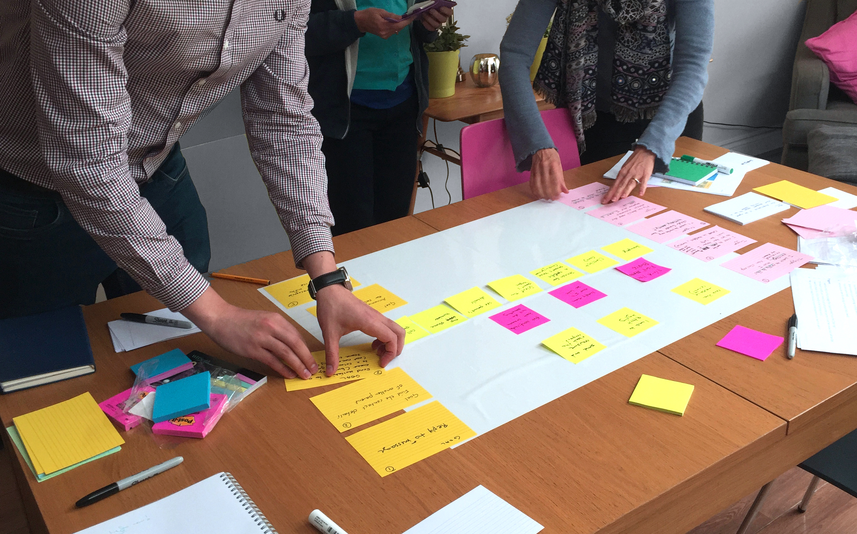
User journey mapping workshop with stakeholders
Competitor analysis
Prioritisation workshop
UX report and recommendations
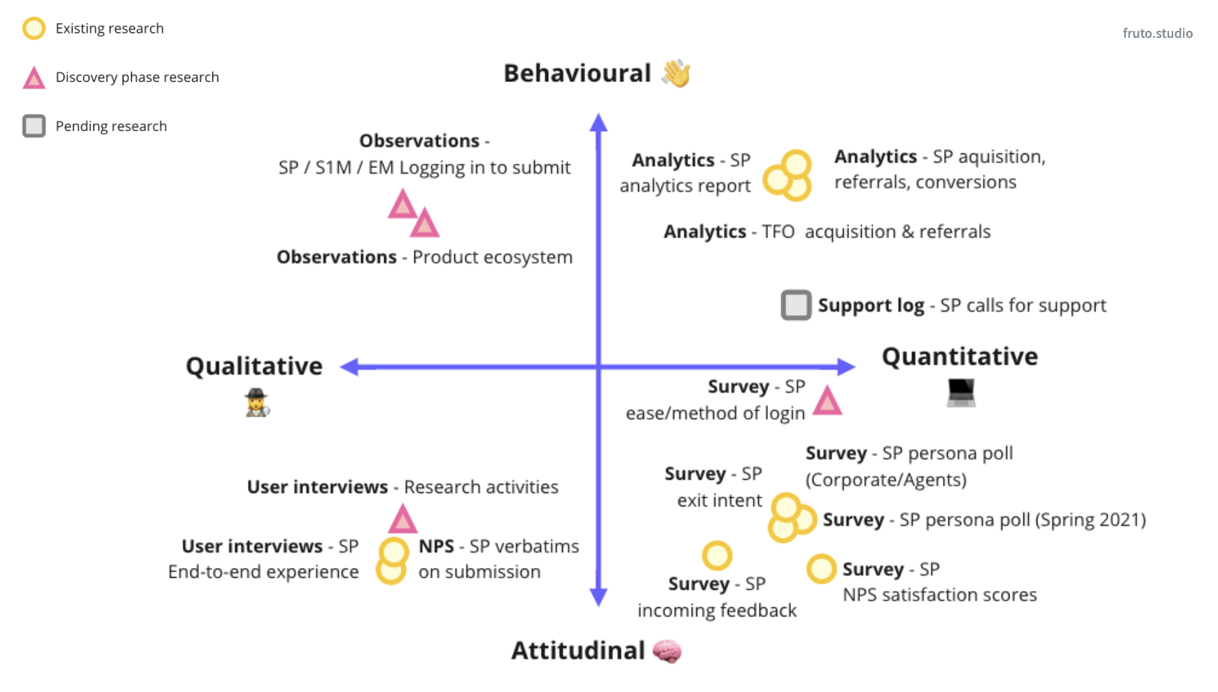
Initial assessment of existing research to identify potential knowledge gaps.
Once this discovery stage was complete, we moved into a prototyping and testing phase in which we used clickable prototypes to test our design concepts and gain further feedback ahead of making our final design recommendations.
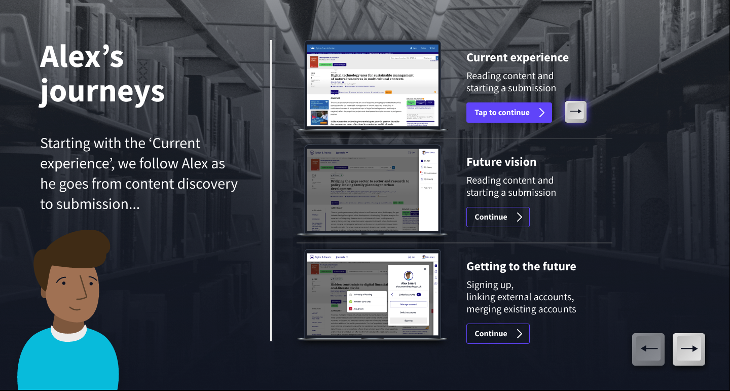
The final stage saw us create an interactive storyboard to illustrate the current onboarding journey to help communicate a ‘future vision’ that had researchers’ needs and experiences at its heart.
Each step of the journey was accompanied by insights into the user experience as reported and observed in usability tests that we conducted with a sample group of representative users and a user survey (which would also act as a benchmarking tool against which the effectiveness of future improvements could be made).
UX Review for F1000R platform
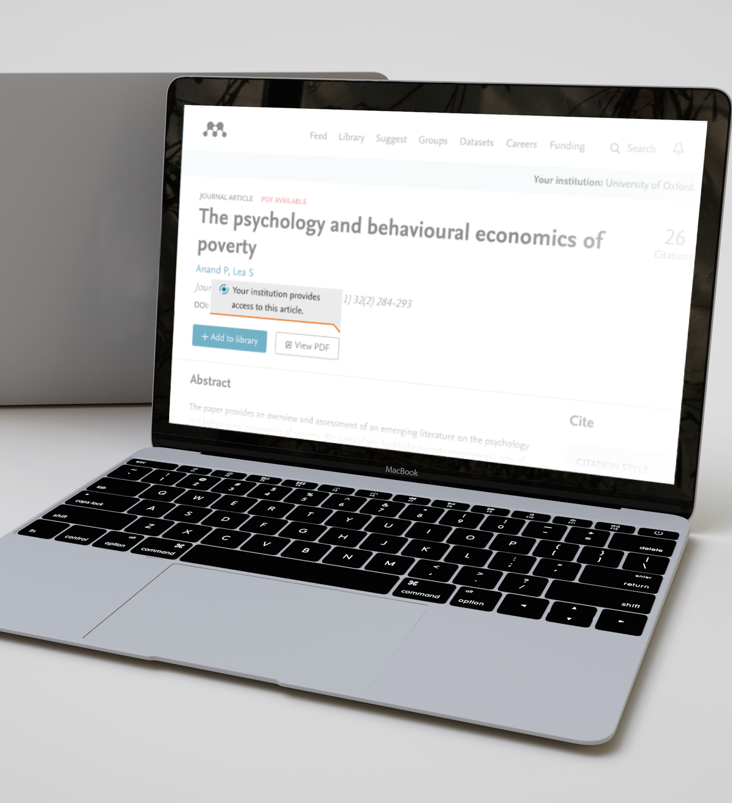
We also worked on a similar tactical project to help improve researchers’ understanding of F1000Research.com (F1000R) - an Open Research publishing platform for scientists, scholars and clinicians owned by the Taylor & Francis Group.
Although they were doing well at attracting target users to the website, T&F was looking to improve the understanding of their model and the benefits of submitting to F1000R over other options.
The project entailed conducting a series of usability test studies and a UX audit of article pages, submissions landing page, and ‘Why publish with us’ page, with the goal being to better understand the needs of two separate user groups:
Researchers who were largely unaware of the platform and its processes
Researchers who either ‘already published’ or ‘were likely to publish’ on the site
Having conducted our research, we reviewed the findings alongside quantitative data from a number of available tools and then ran a customer journey mapping workshop in which we presented our insights and discussed the key UX problems, opportunities, and UX priorities with the key stakeholders.
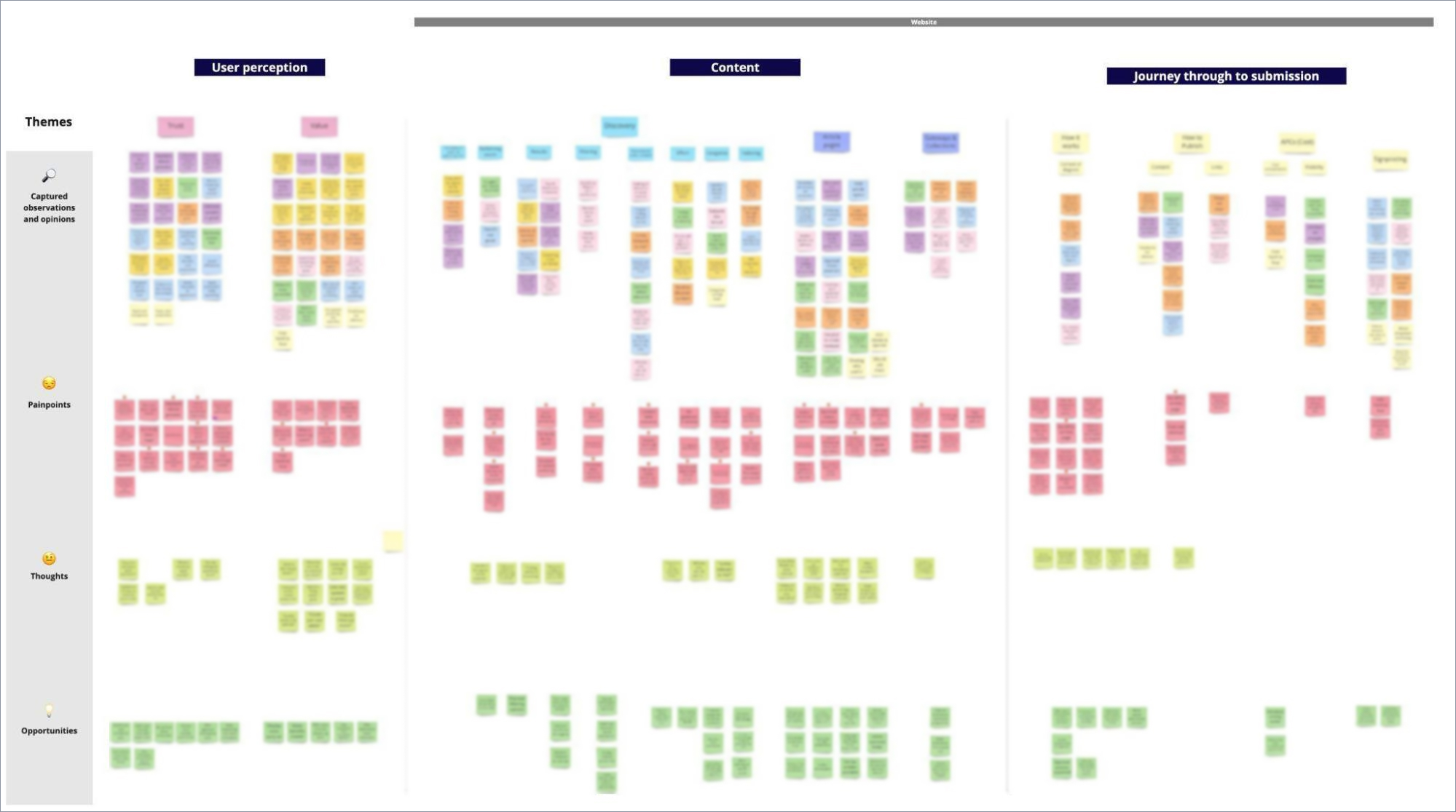
As a follow-up to the F1000R UX Review, we completed a second round of user research with the user group who were already familiar with the site. This time there was a focus on individual user interviews which we then presented our findings to the project stakeholders in the form of a Lean UX report containing analysis from the interviews.
GetFTR icon set design
Another project that we worked on for the Taylor & Francis Group was providing UI Design support for the GetFTR project, a major collaboration between leading publishers of which they are key members.
T&F’s in-house UX team had been testing some icons to indicate levels of access and needed some new unique designs for the access indicators that would improve users’ understanding of their article access permissions.
After first reviewing their existing research, we provided design concepts for four unique icons that could be used as stand-alone indicators or within a button. A review stage followed, then final icons and button assets were packaged with usage guidelines to support implementation across different integrator platforms.
UX Lead and User Research specialists' skills
In addition to these standalone projects, we also provided ongoing UX Lead expertise and consultancy for Taylor & Francis Online - their main platform for peer-reviewed journals and articles (of which the author submissions project we first worked on is a sub-site).
Ongoing User Research support was also provided for multiple projects and teams across the organisation, which saw us work closely with the product manager of each specific platform to define the research objectives, create the scripts, run the sessions and provide recommendations in the shape of a report or prototypes.
This ‘retained’ approach provides T&F with a flexible team of UX and UI resources who are knowledgeable about their industry that they can pull into any project across their organisation, with our team expanding and contracting depending on their changing needs.
Results
Taylor & Francis’ long-term commitment to user research illustrates a high level of UX maturity and an understanding of the benefits of properly resourcing and budgeting for this stage in design projects.
This case study is a great example of how organisations can benefit from working with a UX agency to achieve the right balance between strategic and tactical UX projects and utilise scalable, specialist external resources to support project design and delivery.
We are really pleased with the work from Fruto on the project. High expectations exceeded I guess is the best way of putting it.


