What they needed
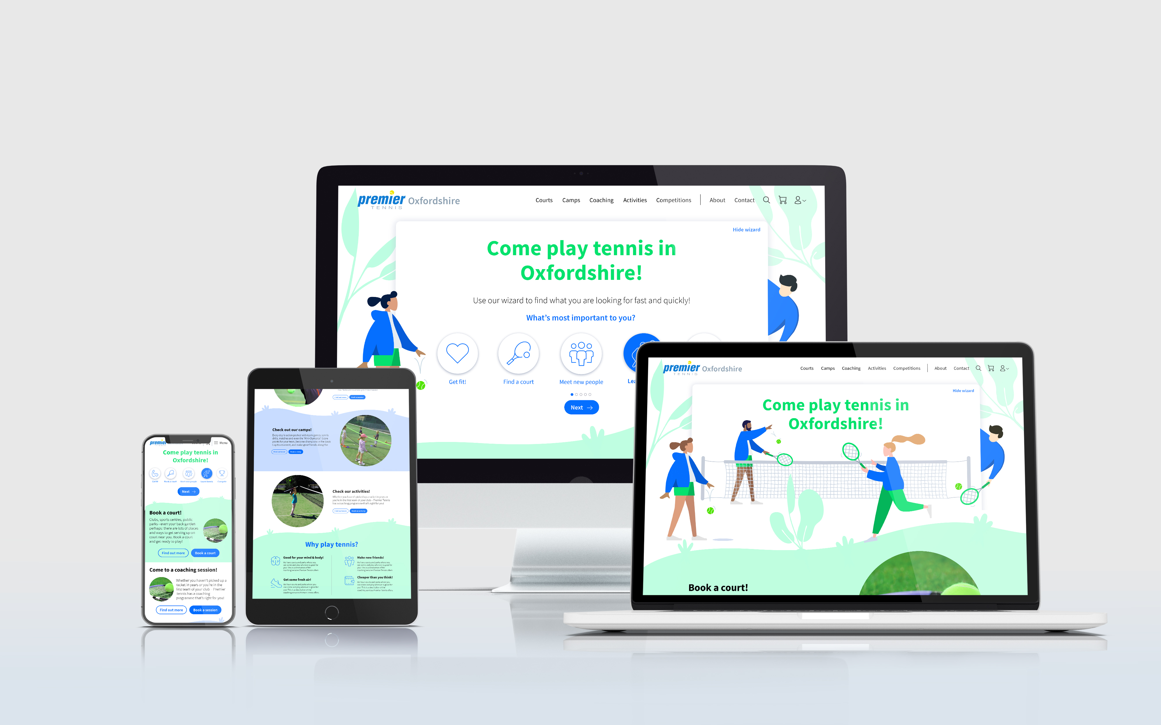
Premier Tennis had several websites for each of their different services and locations. They were looking to redesign them and merge the multiple websites into one single template. The aim was to create a consistent user experience between the different services that they offered and also so that their team could update their site more efficiently. They were looking for a design consultancy partner to work with their development team on this redesign.
The design needed to:
Encourage users that were new to tennis to give it a try by removing their mental barriers
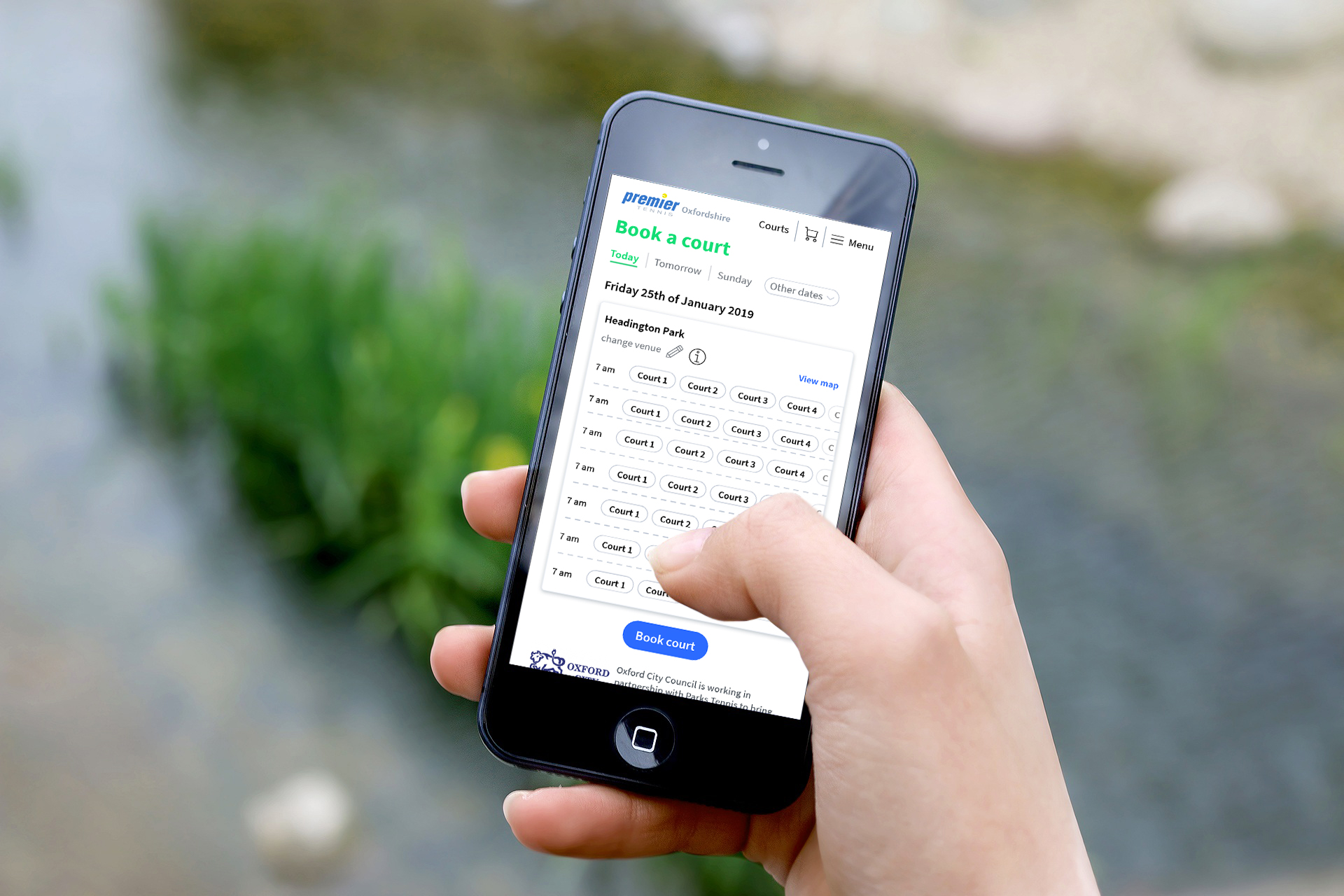
Make it easier for users to book tennis courts
Encourage users to sign up to one of their services (such as holiday camps)
What we did for them
Information architecture: We started by auditing the content and features of the current websites so that we could identify the scope and the relevant areas for the new website.
User profiling and user journeys: We profiled the user groups and mapped out different user journeys to ensure that the experience that we were creating was streamlined and tasks were easy to be accomplished.
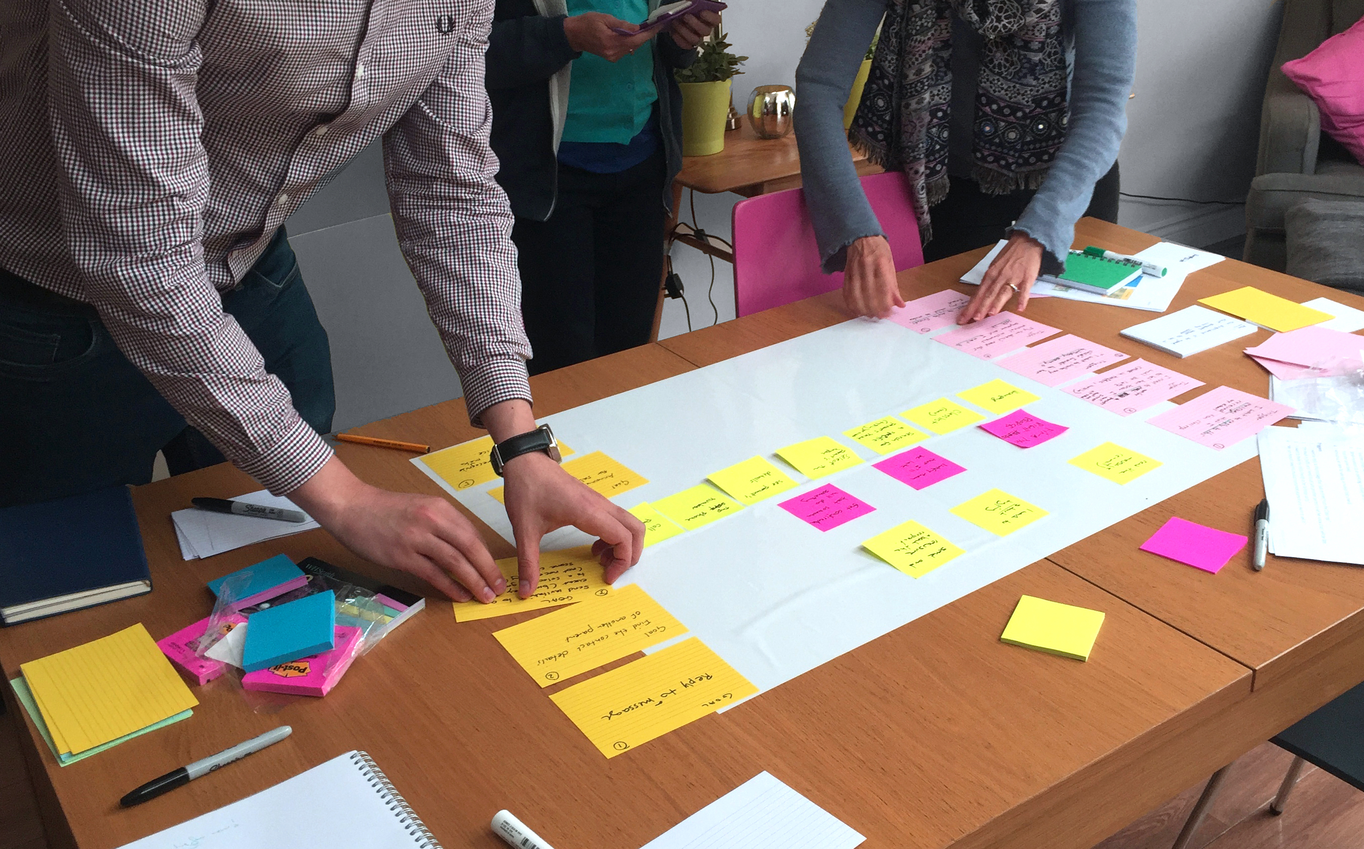
User Journey workshop: We ran workshops with their team and mapped out the different user journeys. Together, we identified the key pain points of the journeys and possible solutions. This allowed us to redesign the page flow aiming for a more clear and straightforward website structure.
UI styling refresh: A refreshed UI would help Premier Tennis attract new customers as well as offer a better experience to existing ones. We used our expertise in usability conventions, design principles and experience to make improvements. The new UI introduced illustrations which helped give the website a more fun modern feel.
Results
Premier Tennis now has a modern-looking interface, that is competitive in the market and an improved user experience that will better accommodate the user's needs. The redesign provides a template that is used for several counties, eg. Premier Tennis Oxfordshire, Premier Tennis Hampshire, Premier Tennis Surrey.


