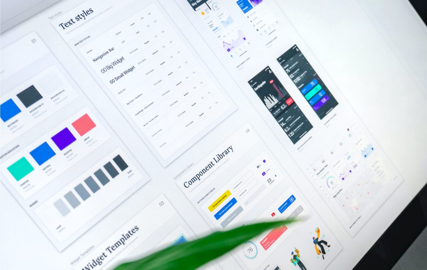
Fruto has been creating UI design systems, including colour palettes, for a variety of clients, from global organisations to early stage start-ups.
The goal of this webinar is to offer a hands-on approach to the creation of colour palettes for UI Design.
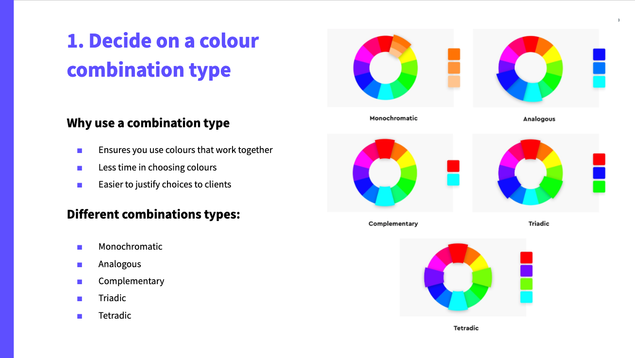
In this webinar we will apply the following concepts to create and successfully apply a UI-focused colour palette to an app interface together:
- Colour terminology
- Colour theory
- UI rules and conventions
- Other rules of thumb
This webinar is for:
- Anyone interested in knowing how to streamline the creation and application of a colour palette in a way that works effectively and efficiently for any client brief without too many tweaks to the process.
- Designers that might not be as familiar with the UI side of the process (and specifically colour palettes) and want to learn more about it with an easy to follow process.
- UI designers who want a steadier and more efficient process for the creation and application of a UI colour palette
Before attending the webinar:
It would be very useful (but not essential) if you could read the article ‘A guide to colour in UI design’ where I talk about colour terminology, its roles, best practices and tips and tricks for a UI-focused colour palette.
You can read the article in our website: (https://frutostudio.co.uk/blog/a-guide-to-colour-in-ui-design)
About the speaker
Carmen Martinez-Freile is a UX designer at Fruto. She focuses on designing at the crossroads of aesthetics and function, crafting meaningful experiences that work for users. Carmen specialises in UI and has experience in creating and successfully applying colour palettes for a wide range of projects. She also regularly blogs about UI related topics sharing her knowledge with other designers and people in the industry. Carmen holds a BA in Typography and Graphic Communication from the university of Reading.