What they needed
Prostate Cancer UK approached Fruto to help improve the information architecture (IA) and usability of their website.
As the content of the website grew organically over time, the navigation ended up having too many items in it, adding unnecessary complexity for the users. The navigation - particularly on the Prostate Information and Get Support areas - could be more accessible and user-friendly for visitors.
They were looking to run user research to understand how easy it was for users to find relevant content on their website, make necessary iterations and then test it again to see if it had improved.
What we did for them
We broke this project down into 3 mini phases:
Benchmark: Test existing structure
Tree test - to identify key problems with the existing information architecture
Usability test - to gain observational insights
Redesign: propose a revised navigation
Test: Tree test to identify if our proposed navigation structure improved the usability
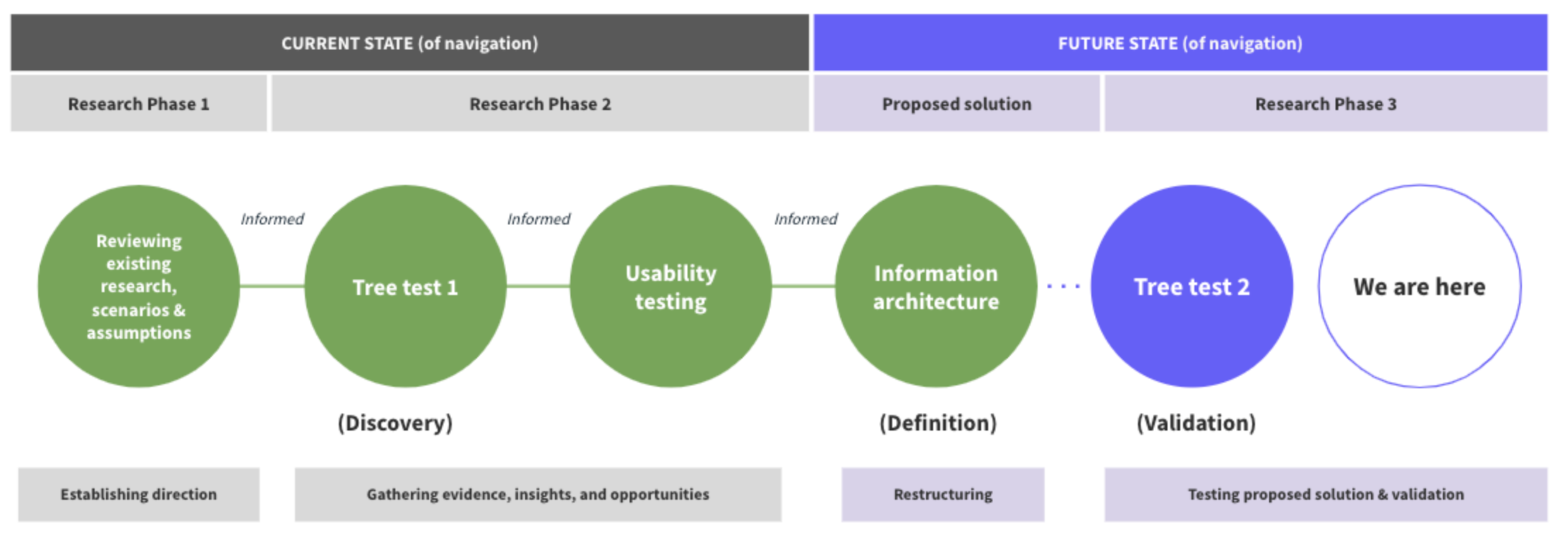
An overview of the project and the discovery activities that have happened in order to gain insights into the navigation of the Prostate Cancer UK website.
Tree testing – to establish a baseline
Prostate Cancer UK’s team had identified 9 key scenarios whereby people might be looking to find information on the website. We used this document as the basis for a task list, along with a test script which was run with 3 distinct user groups:
Group 1 - Those at a ‘high risk’ of developing prostate cancer
Group 2 - Those diagnosed as having prostate cancer
Group 3 - Friends and family of those that had been diagnosed as having prostate cancer
For each of the groups, we identified a series of demographics that should be included in the test to make the target groups as diverse as possible.
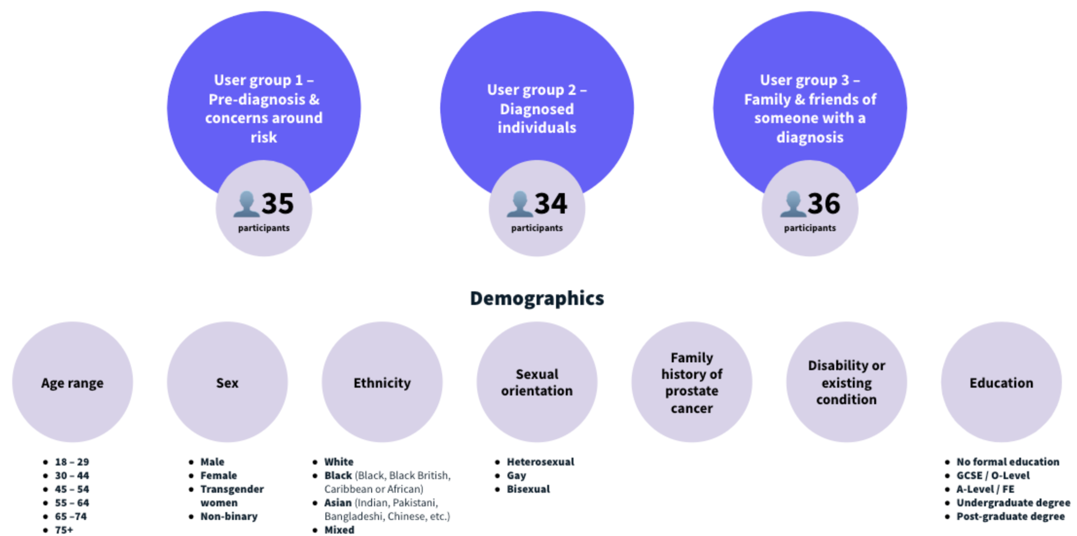
User groups and demographics
For this first round of testing, we wanted to establish how well the existing structure performed to act as a benchmark and to highlight the areas that had the most issues.
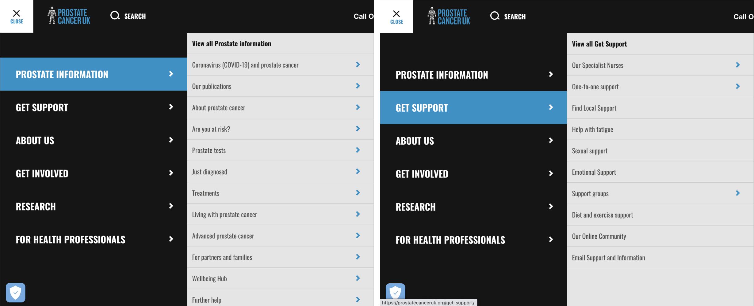
We ran the study using Optimal Workshop’s Treejack tool which allowed us to recreate the existing information architecture and labels in an environment that was free of other distractions. We tracked the time it took for users to complete each task and their exact click paths - so if they got lost, we could see exactly where and when this was the case, and whether or not they were eventually successful.
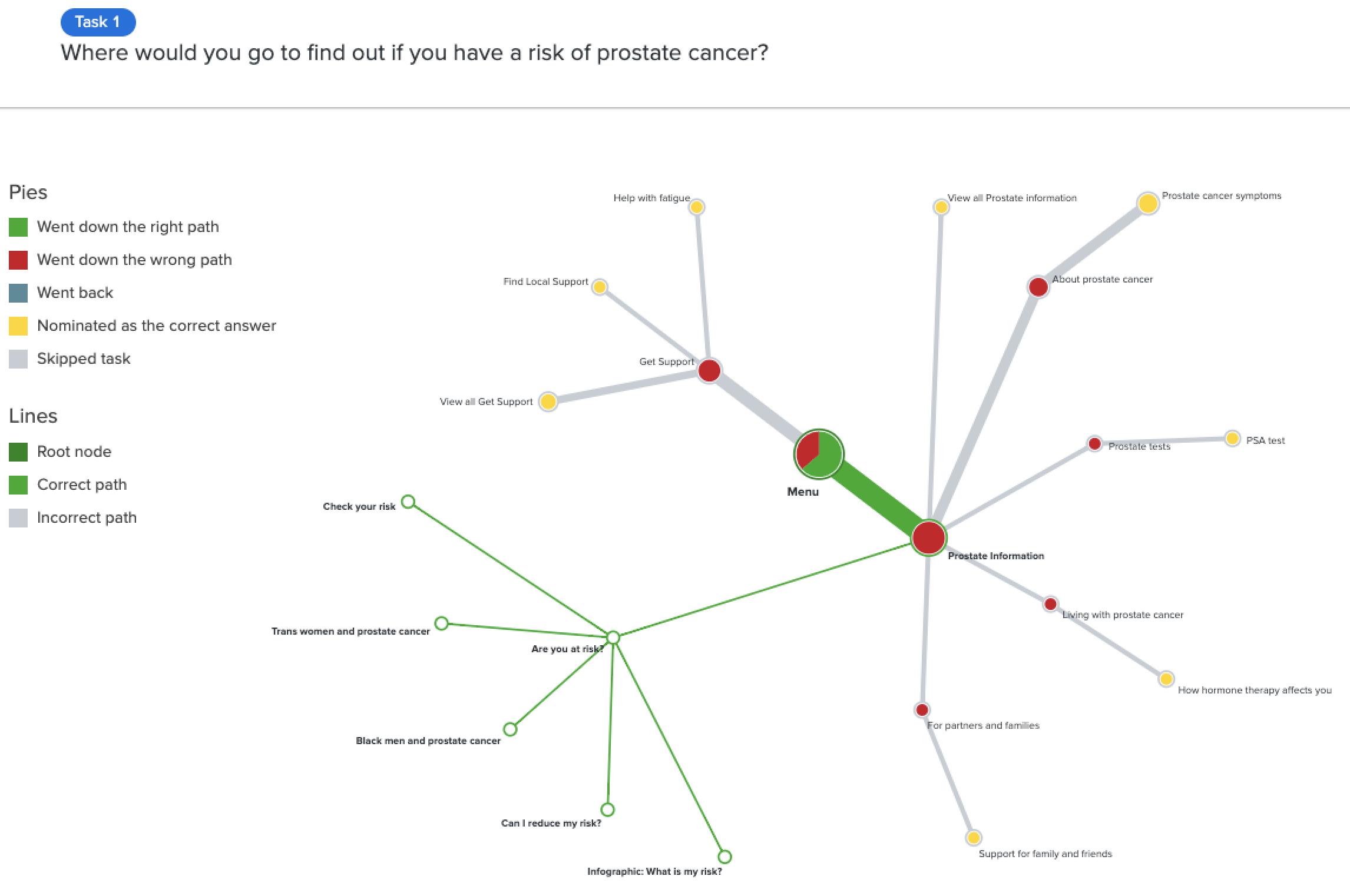
Pietree of one of the tasks showing where users went when asked to complete a task.
The initial test with their existing structure showed an average success rate of 53%.
Open-questioning post-task provided us with additional qualitative information about the users’ mental models, as well as allowed us to better appreciate the different personal journeys of the types of people who were likely to use the site.
Usability testing – to gain observational insights
Once we had our baseline tree test score, we moved on to a usability testing stage in which we ran one-to-one sessions with different users from the tree test where we asked users to complete a series of tasks and then observed them interacting with the navigation and website.
We also observed users completing a card sorting exercise which helped us understand how they would group different types of information.
Combining our tree test data and the results of the usability test, we were able to better understand individual task success and failure rates, along with a ‘directness’ score (i.e. how easily users were able to navigate to the correct page) across the 3 different user groups.
Collectively, our research findings suggested a number of areas that could be improved which we then prioritised based on tasks that were found to be most problematic to complete and of most concern if the user was unable to find the right information.
Once we had completed our research, we presented a comprehensive analysis of our findings and recommendations report to Prostate Cancer UK’s Content and Digital teams.
Information architecture (IA) – proposed solution
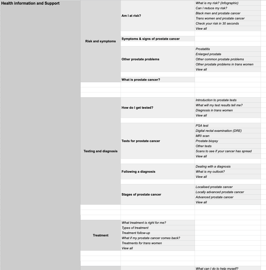
Based on these insights, we were able to design a new IA and re-label troublesome menu items to one that we believed better replicates users’ mental models and maps to real-life’ prostate cancer journeys - from pre-diagnosis, through side effect management and support.
The deliverable of this phase of the project was a spreadsheet detailing our revised menu structure and labels, along with a clickable prototype. We discussed our recommendations with the Prostate Cancer UK team and then moved on to recruiting a new set of participants to test our proposed solution.
User recruitment
To help with the recruitment of study participants throughout the project, we engaged the services of People for Research. Using a user recruitment agency meant that we were able to recruit a diverse set of participants, including those who were not already familiar with the Prostate Cancer UK website. This was a high-quality and engaged cohort of testers that felt personally invested in the project.
Tree testing – to evaluate if the proposed solution improved the usability
Once we had completed our research phase we were able to propose and test and validate our proposed solution.
All of the previous problem areas saw an increase in success rates:
Tasks which resulted in the poorest success rates in the first test (Task 4 - Awareness materials, Task 5 - Diagnosis, and Task 10 -Symptoms/side effect management) ) more than doubled their success rates with the new IA structure.
The symptoms/side effect management area remained a concern however as even with the improved success rate, fewer than 50% of participants managed to successfully navigate to the correct link.
Interestingly, we found that different user groups demonstrated differences in where they expected information to be found - with those diagnosed with prostate cancer (Group 2) having lower success rates than the other groups.
Overall, we observed that a more logical approach to the navigation - mapping top-level labels to corresponding stages of the conditions - led to faster decision-making and higher success rates in the tasks.
Tasks around symptoms, risks and treatments were on average completed much faster in the second round of tree testing - and also benefited from higher ‘directness scores’ (where 70% is considered to be average).
Results
Our research and design resulted in some impressive usability scores:
The average success rate has increased by 20.7% (from 53% to 73.7%)
The average failure rate overall tasks has decreased by 19.3% (from 44.5% to 25.2%)
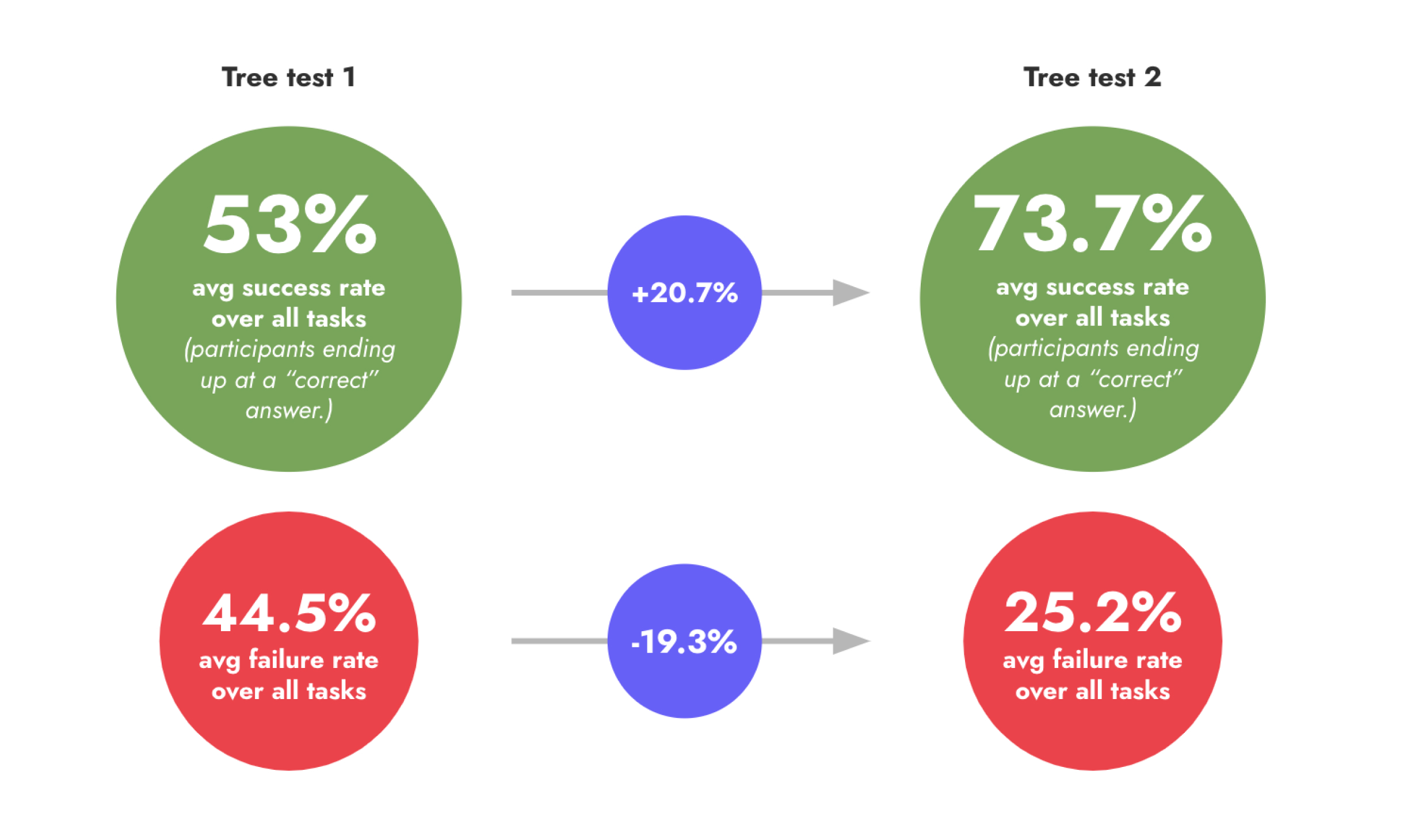
We saw improvements for all 3 user groups:
At Risk (Group 1): 75.1% success / 22.3% failure / 81% directness
Diagnosed (Group 2): 68.34% success / 31.1% failure / 80% directness
Family & Friends (Group 3): 77.6% success / 23.3% failure / 82% directness
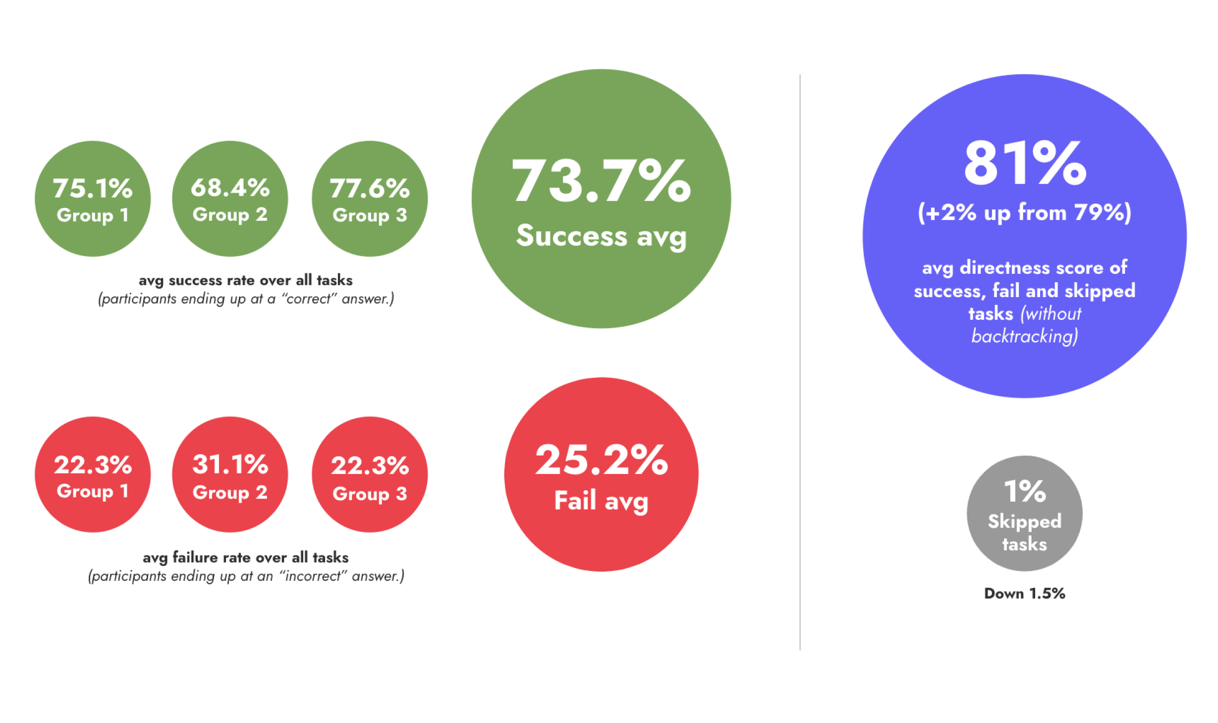
Testing of the new IA showed an increase in success rates on almost all tasks (13/15), with participants ending up at a “correct” answer an average of 73.7% of the time - an increase of 20.7 percentage points - and failure rate dropping from 44.5% to just 25.2% (averaged across user groups).
Prostate Cancer UK are doing some incredible work and we’re proud to help them in their mission to make the lives of prostate cancer patients and their loved ones’ easier.
Visitors to the Prostate Cancer UK website are likely in the midst of a difficult time, and helping them find the information they need quickly with as little stress as possible is something that can make a huge difference.
The increase in usability that we were able to achieve clearly demonstrates the importance of this project - and how design directly impacts people’s lives.
Fruto was an amazing company to work with. They listened to our needs and developed a new information architecture for our website that was centred on the needs of our service users. They were pivotal in making sure men affected by prostate cancer can access health information quickly and easily.


