What they needed
Fruto were engaged by the Beautiful Voice’s founders to help improve the User interface (UI), usability (flows) and consistency of design across the platform - something which is common in early-stage startups. However, in the case of Beautiful Voice, there were many different user needs with a variety of accessibility needs.
The platform is aimed at two distinct user groups - Home users (people who need speech therapy), and Speech and Language Therapists (SLTs).
The accessibility needs of the Home users could be quite varied depending on their particular circumstances. This meant that not only would we need to account for some general age-related considerations with the design (the majority of home users were over-60s and some would have some sight, strength and dexterity issues, as well as not being overly tech-savvy), but also the different variations in general capabilities relating to their particular disposition.
Some users needed therapy either for general speech issues, whereas others it was as a result of having had a stroke, or Parkinson's Disease, for example. Speech issues present in different ways (reading/processing/verbalising/phonetics), and accounting for varying degrees of motor skills was also important.
What we did for them
Starting from the existing user feedback, we ran a series of desk research activities before wireframing and designing a more user-friendly interface that considered a broad range of accessibility changes faced by Beautiful Voice users.
Focusing predominantly on the navigation, homepage, onboarding and daily training areas of the site, we also created a pattern library that could be used to guide future design updates as additional features to support additional patient and therapist needs.
Review existing user research
The Beautiful Voice team had already collected some user feedback via user interviews and user surveys, such as the System Usability Study (SUS), so we started by reviewing their existing research.
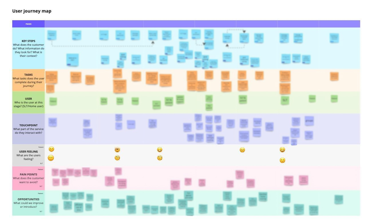
User journey mapping workshop
To help us better understand the different stakeholders' and users' needs, we ran a user journey mapping workshop with the company founders and two SLTs.
It was incredibly valuable to have both user groups represented in the journey mapping workshop.
The SLTs provided a lot of background knowledge on what their patients need to exercise, what the triggers were for people visiting the Beautiful Voice website, and reasons why their clients (Home users) might not continue using the app on their own.
The SLTs were also able to share insights into Home users’ pain points and what they particularly liked in the existing app, which gave us information to keep in mind when it came to wireframe updates.
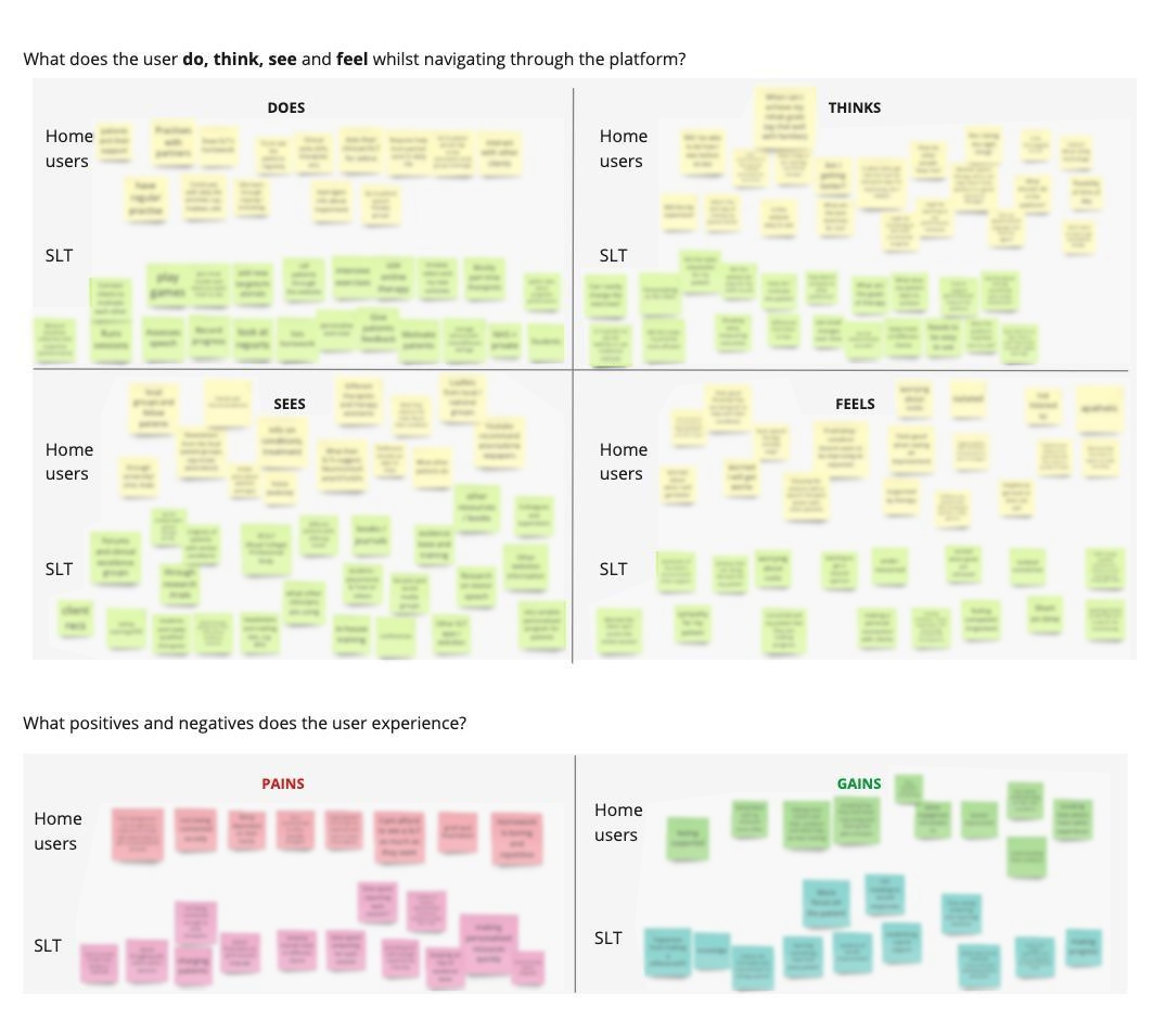
Empathy mapping
As part of the user journey mapping workshop, we ran an empathy mapping exercise to help us understand the range of symptoms across different health conditions and their nuances.
We wanted to understand users in depth to ensure that the design would work even with users with extreme accessibility cases.
Having the SLTs involved with this exercise was highly beneficial as they brought with them a really good understanding of patient needs, highlighting that even patients with the same condition (e.g. Stroke/Parkinson's) might have different needs.
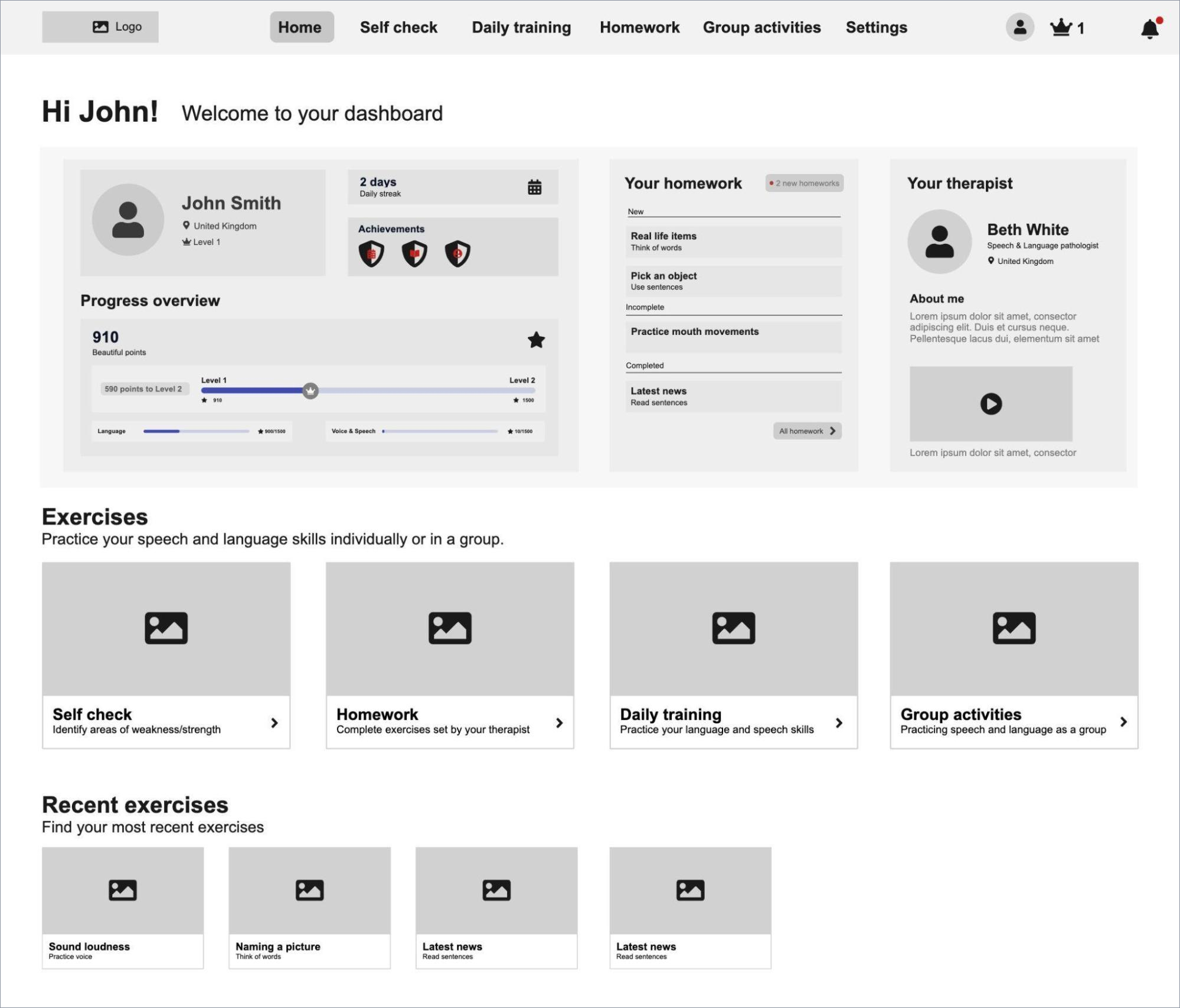
Information architecture (IA) and wireframes
Following on from the user journey workshop, we created the Information Architecture (IA) by redesigning the navigation and page flows that would best meet user needs.
We then created a set of wireframes to define a new page layout, the content and the information hierarchy.
Wireframe to define layout, content and information architecture.
UI Design and Pattern Library
Once we defined the wireframes, we then refined the designs by applying branding, styles and accessible UI elements.
Across the site, we made a number of fundamental updates that were geared towards improving:
Personalisation - Presenting users with a unique set of suggested exercises based on their sign-up profile helped reduce the overwhelm users felt, and made it much easier to track their progress
Ability to self-service - Increasing signposting to key areas of the app to help users understand the relevant app features, and navigate to where they need to go, faster
Gamification - Making it easier for users to understand the points system (what it was and how it worked) and how the different activities impacted their score
Much of these improvements resulted in updates to the Homepage. For example, turning the homepage into a dashboard reduced the need for users to check progress and gave a more personalised feel to the app as more of the information presented was relevant to their individual profile and usage needs.
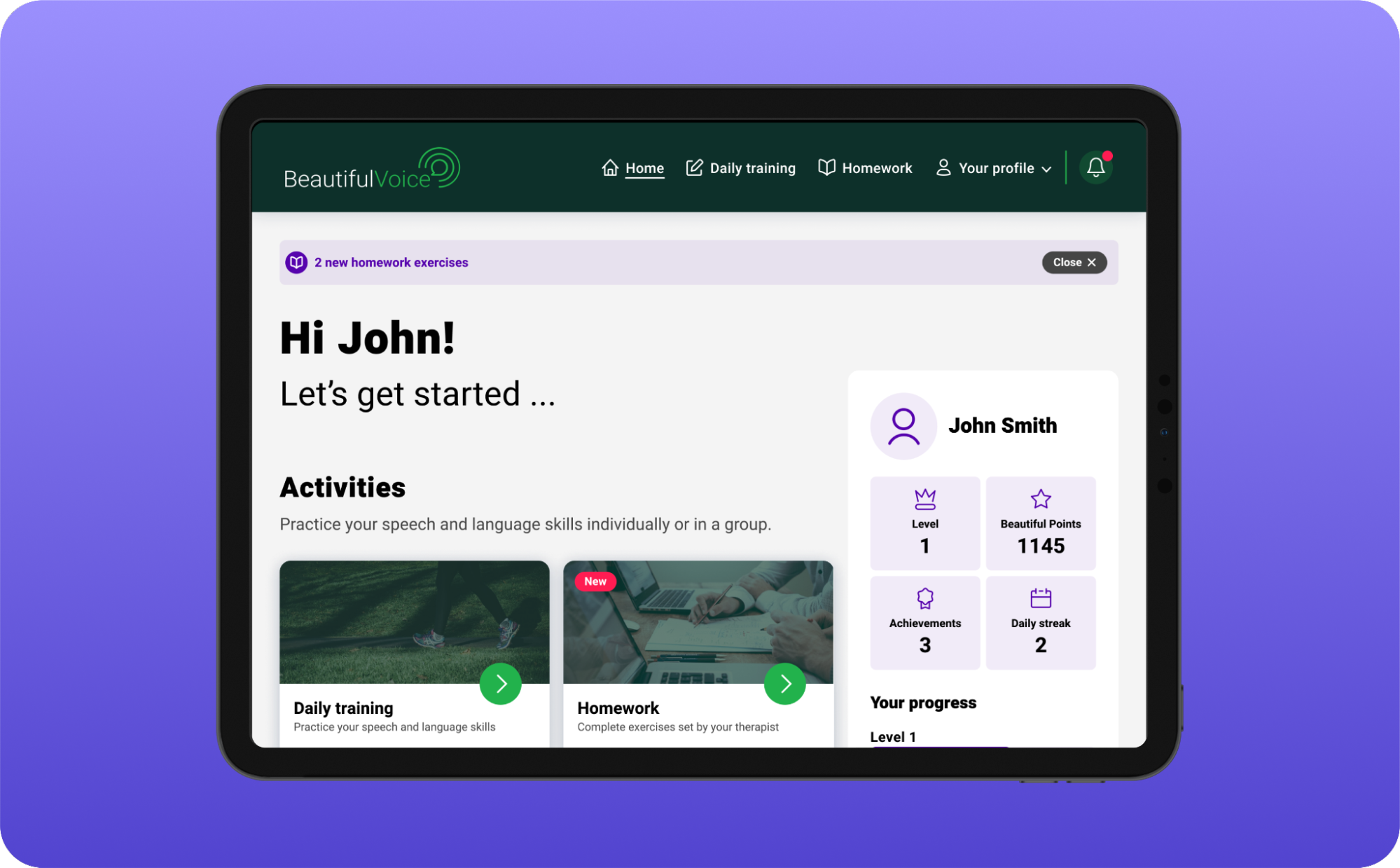
UI design of the homepage
As Beautiful Voice also wanted to help connect people with therapists, we also added a new module to help Home users understand who was available to help them, and again make it a more personalised experience.
The Exercises area of the site also received numerous design updates which helped make it easier for users to understand their progress and continue their learning from within an existing exercise page, rather than needing to navigate back to the Homepage.
For example, the interactive bio feedback feature was simplified and standardised across all exercises to make it easier for users to gauge their success when doing speaking exercises.
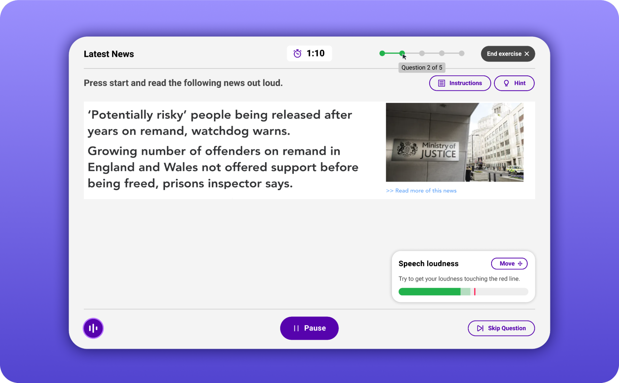
UI design of the exercise player with interactive biofeedback
We also replaced the existing Exercise rating/feedback modal (pop-up) with an embedded, simplified 1-5 star rating system and option to leave more feedback to help increase feature use; and added a “Similar exercises” section to make it easier to find relevant, new/alternative exercises.
AA-Standard Accessibility
Accessibility was a particularly important requirement on this project. At Fruto, we follow the WCAG 2.0 AA accessibility standards on most of our projects. Some accessibility considerations and improvements we made in the interface were::
Large buttons with lots of white space around them and around other components, so they were easily clickable and to account for limited movement
Each exercise category having its own colour attributed to it to help identify relevant options
Inclusion of icons alongside labels on buttons and in the navigation to account for colour blindness and the fact that although some users had difficulties reading labels, they could understand icons
Increasing the weighting of the fonts used across the app and tweaking some of the colours to help improve contrast and purpose behind different colour usage.
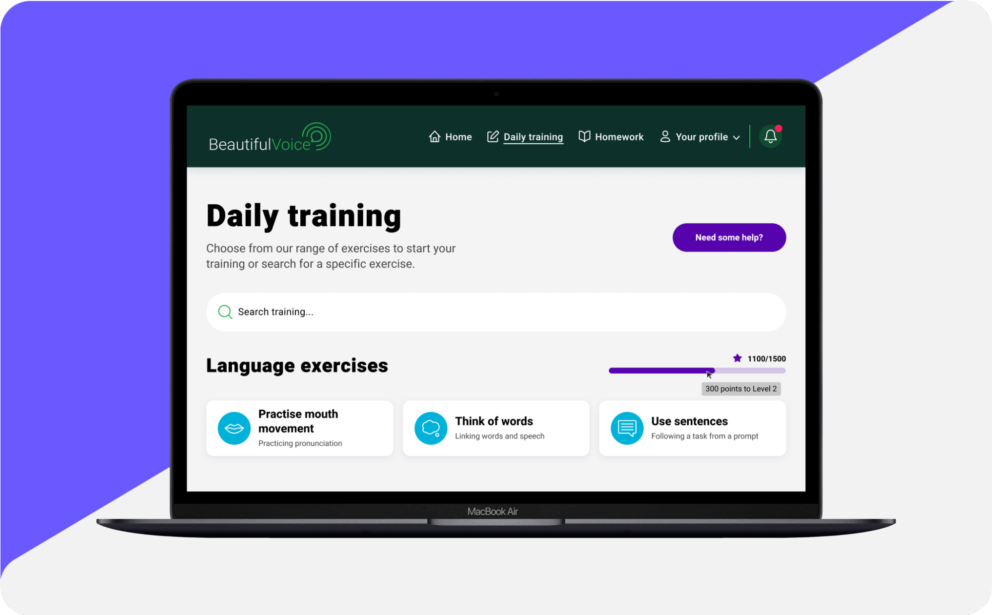
UI design of the daily training page including accessibility-friendly features
Results
The new, user-centric UI design not only hit the brief of being cleaner, simpler, and more streamlined - with increased flow and design consistency - but has also increased overall accessibility throughout the app.
The partnership with Fruto made the Beautiful Voice platform accessible by a much wider range of users. Its intuitive interface allows for users who are not familiar with computers or have cognitive issues to do speech training at home, at their own pace and for as much as they want.
 Andre Hallack, Director at Beautiful Voice
Like many early-stage products, this project has highlighted the importance of user research - and empathy mapping in particular, when it comes to healthcare products - as it would not have been possible to produce such an inclusive design had we not had such detailed user information available on which to base our recommendations.