UX design for video-on-demand subscription process flow
British Film Institute (BFI) / BFI Player
Overview
The British Film Institute (BFI) is the UK's leading organisation for film and the moving image. Working in collaboration with partners to nurture a thriving film culture and engagement with the moving image, co-designed projects have included a research centre, work placements, masterclasses, short courses, BAs and MAs.
These Higher Education partnerships support each institution's strategic ambitions and often include annual subscriptions to the BFI’s award winning video-on-demand service, BFI Player, for staff and students.
What they needed
BFI needed a more efficient process of granting staff and students BFI Player subscriptions. The existing solution was quite a manual process that was admin heavy for their operational team and the eligibility verification process wasn’t as GDPR-compliant as they would like.
As a number of partners had asked about integration with Shibboleth, BFI decided that this would be a good opportunity to investigate doing so, as was creating a new user journey that was more tailored to subscribers invited by their academic institution.
The new solution needed to be feasible for the development team to implement in time for the start of the new academic year, so a quick turnaround was required. A lower volume of support queries and a drop-off rate below that of the standard sign-up process (18%) were also identified as target outcomes for the new approach.
What we did for them
The tight timescales needed in order to fit BFI’s development sprint cycles meant we needed to adapt our standard UX design approach to account for a much leaner process, largely using existing research done by the BFI team rather than conducting our own user research phase to:
Identify the ideal user journey and how it could be delivered
Design the individual page flows
Design the new user interface (UI)
Once the design stage was complete, we then handed over to the BFI development team, checking that they understood the design, and provided basic implementation support.
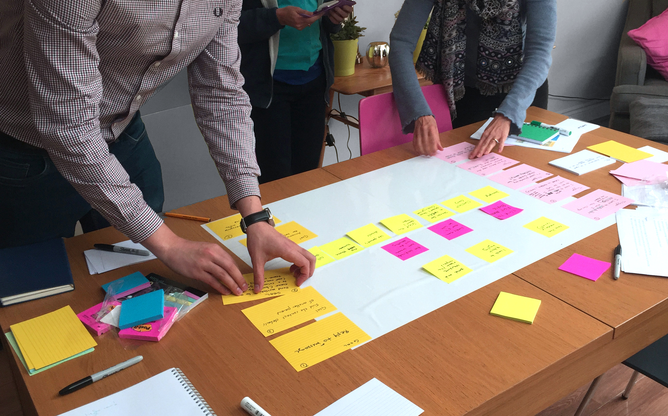
User journey mapping workshop
Having met with King’s College London and Cambridge University, BFI had already mapped out the existing user journey which highlighted some key UX issues that needed to be resolved in the new solution.
A user journey mapping workshop was then used to explore and define each of BFIs key stakeholders’ understanding of the users’ pain points and ideal flow for the users. This enabled us to quickly understand the full range of issues and determine the path of least friction that was needed with the new design solution.
User journey workshop on Miro
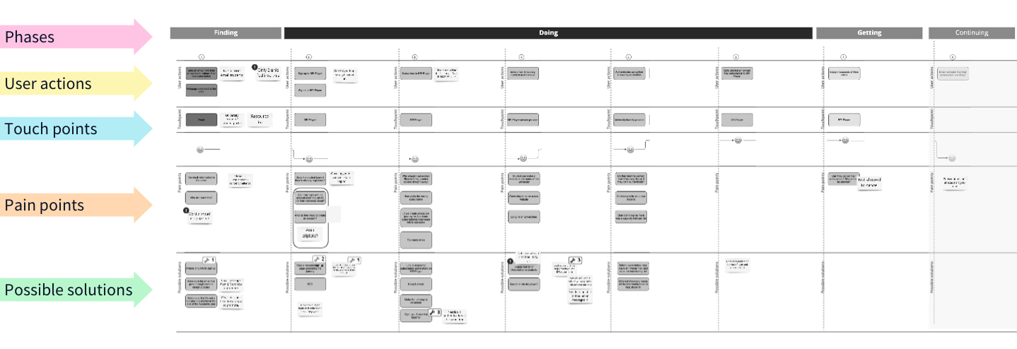
Page flow mapping
Considering each of the ideal user journeys alongside their technical feasibility, we were quickly able to challenge each step of the process and design a concise, streamlined flow that would not only improve the current user journey, but was also deliverable within the project’s limited design and timescale constraints.
UI design
As subscription is a multi-step process, a key design element was to add visual indicators to the top of each screen to illustrate to the user where they were in their subscription journey. By following the BFI Player pattern library, we ensured the user interface design was consistent with the existing website.
Step 1 - Create account
In step one, we made some fundamental design changes to the page content so that it was more contextual to the (academic) offer. This included:
Adding a subheading with a line explaining the process
Adding 3 key benefits of the subscription, specific to students & faculty
Removing information that was irrelevant to the academic subscription and was a common cause of confusion (such as the credit card form)
We also added some extra space between form fields to help visually group the information that was being asked for.
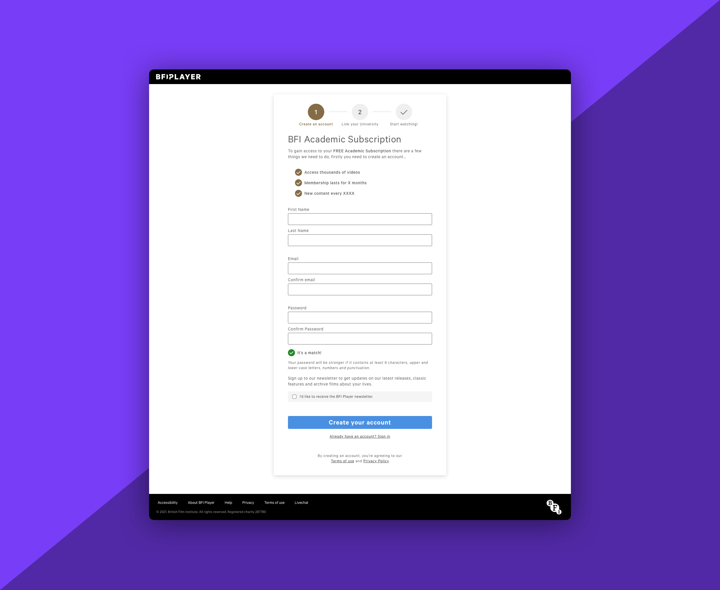
Proposed design for the new Create Account screen
Step 2 - Link institution
The second step in the journey was for the user to link to their academic institution - which would only be possible if they were eligible for the subscription offer.
As research suggested one of the pain points of the existing user journey was confusion when moving between different platforms during the sign-up process, we needed to design a new screen that allowed users to select their institution whilst still appearing to users that they were “in” the BFI Player (when in fact they weren’t).
In addition to clearly indicating that they were on Step 2 of the process and what that entailed, we also introduced a new, searchable, free-text box (rather than a dropdown menu) to make it easier for the user to find the relevant institution.
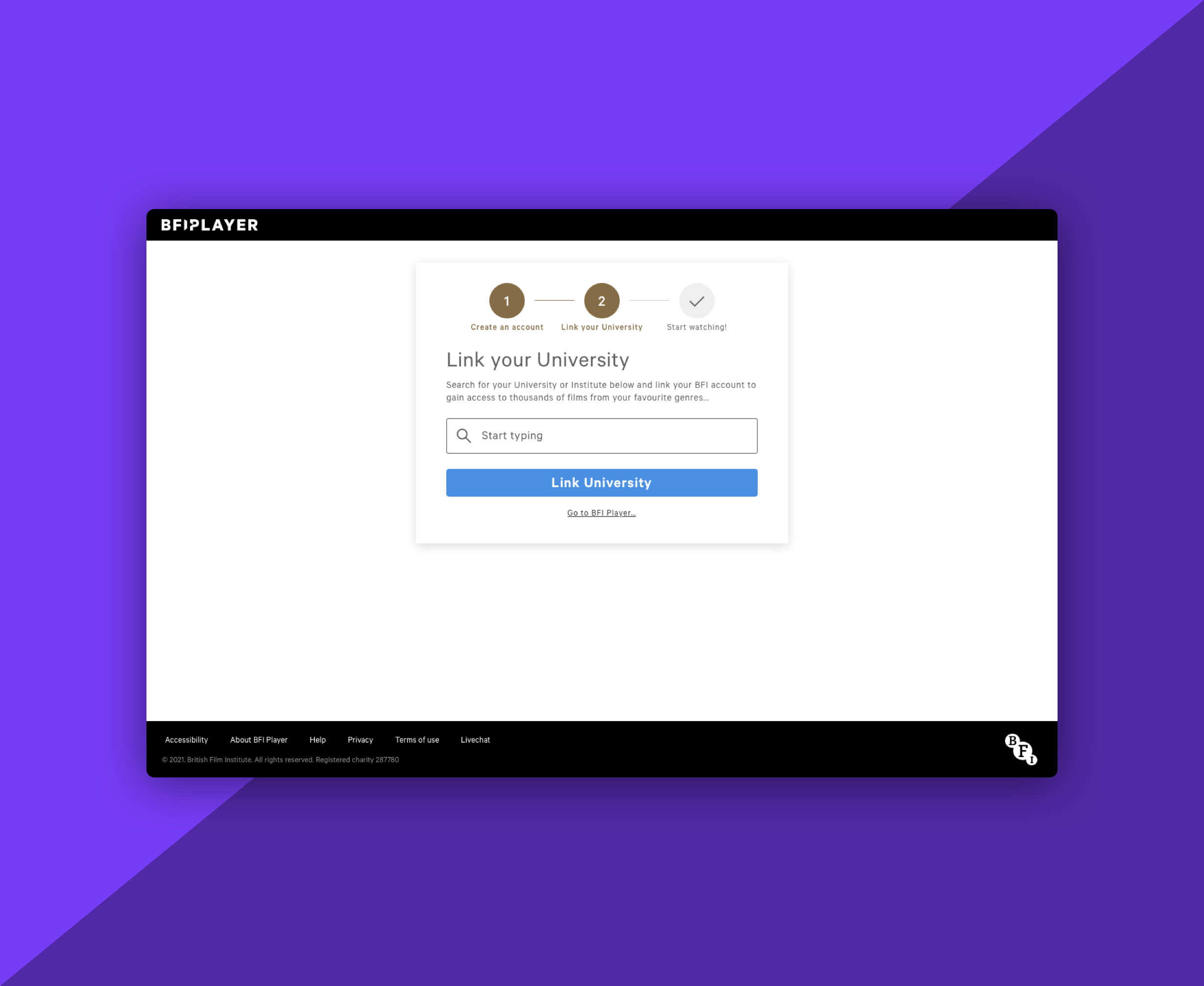
Proposed design for the new Link your University screen
Once they’d selected their (eligible) university, users were taken to their institution’s standard Shibboleth sign-in screen, which would result in them visually leaving the BFI Player site to be presented with the sign-in screen for their university. (Although we had no control over the design of these screens, as users would be familiar with the look-and-feel of this third-party process, it wasn’t deemed to be a likely cause of any unnecessary friction.)
Step 3 - Start watching
Once eligibility was confirmed - by successfully linking their University account - users were then notified that their subscription was active, and could now access the available content straight away (without the need to navigate further).
This replaced the old flow that took them to their new BFI Player Account page and a notification that simply said “You’re subscribed”. In doing so, removing any uncertainty about where they were and what they needed to do next in order to access the content.
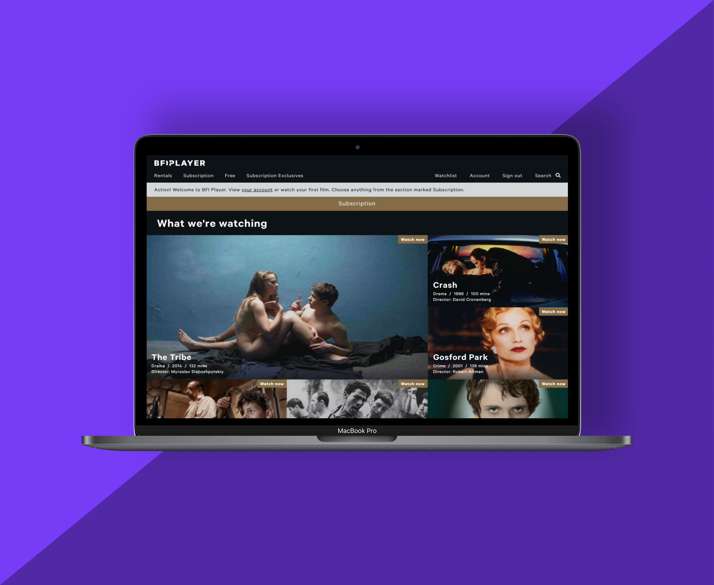
Users were taken directly into the Subscribers area of the BFI Player once their university account had been successfully linked
Results
From a technical perspective, the new integration with Shibboleth means that administrating subscriptions is both more GDPR-compliant, and far less admin-intensive for the BFI Player team than the process it replaced.
The new UX design also delivers a leaner, less confusing and more straight-forward sign-up process for users, with a visual design that also accounted for the technical and time constraints of the project.
The new academic subscription flow is currently in a pilot phase and we’re looking forward to hearing the outcomes of the new solution later in the year once full roll-out has taken place.
Working with Fruto on this project was great fun! The team is dedicated, enthusiastic and organised. They quickly understood the challenges we faced and helped us deliver our new user journey on time.
 Margo Cayla, Product Manager, Digital & Ventures at British Film Institute (BFI)